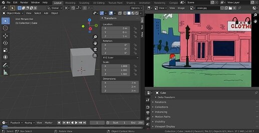
I’m working on a game right now, and I want it to have a very distinct look, it’s going to be a combination of pixel art, 3D and, in this particular case, Classic Pink Panther, I’m just teasing it for the moment with this work setup. I’ll probably end it by the end of the day, I’ll share it here, with different images, some in Blender, others in Unity since I already got the Post-Processing and Shaders working there.
Here are the results so far, I wanted to see what it would look like before going forward because this is pretty much an experiment.
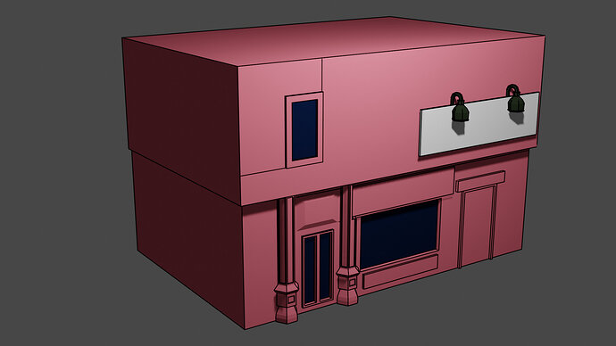
Here’s how it looks in Blender:
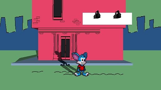
Here’s how it looks in Unity with shaders applied and some added details in form of sprites. It looks neat but I just realized a big issue and that’s topology.
I need the building to cast a Shadow but not the other parts of the building, this is going to be super tricky to pull off.
Looking good Yee! I’m excited to see your progress through all of this!
I like it! 
How are you planning on getting the shadow to cast in Unity?
I’m not sure, the shader I’m using can pretty much “deny” all “self shadows”, so maybe I’ll just disable them and see how everything reacts, I need to place the floor first tho xD
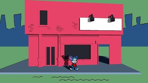
Another quick experiment, now it has shadows! It looks really good.
What if I make the model as simple as posible and I add the details with sprites so I can avoid certain shadows, like the door frames?
Wow! That’s definitely a step in the right direction! It’s going to look good when surrounded by more buildings.
Simple will be better. Allows more control and better frame rate.
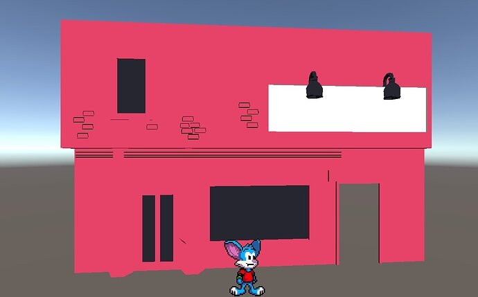
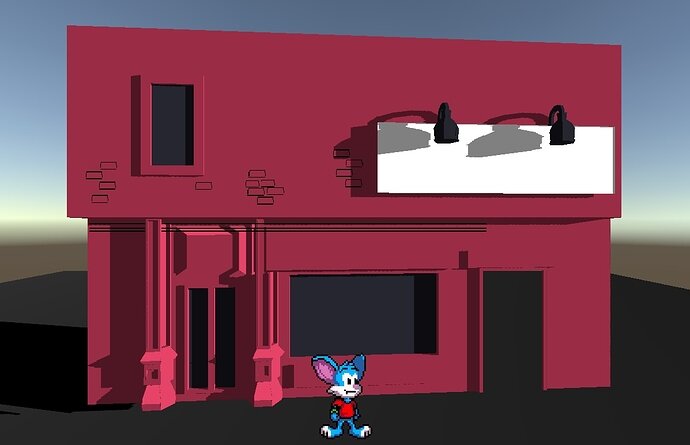
Here are the results of the experiment before I commit to do it with more detail:
No Shadows building, everything is done with sprites, Blender wasn’t even used in this case.
Shadows, Blender had to be used to model the pillars, doors and windows.
I’m not sure which one I like the most, one is far closer to the source material, the other looks more “profesional” in a weird way, I’m probably gonna end up combining the two. I’m also starting to play with the post-processing effects, adding a little contrast makes everything look like 300% better.
In my opinion the second one looks way better. It also fits with the very polished toon character. I think the best strategy is to combine the two.
Thanks for your feedback! I’ll probably end up combining the two, that’s what I’ll be doing today.
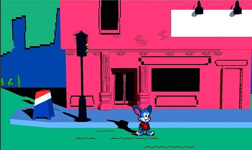
Final experiment!
Some post processing to make the colors look more vibrant! I still can make it look even more cartoony and better, but for an experiment I think I nailed the effect I was going for. I’m quite happy with the end result.
awesome stuff
Looking impressive man! Very Nice work!!

