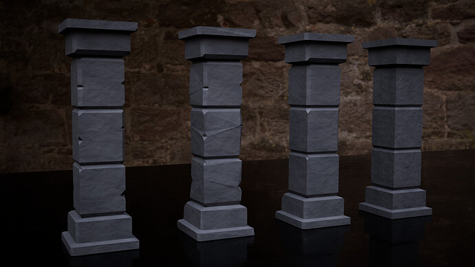
Following up on the initial set of pillars that I made, I used this lesson to go deeper into the material side of things.
Even while keeping things oriented around a low-poly aesthetic, I still wanted to incorporate some subtle bump depth and dynmanic roughness into the materials:
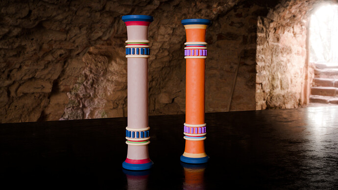
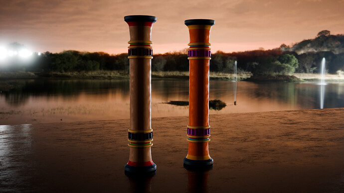
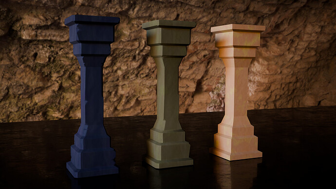
For the third concept, I wanted to carve out several different material slots so I could apply different color and patterns to different pieces and provide an opportunity for a multi-colored aesthetic that would recapture a lot of the now-faded hues of ancient Egyptian rock paintings and hieroglyphics (for example, Egyptian Blue)… to capture what they would have looked like back in all their glory:
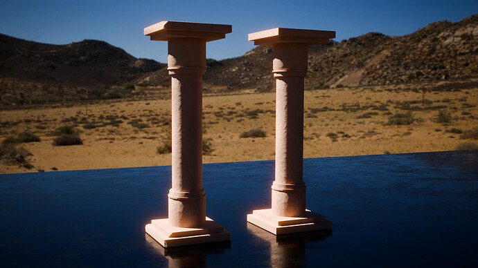
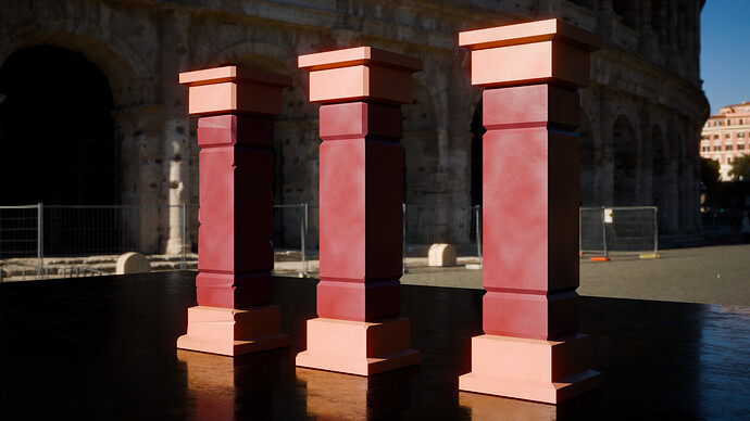
For Concepts 4, I applied a basic Roman-style color scheme:
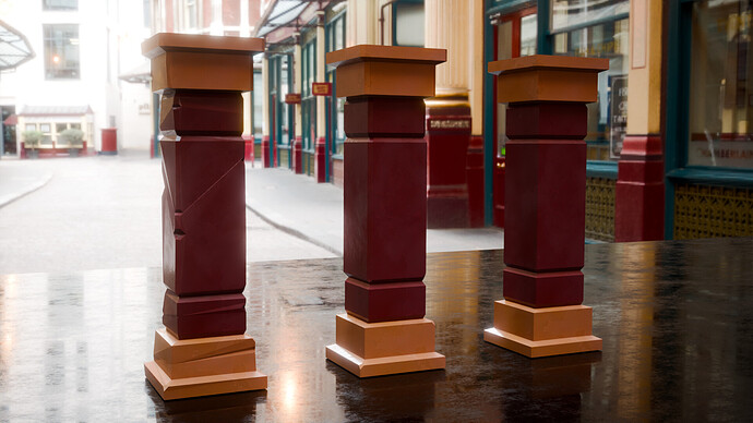
… which could also be popular in many modern settings  :
:
And for Concept 5, I started experimenting with even more noise-texture mixing, composing some very subtle weather-beaten streak lines with some softer, more-circular smudges – all things that that could fit in among the ancient runes of many a lost civilization  :
:
At the same time, I wanted to sharpen some of my skills around creating assets with different model and material variations and then sharing those in different ways. So in addition to the screens and renders I made for the post above, I tossed several variations of the pillars up on Sketchfab:
