
Looks good, two types of shading.
Thanks 
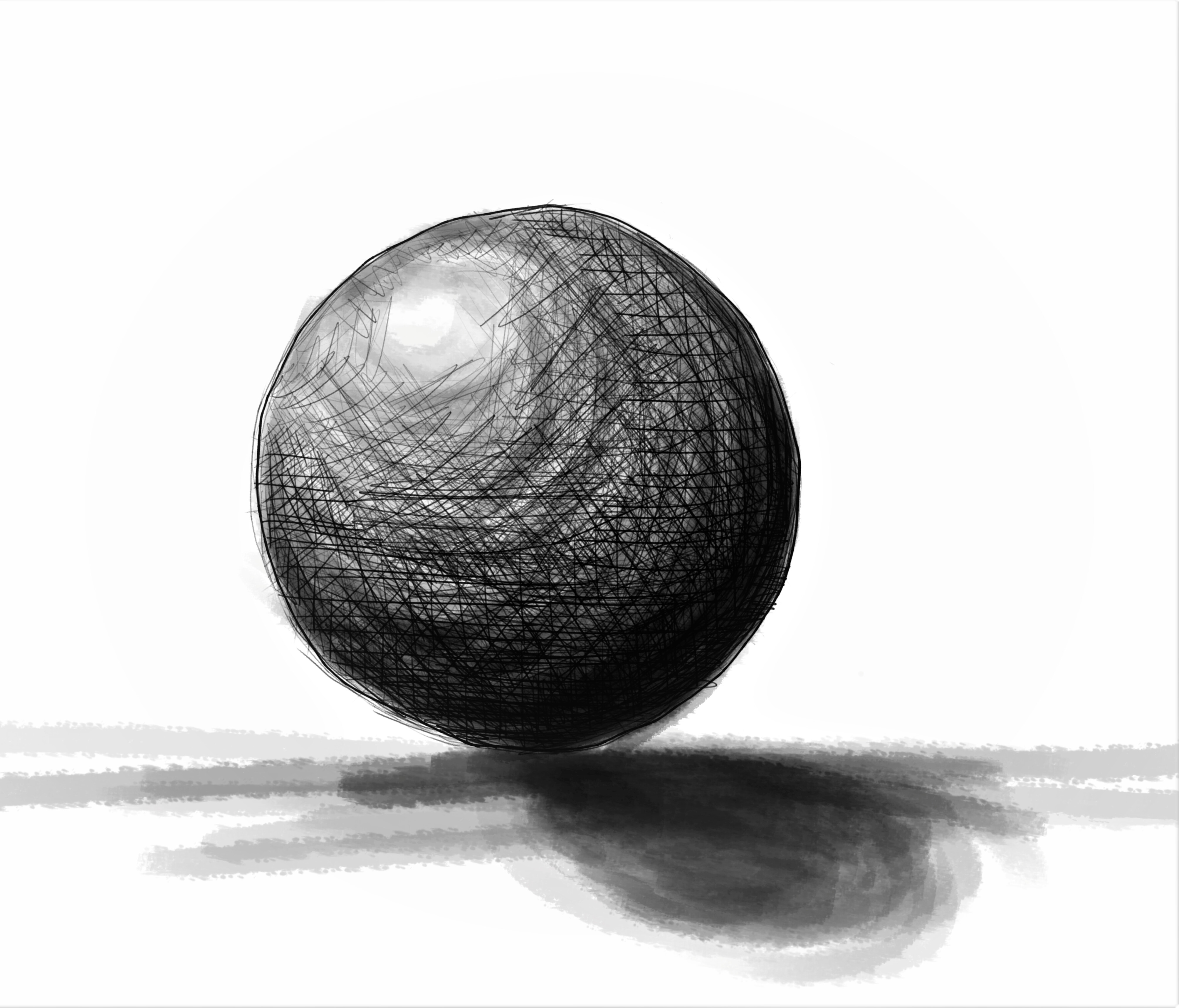
Yes i was not so satisfied with the stroke shadow so i added another.
But the big shadow is in the end not soo good but just for a quick practice Im with it
Is more about practicing a lot, than rather being precise.
It’s a fun course.
No to bad, I suspect you are using a tablet.
I see two things going on here: a pencil ball and an ink ball. They look like two separate objects placed on top of each other, so I will critique each as a separate object.
For pencil, and I suspect tablet, you can get away with hatching any direction you want, so long as you keep your shade value in mind- i.e. darker in the dark areas, lighter in the lighter areas. It blends well with itself and has a variety of gradients that can help establish an object. From what I can see, it is not too bad.
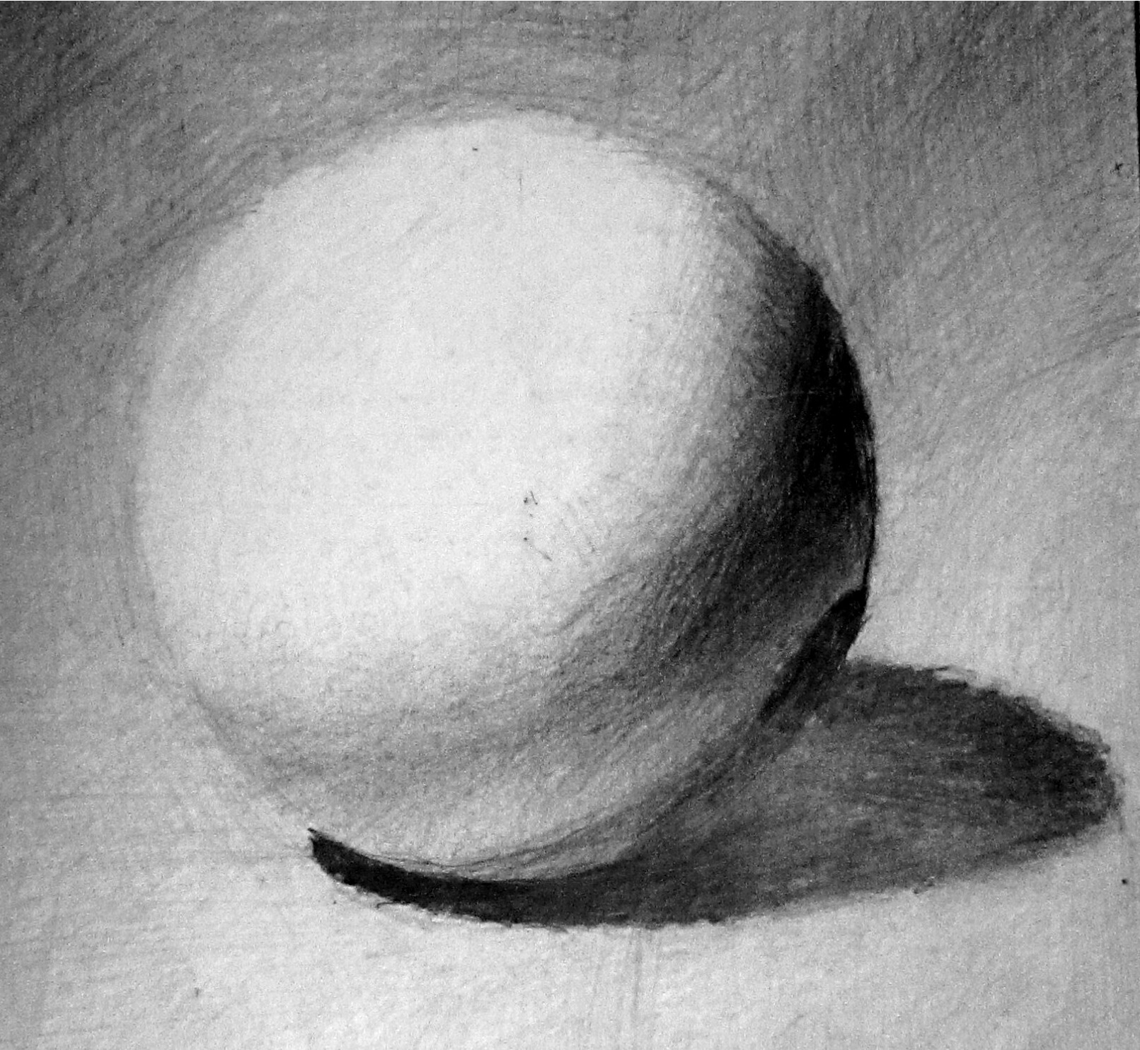
Cross hatching I did last year.
With the ink strokes, however, you will want to be more careful with these bad boys, they are not so forgiving as pencil hatching. Each ink stroke is a definite 8+ value permanently stuck to your page if you are using real ink. Ink easily causes visual clutter because of the white and black contrast it creates, so your strokes must be thought out and used sparingly.
If you look at comic books, ink is used for outlining the subject and solid shading for some contrast, and then texture is used to fill out the rest of the 3 dimensional information as seen below.
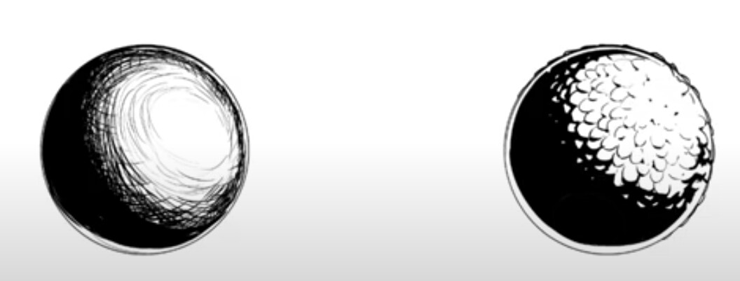
(first is hatching, the second is texturing)
This second picture is from DrawABox.
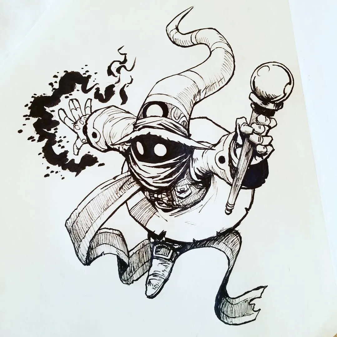
Some random picture of a Final Fantasy wizard.