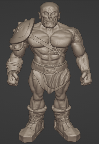
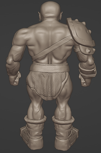
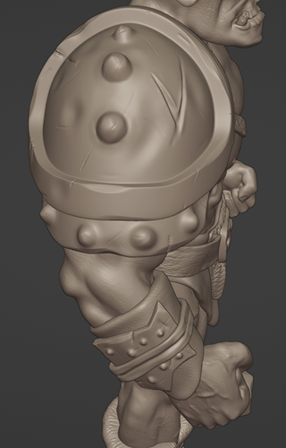
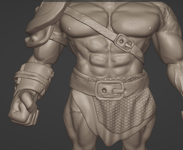
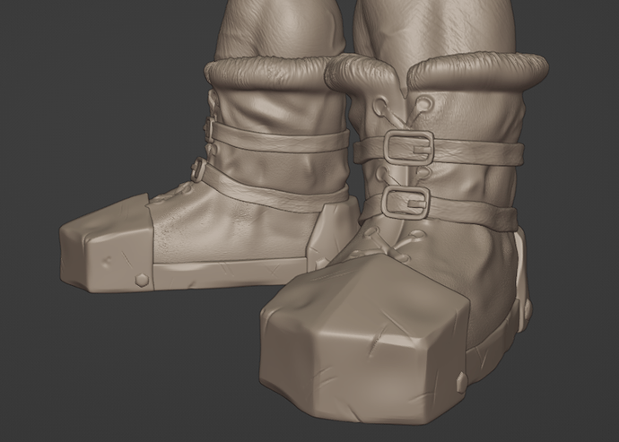
Ork finally plundered some clothes

So after some more work on the clothing here is the result.
I am not sure if sculpting the chainmail was a good idea. Maybe it would be easier to just do this with texture paint. Could be a pain to paint the sculpt. We will see.
As for now I am quite happy how this turned out. Could be better like always I think.


If you have feedback and tips for improvement let me know.
Cheers

13 Likes

Looks very nice, chain maille too, but as you mentioned it I thought ah yes may be a problem colouring that.

1 Like

It’s very cool. I’ve always wanted to learn 3D modeling to draw characters from different computer games. My brother played Monster Hunter: World and often showed me different dragons. Since then, it has been my main passion. My room is like a little museum. There are more than 15 figurines, costumes, and a whole collection of dragon rings. After the release of Game of Thrones, I stopped thinking that the free space in my room could run out. Now I’m interested in three-dimensional graphics, and I want to learn how to work in these programs. Maybe I can become a game designer.

3 Likes

Good job and attention to detail. Just by looking at our model a learned a few way that I could approach some of my own future work. The boots, for example, give the impression of boot ties and holes for them, but they are not separate objects, only “felt” objects etched into the boot itself.

Good thinking :+1:

1 Like

Thank you.
I think modeling things like the ties is kind of a tradeoff. It gets some good detail on the model without adding an extra object. With a normal map its pretty good performance wise i think. but it is a bit more work to paint compared to a seperate object. With the boots that was okay but the chainmail was a pain to paint would have been way easier to just paint a chainmail stencil on the flat surface. I think with game models it all comes down to finding a good balance between the amount of work, the performance on the target platform and the looks.

1 Like

If I remember correctly, the Lamp section of the Complete Blender course may have a solution. It had some material nodes that would affect your edges more particularly than flat spots. In this way you could make your edges stand out more (in the Lamp section it was to try to give a worn edge look to the lamps).

Perhaps something similar can be done here to your chains? Instead of a worn look, somehow a more metallic look could be applied?

1 Like

Thats actually a pretty good idea. Will keep this in mind and try next time. Thanks.

1 Like

Excitedly awaiting the final version. I like the look of the scratched texture of the shoulder pads and boots.

1 Like

Privacy & Terms