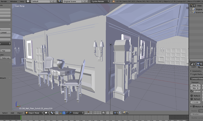
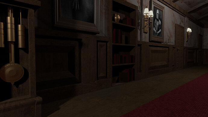
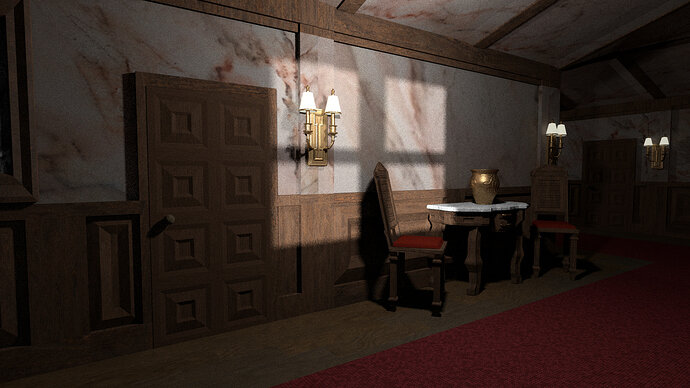
I like it, but I have some problems with ceiling.
Not sure what, but it introduces a feeling of a deformed something.
Still, a great piece work.
Thank you for the feedback! I can certainly see some areas that could use improvement and the ceiling would definitely be one of them.
Very good looking. Great job.
I agree the ceiling is not right somehow. If only that it would be unlikely to be marble? Perhaps you could make the ceiling panels a moulding with some decorative shapes as though in plaster?
Some nice added details the pot paintings, books, and the wall lamps.
Door handle? Probably better brass?
Thank you very much for the constructive feedback! It’s helpful having another set of eyes to help me spot those details that could be improved.


