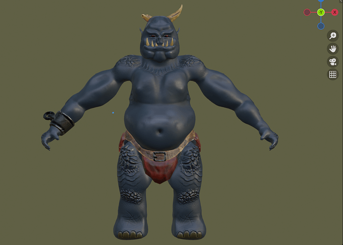
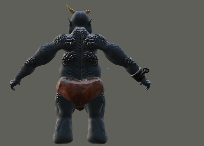
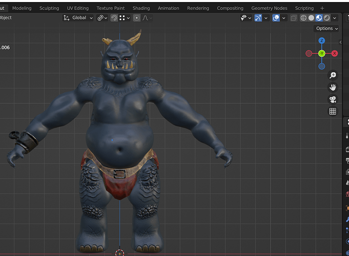
I am quite happy with it, it looks great in my eyes (except the hands …).
That was a great course, thanks Grant and Rick.
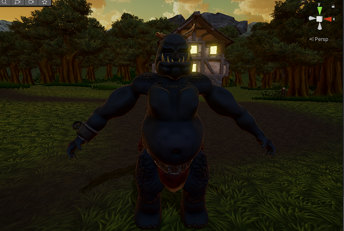
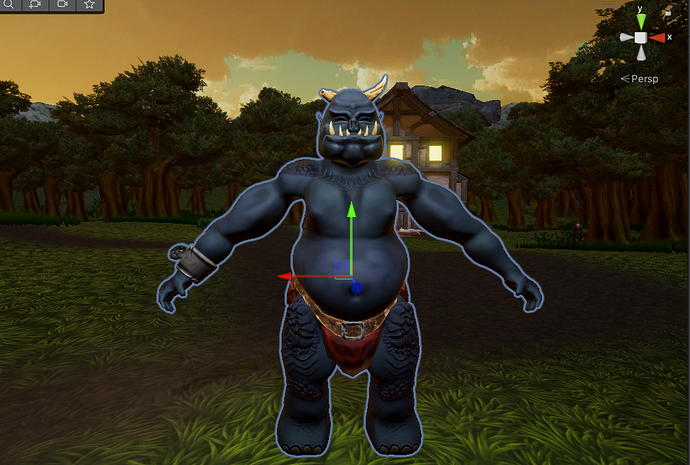
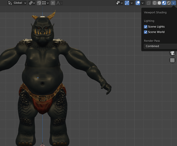
But when importing into Unity, it did not go as well as planned.
The character look much darker, because the lightning is different.
I have to put some light directly above him to obtain a better result. Or pump up the intensity of the default Directional Light.
Still the color is not as clear even with more light. This is apperently a common issue, I will try to investigate and maybe update later when a find a solution.
The start lead is that unity use smoothness which is the reverse of roughness, and we need to reverse-bake it in blender.

