so not a great rotation, pretty sure that with my chosen perspective i gotta get some diagonal lines up in there to make it properly. Despite that i still liked how this animation came out and was ready to move on. lemme know what u think and what i could do better.

Okay, so I saw your post and took it as a challenge for me to rotate your shape. I hope I’m not being an arse but since you asked for feedback I figured I’d share what I came up with and walk through my thought process.
So basically I started by trying to identify what the shape actually is since it kinda changes in your animation but going off of your first frame I settled on an extruded oval. So, I replicated it by eye:

I didn’t really know what the cream patch was but given that it only showed on one side in your animation I assumed it’s not a highlight but something on the shape itself like a label or a sticker.
Then I thought about how to rotate the shape and decided to do the 4 sides of it as a starting point, here is what I came up with:


This already kinda looks like it could be rotating but it doesn’t have any angles like your original sprite. Since your animation had 12 frames I wanted to stick to that which left me with 2 frames for in between each side.
I took the front face of the shape, then scaled it down and sectioned it to get an angle going, after I shifted it to the side. Because the shape is effectively a square from the top it means that as it gets rotated its corners will protrude further out than when looking at it head-on, so I made sure to move the face slightly further out. Lastly, I duplicated the face and put it behind, then connected the two with some details.

I did basically the same thing for the other angle:

Though it did take some extra touching up to make the shape look “right”.
Now that I had those two frames I more or less had them all. The frames for rotating from the side without the cream patch just needed it filled in:


And the frames rotating “in” to each side are horizontally flipped versions, but I had to make adjustments for the shadow to be on the right side of the shape.


Here is the final result:

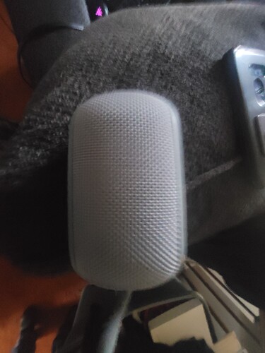
Great job man!! of course your not being an ass lol. My original plan was 2 do it myself however I am extremely busy these days and after realizing it was gunna take longer than expected I just rotated a simpler shape and moved on. I really like how it came out seems like your self imposed challenge gave you alot of good practice at pixel art and problem solving. Glad my post inspired you to find a solution! Btw this is what i was looking at when doing the challenge.
Kudos, your gunna be a great pixel artist if u keep it up!


