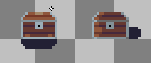
My take on the Treasure chest. I also tried adding in some shadows- the one on the left has more shadows on the bottom and a highlight on top, trying to indicate that the light is coming from the top directly, while the one on the right has a little shadow on the left trying to indicate that the light is coming directly from the left of it
Looks Great! Do you try an open verison of these Chests to?
Thanks!
No, I haven’t tried any open versions, I’m still new to drawing and I’m pretty bad at it so making this actually took me a bit longer than I wanted and I didn’t have time to play around with it
damn, maybe one day you will find some time! Guess you are not that bad!!! keep it going!
while the one on the right has a little shadow on the left trying to indicate that the light is coming directly from the left of it
I think it is ok if we suppose that the light source is exactly on the left side of the chest. I have added some shadows on the bottom of the chest for the side shadows because I have considered the light source to be putted on the top left.
Overall it is a good-looking sprite.