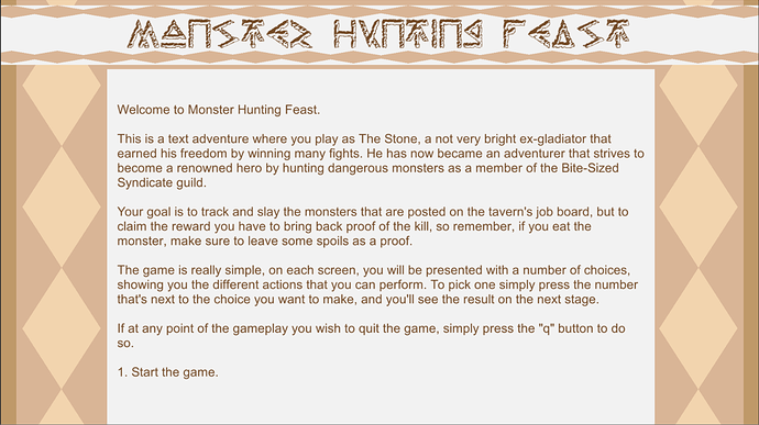
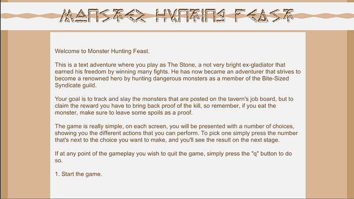
I am visualizing my game in a Medieval setting, so, I chose a look of ancient looking words “carved” on some material like rock or wood for the font of the title text.
And also, since it is a medieval setting, I chose an ancient looking paper color scheme, like the one you would find in ancient scrolls.
I don’t know if the stripes are a bit too much, but I like the general look of it, thought I’m not entirely happy with the way the title text looks, I don’t know what it is. But overall, I think it looks decent. What do you think?


