5 Likes
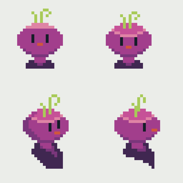
Noice, first one on the bottom looks a bit goofy because the second eye is higher up (I believe so), making it the same level as the first eye should make it look less goofy. Additionally, widening the space between the eyes might help, but I’m not too sure about that.
2 Likes
Thanks! That one I was trying to do a character on isometric view, but yeah, I don’t know what to do with eyes.
