
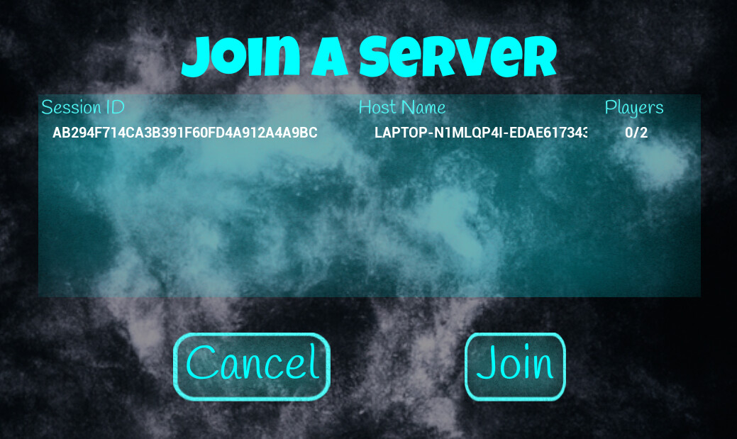
I used a complex system of size boxes, horizontal and vertical boxes.
2 Likes
Just from a UI/U point of view, cancel on the right and join on the left. Is worth looking and dialogs in apps and cancel is usually to the right of Ok, Confirm and so on. Looks great otherwise.
1 Like
Actually if you look at UX design, Join should be on the right. It most newer design styles it follows what i did above. Atleast the UX Design books I read (latest 2022) did the above.
1 Like
On another note, I do also want to change the centre piece to feel more flowy in the design instead of rigid box.
1 Like
I find that strange. Take any Windows application, Notepad for example and perform an open file action - the file selector which is standard across all applications has the cancel to the right. This is fairly consistent across I would say 95-98% of windows applications.
Paint shop pro - Buttonize option
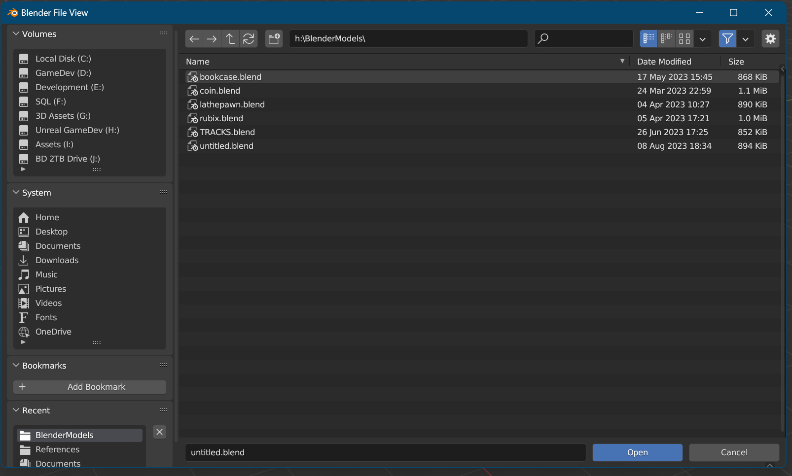
Blender 3.6, a cross platform app:
Don’t go by what UX books say, as they are pushing their style. One thing I learned about these things, is they say one thing but everyone else does the same thing as everyone else in existence, not what they say. The reason is they are conforming to human expectations of a UI.
You switch buttons around and users will consistently click the wrong thing and it can be frustrating for them. I’ve been doing Windows dev and UI design before someone coined UX (since the mid-90’s) so trust me when I say the buttons are the wrong way around.
The reason is, and this is a UX thing I do agree with, is tables are bad and cause eye strain. They are necessary but users will focus down the left side of the form and the first thing they see is Join at the bottom. The key field that identifies the row should be in the left-most column for the simple reason most users will read top to bottom.
I hope this makes sense.
2 Likes
yeah it does! Thanks!
2 Likes