Hi there.
This is my first text based game, definitely needs a lot more content and polish, but it did serve as a learning opp.
Please let me know what you think.

Hi there.
This is my first text based game, definitely needs a lot more content and polish, but it did serve as a learning opp.
Please let me know what you think.
Hi Manie,
Nice story - I’m afraid I got you killed, sorry about that 

Couple of things I spotted;
All in all very good, and well done for completing this section of the course, I’d lean more towards a longer story text and short text for the options to keep the game flowing.
I was relieved that my egg-heads sorted things out and humanity was saved
Hi Rob, I forgive you for killing me
Thanks for the feedback.
I did rush this story out so that I could just get the technical stuff done and learn the next step, not really a good excuse.
I have spent quite a bit of time filling out my story today and will upload a new version when I am satisfied.
Most of the problems that you picked up on were basically due to rushing to compile before bed time, dads need to sleep 
I hope to send you the link to my new version soon.
Thank you and your team for being willing to put in the time to help us discover this wonderful way of creating.
Hi Manie,
Great to hear you’ve spent some more time on the project and have gone back to make some revisions, but I understand about wanting to progress through the course as well - there is lots of exciting things to come! 
dads need to sleep
Oh I hear ya! You are hereby utterly excused
Is your child/children of an age where they would be able to play any of the games you make? That can be a fantastic incentive, or if they have a favourite story, bring that to life where they can make some decisions. In Block Breaker you could perhaps include images of them too, if that’s the sort of thing that they would enjoy/laugh at seeing etc. Just some ideas
Hi Rob
Yes, Amelia is 5 and Abigail is 3. I actually made an android game to help them learn colours, counting and shapes (on their own and as part of scenes/objects) using Android studio and java. It is a rather simple drag and drop type of game.
I tickled Abi and recorded her laugh for the payoff activity when the player puts the right shape in the target box (box spins, laugh plays). Amelia’s voice does all the numbers, colours and shape names.
For good measure my wife did most of the crayon drawings so I could have more time to learn and code. A Family effort!
Edu games is actually something near to my heart, because I see so many games and activities on the market claiming to be for kids but which actually are just super loaded with ads and tend to take kids away from the game in the first 2 minutes. Thereby wasting the advertisers money on useless views and clicks as well as exposing kids to unwanted content.
We all have to eat though right. I actually divided my game into a main menu section which shows an interstitial add, but as soon as the parent chooses an activity then that activity is locked in and (almost ) impossible to leave, keeping little eyes safe and giving mom and dad 10 minutes to hang the washing. Lol.
Any way , mini rant aside, yes I want to build games that will help my kids learn in a safe way.
Have a great day.
Ok , here is the new (hopefully improved) version of The Captains Choice.
Quick question.
I am struggling to keep my font size consistent without overflowing my text box. Would it be better to add scroll bars or should I break up my narrative into smaller chunks.
Hope I found all the pesky little bugs and typo’s.
Have a wonderful blessed day!
I tickled Abi and recorded her laugh for the payoff activity when the player puts the right shape in the target box (box spins, laugh plays). Amelia’s voice does all the numbers, colours and shape names.
For good measure my wife did most of the crayon drawings so I could have more time to learn and code. A Family effort!
That is such a lovely thing to do, I suspect they both enjoyed that a lot and will have fond memories of doing this like this with you both when they are older.
We all have to eat though right. I actually divided my game into a main menu section which shows an interstitial add, but as soon as the parent chooses an activity then that activity is locked in and (almost ) impossible to leave, keeping little eyes safe and giving mom and dad 10 minutes to hang the washing. Lol.
It can be challenging can’t it, monetising but without being overly invasive. I have a fairly low tolerance for ads in apps myself but at the same time, unless it’s something incredibly useful, I’m unlikely to pay more than £1 / $1 for an app. The “Watch this an get a reward” ones I typically am ok with, e.g. say its a game and I need gems to boost something (the greatest con of all), if the link to “Get free gems by watching this video” link is tucked into the gem store, then that’s fine… the little bars that you often see along the bottom of apps though which are constantly flickering/flashing/changing - gah… those apps don’t live long on my device
It sounds like you took a very fair approach to it, “Please support me, ok, it’s all yours now” - that’s very reasonable.
Any way , mini rant aside, yes I want to build games that will help my kids learn in a safe way.
I can’t think of a better incentive to learn than that Manie
I am struggling to keep my font size consistent without overflowing my text box. Would it be better to add scroll bars or should I break up my narrative into smaller chunks.
I will have a look at your update version in just a sec, but to answer your question…
Definitely go with a font size that won’t keep changing, as this is heavy reading based game consistency is key here I would suggest.
With regards to scrolling or not, my own experiences of the Choose Your Own Adventure style books, in my case Fighting Fantasy was that the narrative wasn’t really that long, with the exception of perhaps in the first intro page and the last you won page, all the rest were typically never more than 2 or 3 paragraphs.
With this style of game I think you want to try to keep the pace going, keep the player/reader moving through the game, rather than having states which vary a lot in their narrative length. It is, obviously, a game, and as such having the player engaged through their choices is important, as the state changing is the only feedback that the player gets at the moment (e.g. no sounds, animations, sense of urgency from timers and so on).
Having to scroll might suggest there is more to read in each state than is required. My initial comments with regards to the story getting shorter and the options getting longer was more focused on where that text should be as opposed to the overall length of it. For example, perhaps on some of those states where the narrative was short but then there was a lengthy sentence or two for each option, perhaps the text from those options could be cleverly written into the narrative, with the options then being more like “1: Press the big red button anyway”, rather than “1: Press the big button anyway to launched the laser guided rockets which will destroy the alien planet and irradiate the enemy” <-- ridiculous example but you hopefully get what I mean.
If you are happy with the length of the narrative and you feel its appropriate then I would suggest going with the scroll as opposed to varying font sizes, the latter, as a reader/player, I would probably find quite distracting, where as the scroll I would more easily accept. I don’t suppose it really matters for this game at the moment, but if you were to make more like it, I suspect the length of the narrative may also matter more for the audience you are targetting.
Hope the above wall of text is of some use, I couldn’t help but feel the presence of irony sitting on my shoulder as I wrote about the length of narrative! 
Of to play your updated version now…
Updated Thu Oct 04 2018 13:19
I see what you mean about the Best Fit text issue, and yeah, that is quite distracting as a reader. I think perhaps the narrative is a bit too long for each state. Some of the text for the options is still fairly long also.
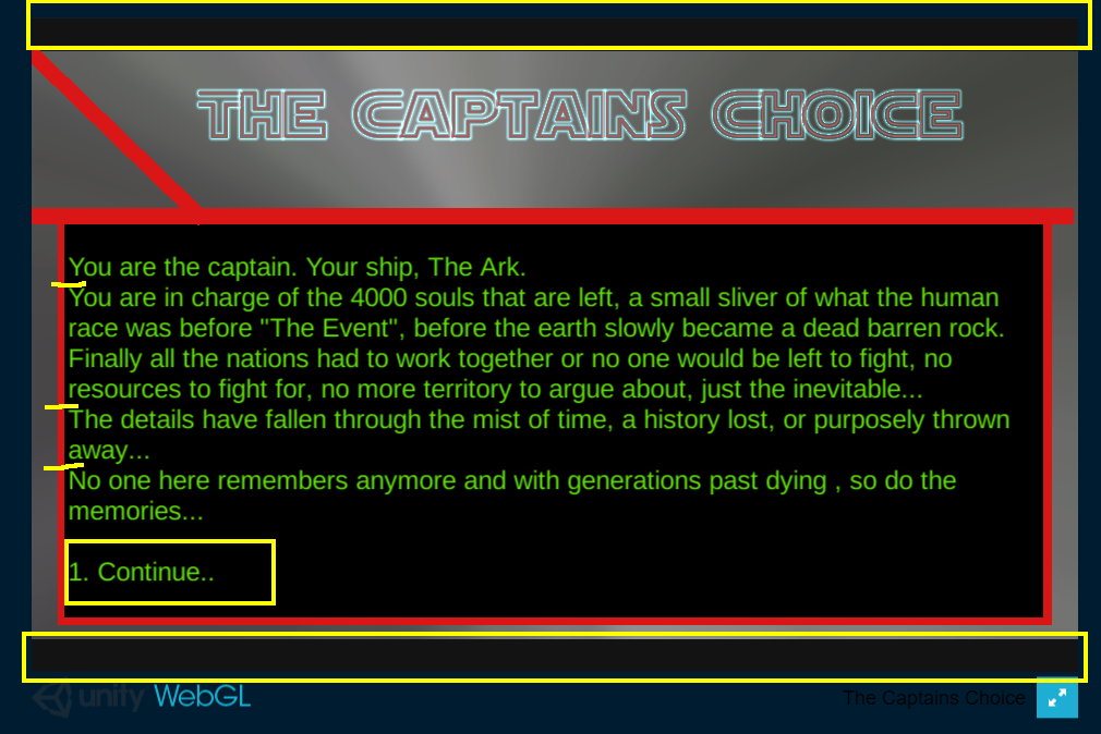
Here’s a screenshot of one of your first states;
At the vey top and the very bottom there is some dead space, your scene isn’t currently filling the playspace/resolution you have set. That is valuable space, it doesn’t help the player being at the top and the bottom like that, but it would help you and your player if it was in the middle where the text is being displayed.
I find, and again, this is only my personal opinion, the text harder to read because there aren’t any breaks for the paragraphs, indicated with the little yellow dashes in the screenshot. I fully appreciate you are trying to save the space for the text, but it makes it harder on the eye.
I’ve indicated the option as well, as mentioned above I think this game provides a maximum of three options doesn’t it, at least by default. If that is the case it might be worth considering allowing for those three options to be in each state even if the state in question doesn’t have three. For example, put a quick state together which has three one sentence (without wrapping) options together and then see how much room that needs. Allow for a little spacing before the options, and then you know how much space is left for the narrative. By creating that space for the narrative you can then force your self to write for the space you have.
The smaller font size, which appears when there is a lot more text, is still very readable, so perhaps you should consider this as the size to use.
Just some thoughts.
Oh, and there’s a broken state I think. I had Sally send a message (I think), and the next state was just black. 
Hi Rob.
Thank you for being so generous with your time, I know how hectic life gets sometimes.
I see what you mean and have made changes to my choice text on some screens to get it under 1 line and rather worked the setup for the choice into the narrative text
for instance
Which used to have a 2 line text per choice
I agree that the lines in between make the text more readable and regret taking them out (desperation move). I have put them back and have found figured a novel way to see how much space is available to me when writing.
I started by finding a comfortable font size ( 28 worked on my smallest screen ). Then I took one of my longest narrative texts , spaced out and choiced to 3 choices ad you recommended. Put that in a test state and ran it .
I then edited it down until it fit properly. At this point I took a quick look at the docs for TextField (you had us add the size params in State.cs ) and changed the min lines to 30, which just fits the text laid out in my test state inside the editor window.
[TextArea(30,30)][SerializeField] string storyText;
Now each time I edit the text for my states, I know that when the scroll bars appear, I have too much text.
I found the broken link , thanks.
I am putting my final (for now) version up , then moving on. Will revisit later and do properly.
Thanks again, I learned a lot.
Hey Manie,
Thank you for being so generous with your time, I know how hectic life gets sometimes.
You are very welcome
Which used to have a 2 line text per choice
I think that will serve you, and the reader well.
I have put them back and have found figured a novel way to … [snip]… Now each time I edit the text for my states, I know that when the scroll bars appear, I have too much text.
That’s a great idea, well done.
I am putting my final (for now) version up
That’s much easier on the eye, easier to read and more enjoyable to play.
Minor note, for when you re-visit it, the options are disappearing off the bottom
Thanks again, I learned a lot.
You’re very welcome, I will look forward to seeing your next creation! All the best

Weird. Works fine in game screen for all aspect ratios… and then I switch to 1920 x 1080 . Oops!
Another lesson learned.
In the browser it actually works out when I use the full screen mode, but not in the normal browser window.
Something to keep in mind when I test in future.
hehe, I so didn’t want to have to mention it after all the work you’ve done and you mentioning you wanted to move on… but didn’t seem fair not to. The second option does still respond, you just can’t see it, I knew it was there though from your text example above so that was handy!
Before you put your TextArea solution in place I was going to suggest that another way to restrict yourself would be perhaps via a word count. With the font you were using on the opening screen in the previous example, about 100 words seemed to fit. If you dropped the font size down fractionally you’d probably get about 150. You could then, potentially, use something like Word for creating the narrative and checking the length of each block before pasting them into your states. Didn’t mention it at the time as I figured this may be more involved than you’d want to get but now you’ve mentioned you’re going to move on I saw no harm in raising it.
Great that this first game has been a good learning experience for you, I hope you enjoy the rest of the course Mannie
Very cool! Although one of the crew mates fell in the black goo, he will be forever missed :’(
May I never be surrounded by people who say nothing when I am wrong