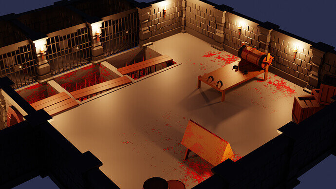
Might of overdone it on the blood.
Its looking nice, although i would desaturate the reds, very sharp IMO. Sometimes i toned down look will give you that better feel.
It also comes down to personal preference in the end and what you want to achieve.
Gruesome dungeon!
Thanks for you advice, I probably wont change it, just because I want to get on to the next section, I agree though, I was thinking as I was doing it that it was too red, but I was just rushing through it as I wanted to get it all done quickly, I’m eager to get to the next section as I have been looking forward to it the most since start of course.
Nice torture dungeon.Nice spike pits by the way  .Just a thought, can’t they walks on the wall between the pits to escape from the cages?

No because they are oiled or something lol. Actually the pits were a very late addition to the scene, I noticed the flaw in it straight away but just decided I couldn’t be bothered to make any more edits. So the story is they are very slippery, it’s quite effective as you can see from all the blood in the pits, no one has escaped yet.
Cool.
Interesting take on the dungeon scene.
Wait? What? Is that not just spilled paint? Where else would you spill paint but on top of spikes, art easels (the triangle wooden thing) and the flour grinder?(the contraption with the roller) 

