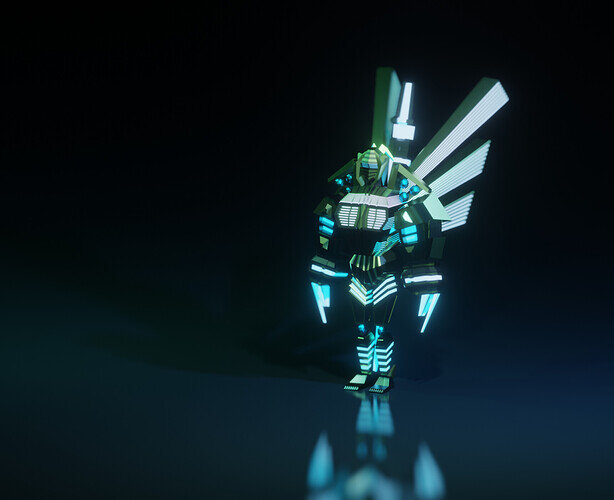
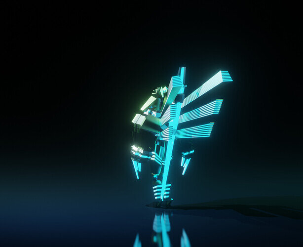
Hello! Wanted to share my version of the cyborg. Any feedback is greatly appreciated!
6 Likes
It is a nice render, but the cyborg is difficult to “read”. Especially the last image. Where it is difficult to see a cyborg shape.
2 Likes
Thank you for the feedback! I think the reason we can’t see the cyborg shape is the cyborg material is too dark for this background, and it’s arms going down. Maybe if they were up, we could see it better? Will definitely work on that!
1 Like
The first step is the shape
The second step is to add details at certain places, to emphasize pose, story, and composition. In your project, the details (bloom, light) is everywhere.
1 Like
Welcome to this site.
Take some time to look around and take part, support, and encourage other students.
Very stylish cyborg!
1 Like


