
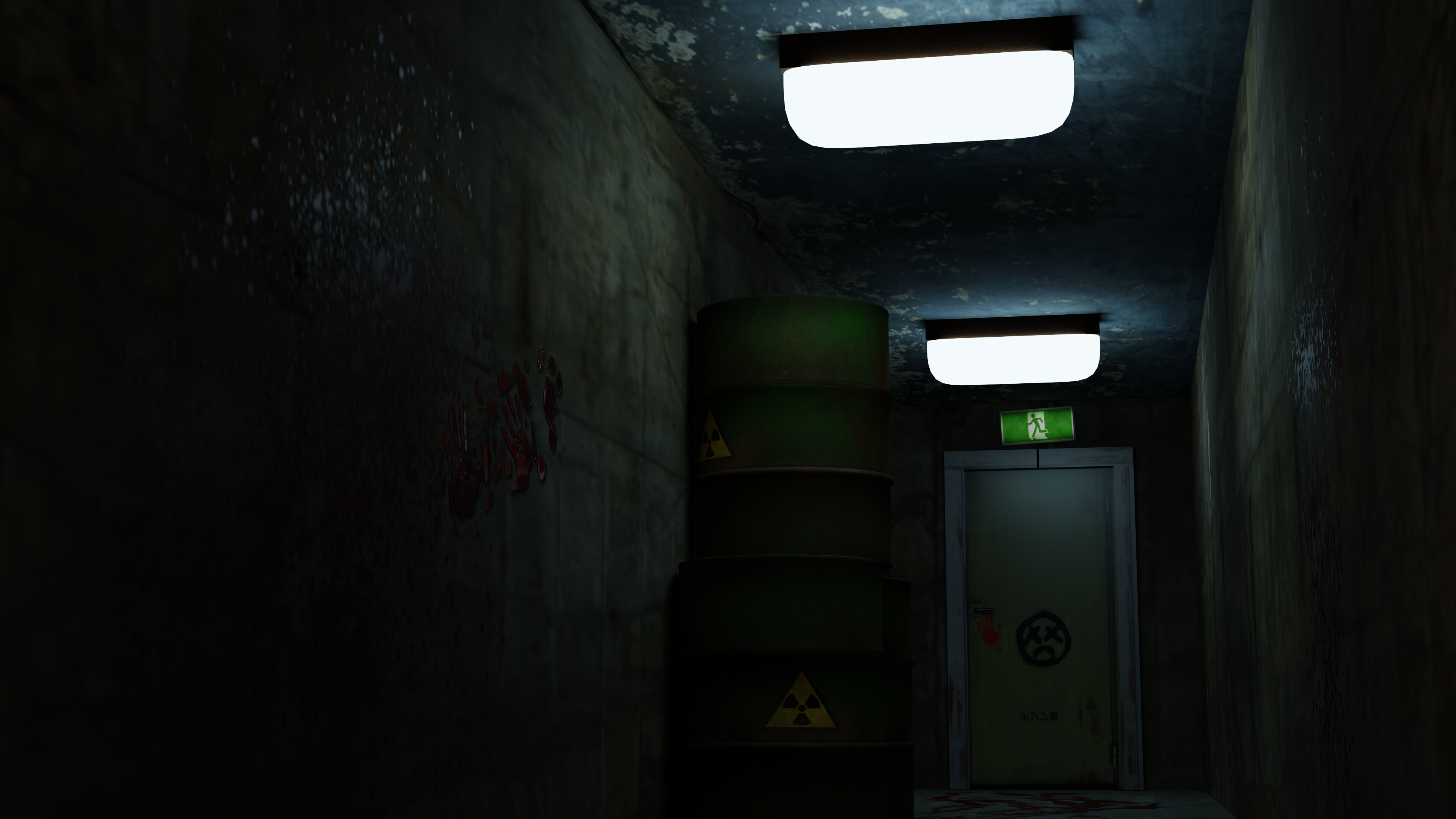
I went for a slightly different tone than the others. I feel blue gave this a more creepy tone, alongside the bloodstains and graffiti on the wall. Feedback on this would be much appreciated!
6 Likes
The lighting is good, dark, and mysterious.
While mostly everything looks deteriorated, dirty, and moist. the lamps aren’t.
Also, I think they are too big in comparison to the environment.
Still an outstanding job, the exit sign is an excellent detail.
1 Like
Good effect. Nice to se the health and safety like green man sign is still working, would not want anyone to trip carelessly in there. 
1 Like
Now that I look at it twice, the lights do look big. I’ll change that!
1 Like