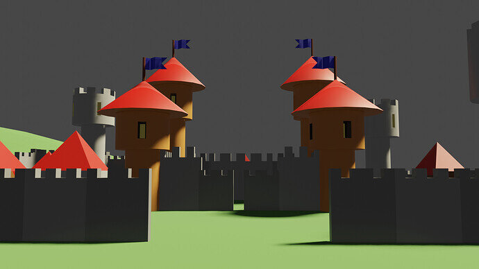
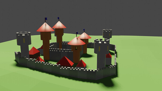
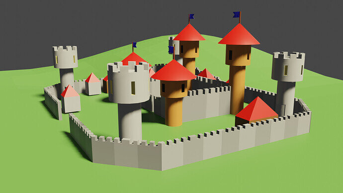
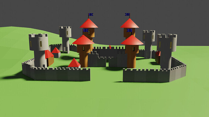
I had fun with this lesson and decided to take it a bit farther by adding in some small houses to add a bit of variety
I like the version with the frontal light.
thank you and  actually that was the same lighting through, just a matter of perspective from where the camera is but I definitely like that front shot for how the light hits it!!
I agree with @FedPete about the frontal light. I realize you just moved your camera for the other views, but it made a huge difference.
My only other comment is . . . from that frontal view, the small house near the front gate appears to be floating, as it’s not touching the ground. The same is true of the house further back (and to the right in that view). Everything else seems to be planted firmly on the ground.
Very nicely done. 
I didn’t even notice that  I’ll have to go back and reposition some buildings lol but glad to hear its liked and thank you both for the feedback!!


