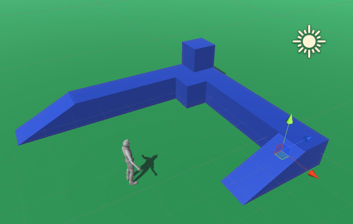
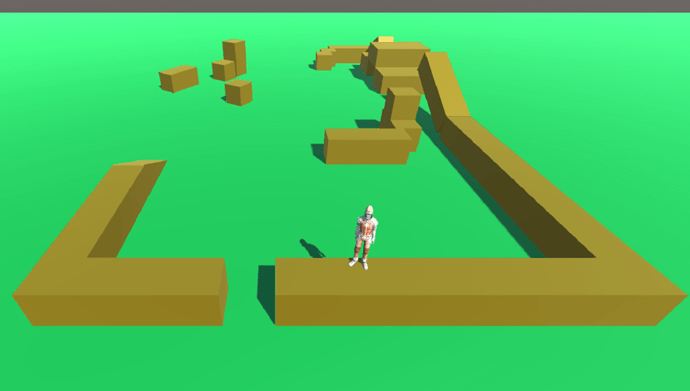
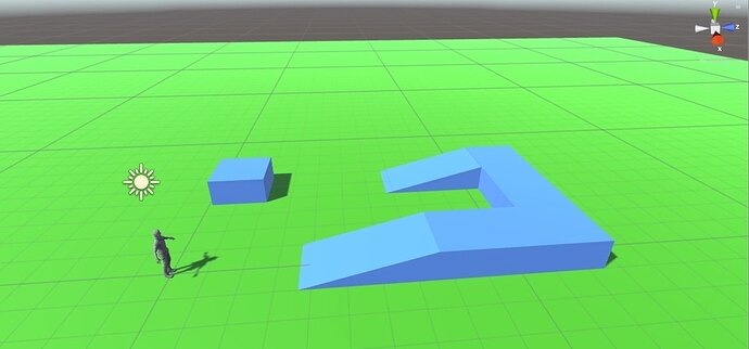
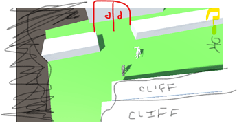
Kept it nice and simple.
Very nice. Two ramps, indirect path, I have a feeling this layout will be useful when we get to click-to-move.
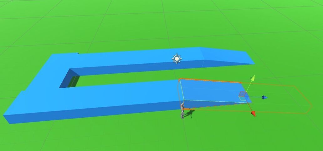
should be good for the point click testing.
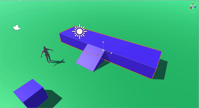
Anyone know how to reset the movement arrows after rotating? I copy / pasted my second ramps and the xyz movement had rotated with the object so when I tried to move it to a new position it went into the ground.
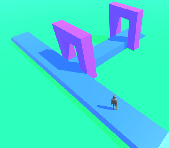
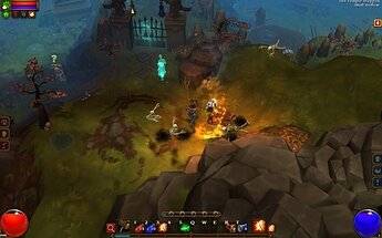
@James_E Love the colors in your setup! How about holding on to this with your RPG development like the example below?
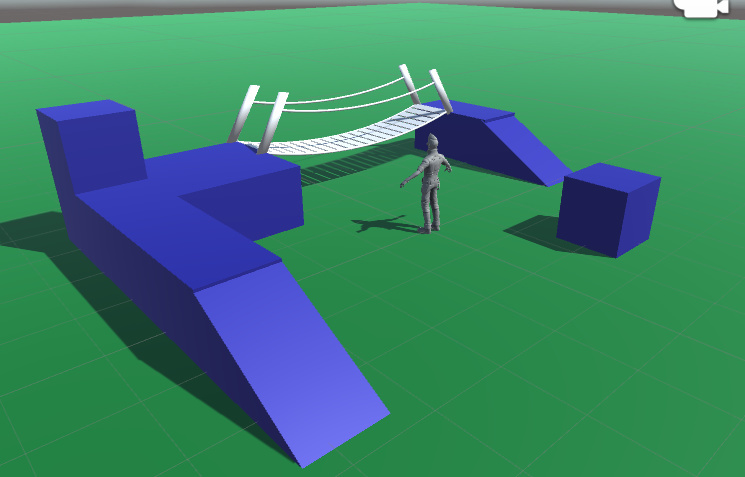
I’ve been playing with blender while waiting for lesson 9 to drop.
I put a mesh collider on the bridge but Ethan went it to spasms when walking across it, I think I need to create a collider in blender so the gaps in the planks don’t effect the character movement. Also the scaling and rotation is completely messed up compared to blender so I need to do some reading on creating blender objects for unity.
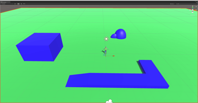
Wonderful! I wish I could claim my colours were a result of artful design! This pic is great!
@Stephen_Crookes… Might also be that the bridge is too narrow, have you tried stretching it wider to see if that works?
@Rick_Davidson I made a seperate mesh collider for the bridge and Ethan walks over it fine now. The issue was that the walking surface is made of seperate planks so when walking over a gap Ethan’s falling animation ran and then switched back to walking.
Gotcha, glad it worked for you. 
Here I added the walking platform as guided in the video but I added a “building” on the left and “boulders” to the top of the image. Ethan kind of reacts to the boulders which is kind of cool, he does a little jump when bouncing off them.
