Looked on to some of the other showcases attached to the video and thought that this was a really good concept for the challenge:
Well made classic item.
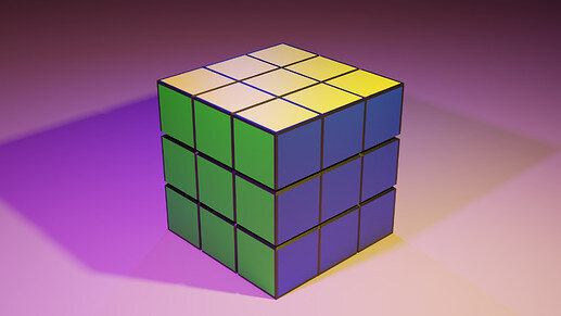
Really well made rubix cube. Cool that you got the gaps in there, nice touch. Completely in love with your lighting setup. Gorgeous purple and yellow shadows!
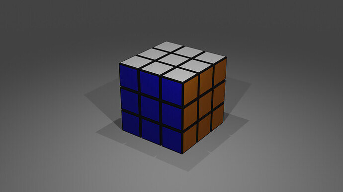
The colours are wrong. I made the same mistake a few years back on my first cube.
Wrong in terms of shading or color?
On shading I was pretty lenient with myself. Color scheme – I’m not really all that familiar with the Rubik’s cube myself, so I just used wiki article’s color scheme and made rough approximations. Lots of variations when searching images on the net.
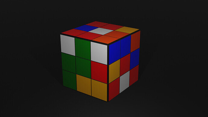
This is too funny! By chance I also created a rubiks cube, came here to the forum to share and your post is at the top of the list. They even look really similar too 
PS I think what the other poster meant by wrong colours is that green and blue are always opposite each other on a standard rubik’s cube.
Nice work!
Thanks. That makes sense now that I think about it  They even had the diagram split out like you would see a UV map and I didn’t notice.
I actually went to Wikipedia page to have look and all is right there. Didn’t want to correct you as that would be just a dush move
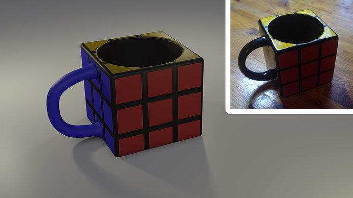
That looks like it would be hard to drink from haha.
Who needs to create donuts when we got an Rubik’s Cube showdown? Nice work on the Cubes, and Cups.
This topic should be a Weekly Challenge pick!
Nah can’t tell the difference from normal cup


