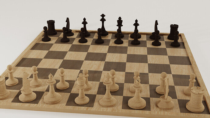
I went with a minimalist wooden board. I modelled them after a set I inherited from my father, it’s very old. My cycles render is a bit washed out.
7 Likes
Welcome to this site.
Very nice all wood set and board.
Perhaps the white pieces could be a different, whiter, wood so they show up more on the white squares?
1 Like
You’re right! I’m converting my C4D material library to a Blender 3.0 asset library, I’ll see if I can find a nice lighter wood material.
2 Likes
Yes, you need to spend more time on the lighting aspect.
- Don’t put lights close to the board, but farther away and then increase the wattage.
- Start with one lamp the key-light. Increase wattage without overburning the white. Then add lights to light the too dark spots.
- Try to use HDRI images, which generates an environmental lighting map (more natural)
- Also a white back ground doesn’t help if your subject is also light in color.
I do have an HDRI and a single far away area light, but I’ll play with my options (different hdri, backdrop color, wood material) to improve.
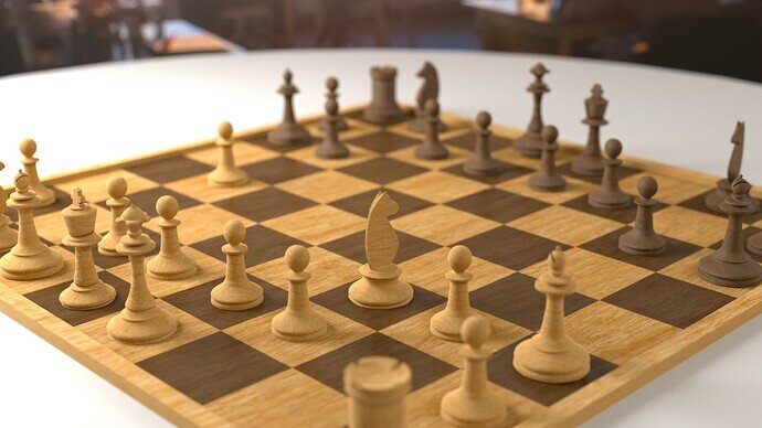
I increased the contrast between the materials, tweaked the key light size, position and brightness, changed the camera, added the DOF and fixed a problem with overlapping geometry on the board
 The table is grey, a backgrond photo suggest a café, switched to tandard instead of Filmic view transform. Thanks for the feedback!
3 Likes


