
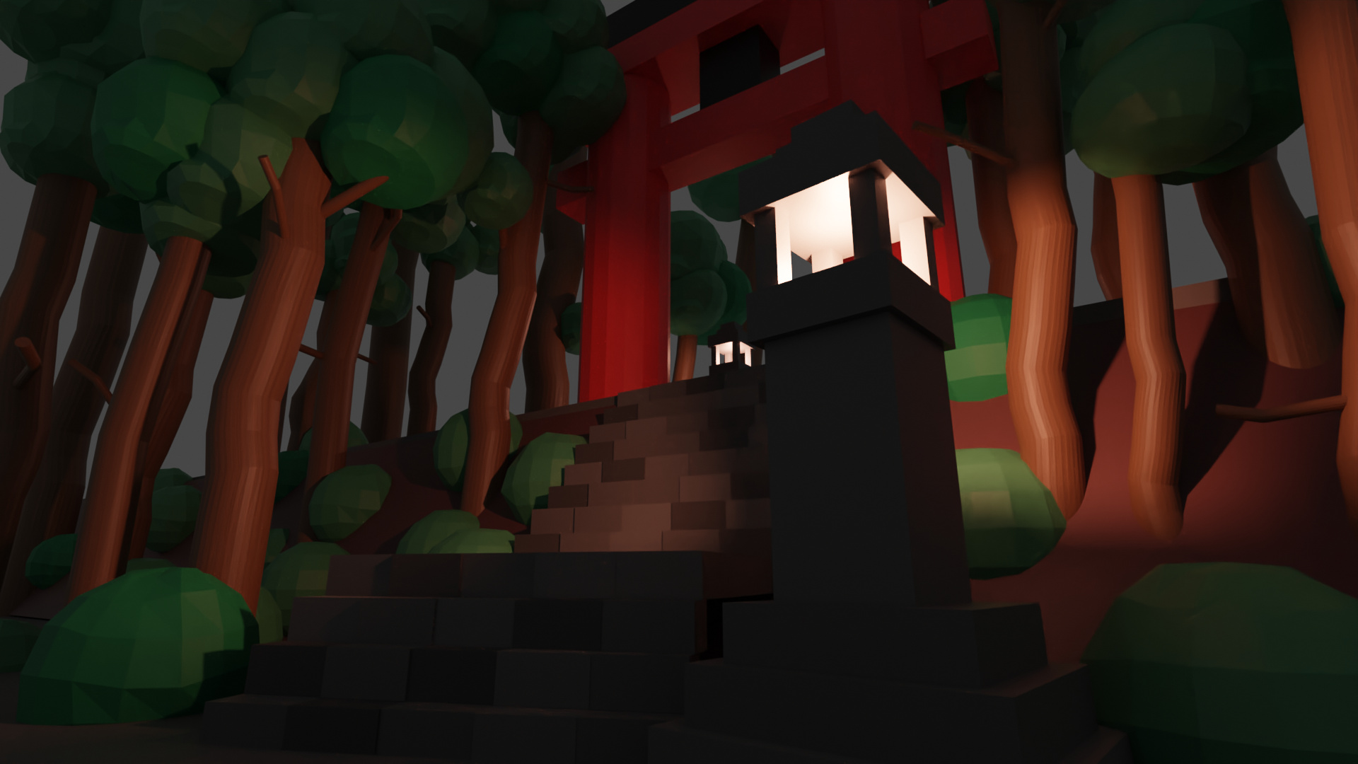
I tried to replicate a Japanese torii. Hope you like it!!
9 Likes
very mystical, great first post. And welcome!
1 Like
I would make a few changes. I know the feeling your trying to go for (since I used to live in Japan): mystical, secluded, and spiritual.
Notes about your work
Firstly, there is little composition in this scene. Specifically, there is no focus (or emphasis), no movement, and little balance.
Focus can be described as where the viewers eye’s ultimately “focus” in on. You want this to be the focal point (i.e. the most important part) of your art. Here it’s the torii gate. So why then is there a giant lamp covering a quarter of the gate? It’s visually distracting, and it the biggest offender in the entire scene. A simple fix is moving it to the other side. That way it’s not covering up the gate, but it still provides a light source.
Movement can be described as an arrangement and position of objects in the scene. To improve the flow or your art you want to use leading lines. Although this explanation is for photography, the same applies to Blender. For example, in your work, the (uninterrupted) stairs could be a leading line to the torii gate. If you played around with the placing of the lamp that could also be used to lead your eyes upward (and then maybe have a branch of tree lead you horizontally to the gate.
Balance is obvious: not making one side of your work feel heavier than the other. Symmetry adds calmness, whereas asymmetry creates dynamism. Depending on the feeling you’re going for, you should apply whichever one makes more sense. Here, you could add two lamps at the base, or keep just the one lamp (but move it to the other side!).
Other elements of composition.
An example
Here’s an example:
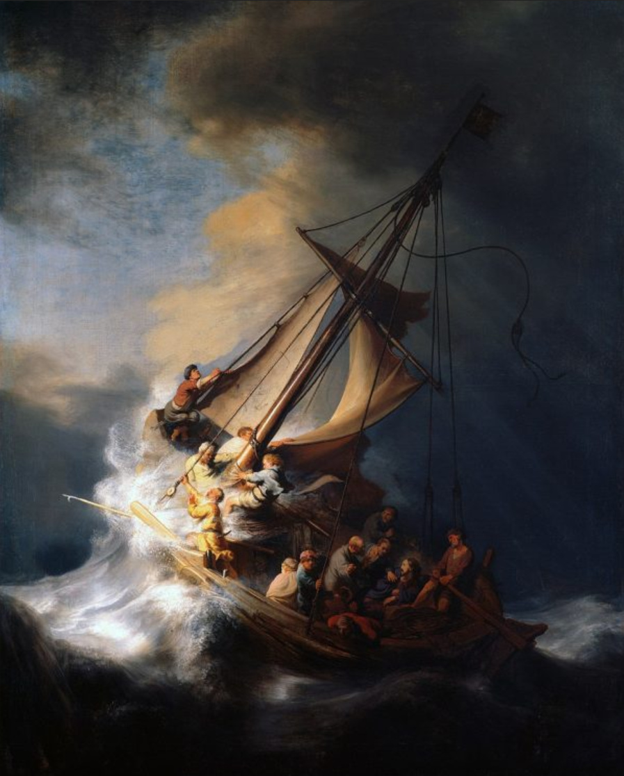
This painting is Rembrandt’s Christ in the Storm on the Sea of Galilee and it has excellent composition.
First: the focus. A combination of the light, the direction of the hull, and the mast are three points that lead your eyes downwards and to the right of the painting, which intentionally focuses on Jesus sleeping (my red triangle almost covers his face, sorry). In the other direction, the same aspects plus the yard (that horizontal piece of wood on the mast) moves your eyes upward, towards the parting sky, and assert the disciples salvation. On another note, the mast also doubles as imagery of a cross.
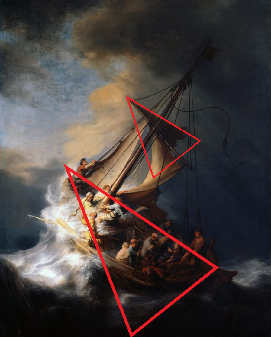
Second: the movement. The two primary leading lines are the mast, which brings your eyes downward, and the light, which move your eyes the lower, right-hand corner, exactly where Jesus is laying. Some smaller leading lines are the fishing spear and the part protruding from the mast (not sure what that’s called in boat terminology…). Another principle used in conjunction is the golden triangle, which tell us to putt the main action in just one of the triangles. As you can see here, it’s the lower right-hand triangle.
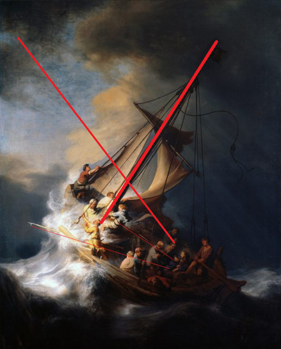
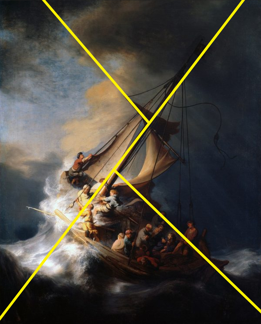
Third: the balance. This painting is balanced and asymmetrical. If we take the mast as being the line of symmetry, a much greater part of the boat falls to the right of that line than does to the left. This emphasizes the roughness of the waves and the upheaval of the boat. Further, it gives the idea of movement and a rapidly changing, tumultuous sea. Even if he didn’t use a gif to show the action, you can still feel the waves in a static image, right?
Fourth, also take note of the use of complimentary colors in the sky. Complimentary colors are peaceful and illustrate salvation. On the other hand, the more monochromatic colors at the base of the image are used to exacerbate the fear, loss, doubt, and hopelessness of the situation. Also take note of the lighting: the godrays, the contrasts, and the emphasis of dark vs. light.
As you can see, I’ve repeated myself several times. This is because these pieces work in conjunction and usually cannot work alone (I say usually because there is probably some exception). I also want to emphasize that you will not be able to achieve this near perfection in your next blender work. Rembrandt was 27 when he painted this and had been painting for 13 years. So it’s not going to happen soon … but next time you do a mid-section challenge try to focus on just one aspect of composition – color, balance, focus, etc. – and improve that.
By the way, this painting was stolen in the infamous robbery of the Isabella Stewart Gardner Museum (in Boston, Massachusetts, USA) and has never been found.
A video
This is a good explanation on the use of composition in a piece of art. I highly recommend it as food for thought for your next oeuvre.
A note
Blender is such a complex and technical tool that many people can often forget that you’re working with an artistic medium; therefore, to make something look good you need a combination of skill and art theory. Both can be acquired through practice, but learning the latter can be accompanied with videos, reading, etc. about the subject.
Hope this helps (sorry for the wall of text)
-Enrico
3 Likes
Thank you so much. You have been very clear. I will try to make some changes and I will pay attention to what you have told me also for my future works.