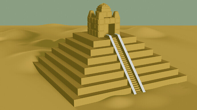
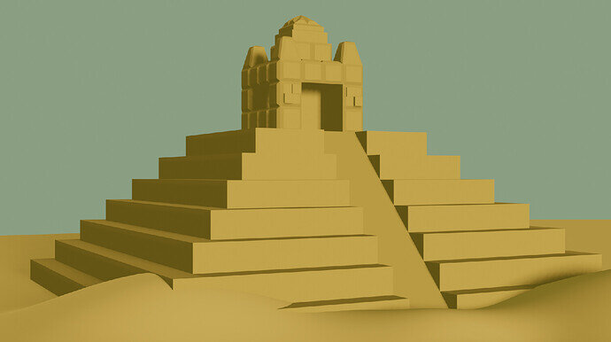
Here’s my result for the final challenge. I’ll admit, the back might not be its most flattering angle 
5 Likes
Very nice pyramid. I’ll admit though, the coloring is throwing me off. It feels very flat but in an almost cartoon way? Maybe make the pyramid texture/color ever so slightly different from the environment?
2 Likes
I like the second view.
The first one is more bird-view like.
1 Like
I agree with @FoolishJester. A fine pyramid, but some color variation would make it more interesting to look at. ALso, nice job implementing the sand dunes 


