I see how we can do min size and preferred size and flexible size with all the stuff we’ve learned. But how about max size?
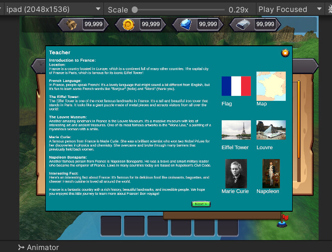
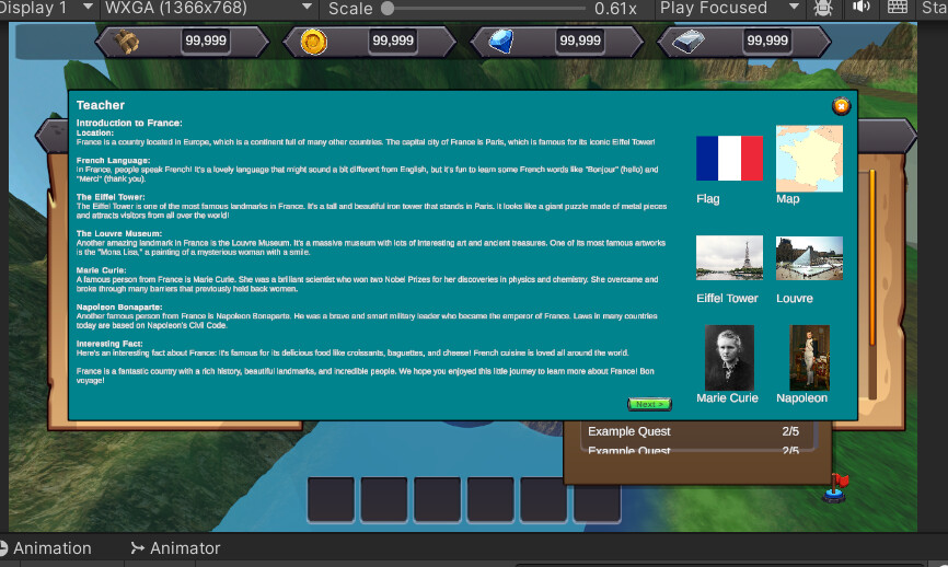
My situation is that I will have very extensive dialogues (My game is educational in nature). On an ipad with a 4:3 aspect ratio I set narrow left and right margins (e.g. 180 pixels relative to Canvas using “top stretch”) to make the text format nicely. iPad Mini is the target device I am optimizing for but there are many tablets with wider screens. It looks silly if it’s on a WQHD (2560x1440) or wider screen. So with a wider screen, I want wider margins.
The canvas the Dialogue object object sits under has a 2048x1536 reference resolution (ipad mini 5) with screen match mode set to expand.
I guess I could always write a script to change the margins on the dialogue game object in response to changing aspect ratios. But it feels like there’s a solution I’m not thinking of.
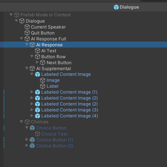
I think I figured out the answer. I’m using the preferred size to represent the max size and a content size fitter outside everything where horizontal and vertical fit is set to preferred size.
This also allows me to enable and disable the “AI Supplemental” object when it’s not relevant to the dialogue and still have everything render nicely.
If anyone has a smarter idea let me know or I’ll resolve it with this solution.
That’s pretty much what I came up with as well. It’s ironic, I just replied to a student who wanted auto splitting of 300 word Dialogues (which I don’t have an immediate solution at all!) and my response was I’ll try, but shorten your dialogues if possible, due to user retention. 300 words is a LOT (1/2 a page printed, little over a minute for high school reader to read) for a game dialogue node. Most folks tend to script when an individual line of dialogue gets that long…
Here you are showing me a corner case to that logic, a tutoring app. Well done!
I do want to point out that both UI you posted look excellent. Mobile apps are notoriously hard to design for, because while the Device Simulator has a dozen or so layouts, for every physical device that exists, there is another device layout you cannot prepare for.
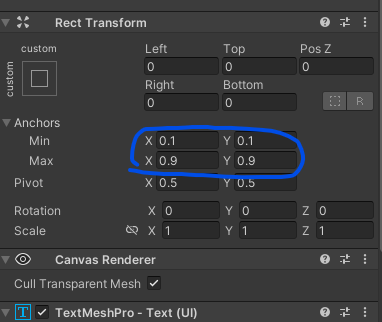
The best you can do is to use your anchors well and try your best to use percentages instead of absolute value… for example, if you want a margin of 10% around the device edges, rather than expanding to the full screen and choosing pixel based values in the Rect Transforms Top, Bottom,Left, Right, set your anchors for .1, .9, .1, .9 (see photo)
Thank you! Also, in later versions I intend to make that UI a little more interactive. i.e. The images on the right hand pane will be buttons and can re-render the content on the left to more narrowly scoped. I’m trying to make my app as interactive as possible to make it fun and engaging. And it will play just like an RPG too, except with a cute theme.
My trick is to try the extremes. (4:3 or 1.3333) and (21:9 or 2.3333) and make sure it looks good and also make sure it looks OK on lower pixel densities too (e.g. 1366 x 768). Finally I test for performance on a lower end device (ipad mini 5 is now 4+ years old). I’m not an engineer, not a designer but my background is otherwise in tech so I have a few basic tricks.
Oh I completely forgot this other way to use the values. Thanks. I will have to play with that.