Math - Interquartile Range

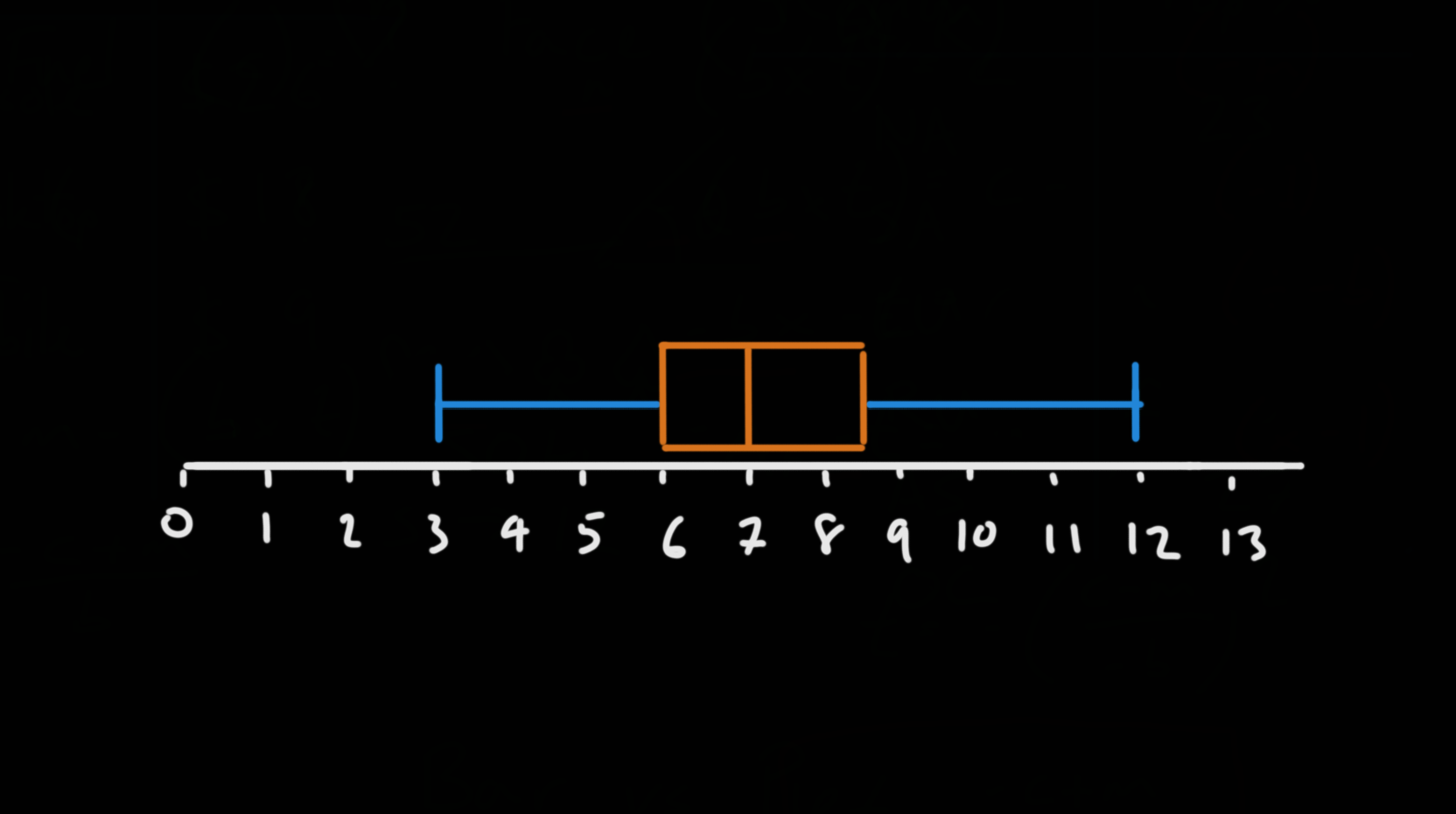
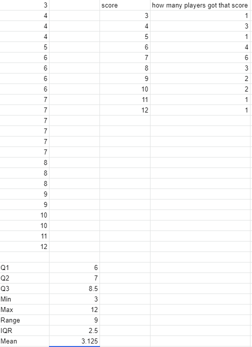
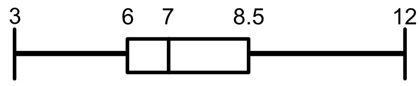
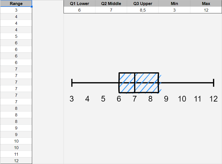
In this lecture we started to analyze the spread and variability of our data by looking at the range and interquartile range.
We were also introduced to two new charts - the histogram and the boxplot.

For your challenge, you asked to draw the boxplot for the dataset:
{6, 7, 9, 8, 7, 6, 3, 8, 7, 6,7 5, 6, 10, 7, 8, 10, 9, 4, 11, 4, 12, 4, 7}

Here is the answer so that you can check it against your own.

Min: 3
Max: 12
Q1: 6
Q2: 7
Q3: 8.5

The dataset has a very slight positive skew.
The interquartile range has a very slight positive skew.

Here is my response to the challenge, with a little help from Excel.

1 Like

[spoiler]

[/spoiler]

1 Like

Here is my attempt, I sorted the array beforehand, calculated the interquartile values that are 6, 7 and 8.5 and whiskers should be 3 and 12

This is the graphic representation

---------X---------[----|-----]------------X
–1--2–3--4–5--6–7--8–9--10-11-12

1 Like

Privacy & Terms