Hey everyone,
I’m taking the course for blender, I’ve found out about this course from a YouTube channel and I liked it and the community it provides.
I know it’s part of the course and I guess I haven’t reached that part yet but, I’ve been playing lots with blender and also followed other tutorials on YouTube but for some reason I can’t seem to understand the realizem part of meterials.
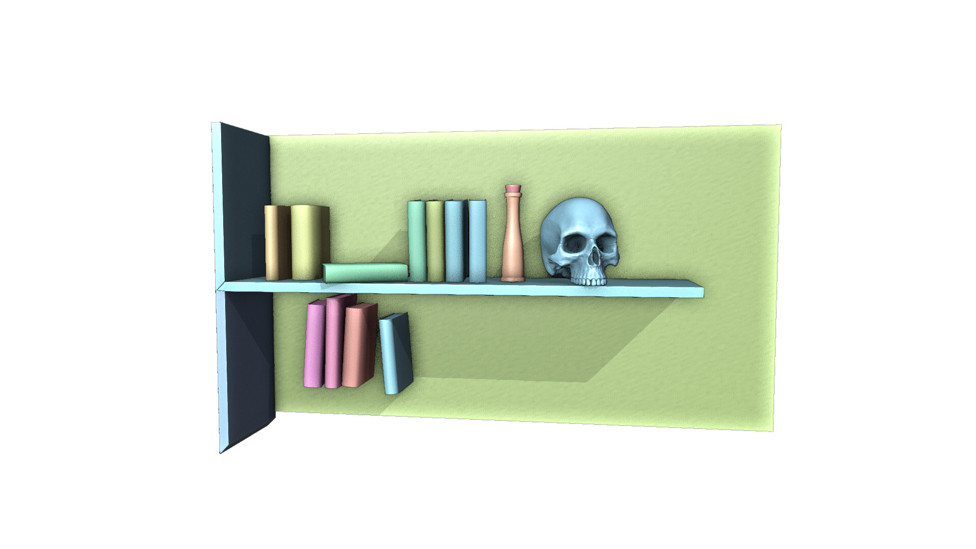
For example, if you’ll check out this week collab (Books) you can see that one of them looks very real, what I don’t understand is, do I need to create nodes for each element that I want to look more real? Including displacements and such? How do I know which path to choose?
I mean. I could use vornoy texture or noise to add some details but it doesn’t seem to make the end render looking much better…
Would love if anyone could refer me to a specific video with more information or if you guys could add some helpful insights you have, it would be cool
Realism is hard. And it starts with the mesh. Some of the mesh can be manipulated by hand (mouse drag and drop vertices, edges, faces. How far this kind of detail goes, depends on the subject and how it is used. Like zooming on a brick wall. First, you see the bricks then you only see the grains of sand in those bricks. What to model …? it depends on the usage.
Materials are an easy way to manipulate the texture of an object. Adding tiny details to the surface. But also here it depends on the zoom factor. Like an image in Photoshop, GIMP. If you zoom in you start to see the pixels. And don’t forget the bit depth of a color pixel 9256, 16k color, etc)
So mesh details and photo textures sizes do matter for realism. Where the optimum lies for advertisement, games, os movies depends hugely. Experience (practice) is a factor.
The way of a 3D package, like Blender, render the end results depends on many material properties. So you need to know the properties of the real material. Like glass, what is the light breaking index, for example, or the translucency of human skin?
Many of these material properties are numbers that can be translated into colors in a bitmap.
Most people will use a diffuse map (color) and a normal map(simulate bumps). But Blender can use and produce many more maps, like roughness, cavity, z-depth …
Als kinds of information, store in bitmaps to manipulate the material.
But bitmaps have a problem, they need to be repeated. Tiled and those tiles need to fit seamlessly.
While procedural textures are mathematical generated and infinitive. But designing a material using those mathematical functions, is a course on its own. Personally I like to do this, but my machine is to slow to do complex procedural textures.
But basically, you do the following.
Plan your scene and composition and stick to it.
Create the mesh in such details, which can not be solved by materials only (you need to get experience in this)
Unwrap your model to a flat 2D surface. Creating the needed UV-Map
Load your exported UV-Map in GIMP, Photoshop. Copy photo illustration onto the uv-map. This will be your DIFFUSE (color) map.
Make, extract different material maps; like which part of the uv-map is shiny or not (greyscale). Where are bumps (greyscale heightmap > Normal map), mesh displacement maps (greyscale), etc. Many maps are possible. Many students are using Substance 3D Painter. Which is just Photoshop, but with very smart image layer manipulations. It will create a lot of map types for you.
You can also go to material libraries and download a map set, like bricks.
Combined all those maps in Blender material. And test and tweak.
Assign materials to objects.
adjust lighting, tweak composition.
render image
In de Blender post compositor. Manipulate the rendered image (this is something you can do in Photoshop too). Color balance, blur, etc.
So maybe @Digitz can explain what kind of techniques he uses to create his entry.
To get more experience in this, start small. Like download a brick set. Use diffuse and height (normal map), if ok (you understand the procedure) Then the next step is to add a displacement map. Displacement works on vertices. So you need to create many more vertices to let a displacement map work.
It does the same as a heightmap. But gives better results at a cost of too many vertices to handle.
In the Orc character course, you will learn to turn a high-resolution mesh into bitmaps, to be used on a low poly Orc. Giving nearly the same visual results.
It depends on how you use the Vonoroi output! sometimes the effect you want is only visible in a small gray range. Trail and error here.
For every input node of your PBR-shader you can create an image and or procedural solution. Both take a lot of work and experience. Adobe substance painter does a lot of work for you. But most people don’t know what substance really does. It is very handy because it comes with all sorts of material properties out of the box. Just paint rust and all rust properties are created (diffuse, height, glossy maps and more).
Hey @FedPete,
First of all, Thanks for a detailed reply, this really helps clear things out…
Of course practice makes perfection, I’m just trying to make sure I’m on the right path.
Secondly, I chose blender also because of the expanse impact, I’m doing 3d as a hobby and not really planning on gaining a job in this field. so all those Adobe software (such as substance painter) are kinda pricy aren’t they?
I will try and think of a scene and run through your checklist and share the results
Free for students, to drag you into their product portfolio.
While Substance painter is a time saver. All things can be done with GIMP or Krita.
I even prefer this, because it gives you knowledge about the basics of 3D and material design.
For GIMP there is a plugin, to turn a grayscale image into a normal map.
Krita can do this too. I use it to make textures like a Philips screw. Or hatches, etc.
In GIMP I create a background of grey (50% black).
Draw with black and white pencils details (lines, bumps, etc.)
Then convert this greyscale bitmap into a Normal map (purple color (red, blue, green).
And import it as a normal map in the Blender shader.
This way you can create details that make the render (books) more real.
But other routes are also possible.
It takes a lot of time and practice, but I think there are four keys to realism, after modeling. The materials, lighting, camera and subtle details. I take a lot of time to find free textures that are under the creative commons license (cc0) or create the textures from my own photographs.
Realism isn’t always about making it look perfect, more about making it look believable. The subtle details, you may not directly notice, but your mind still picks up.
Blender can take the place of Substance Painter, but it’s not as straight forward since there are so many different ways to get the same or similar results. I use texture painting in Blender, mostly to paint masks (just black and white images) to determine where materials will be displayed on a single object, like edge wear.
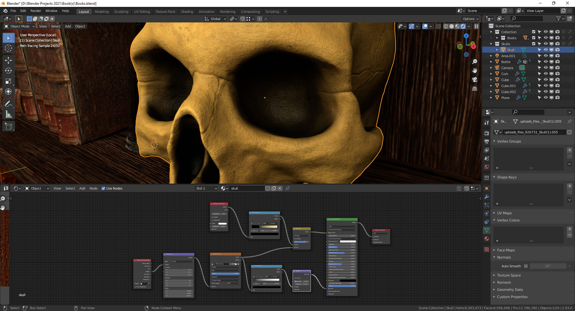
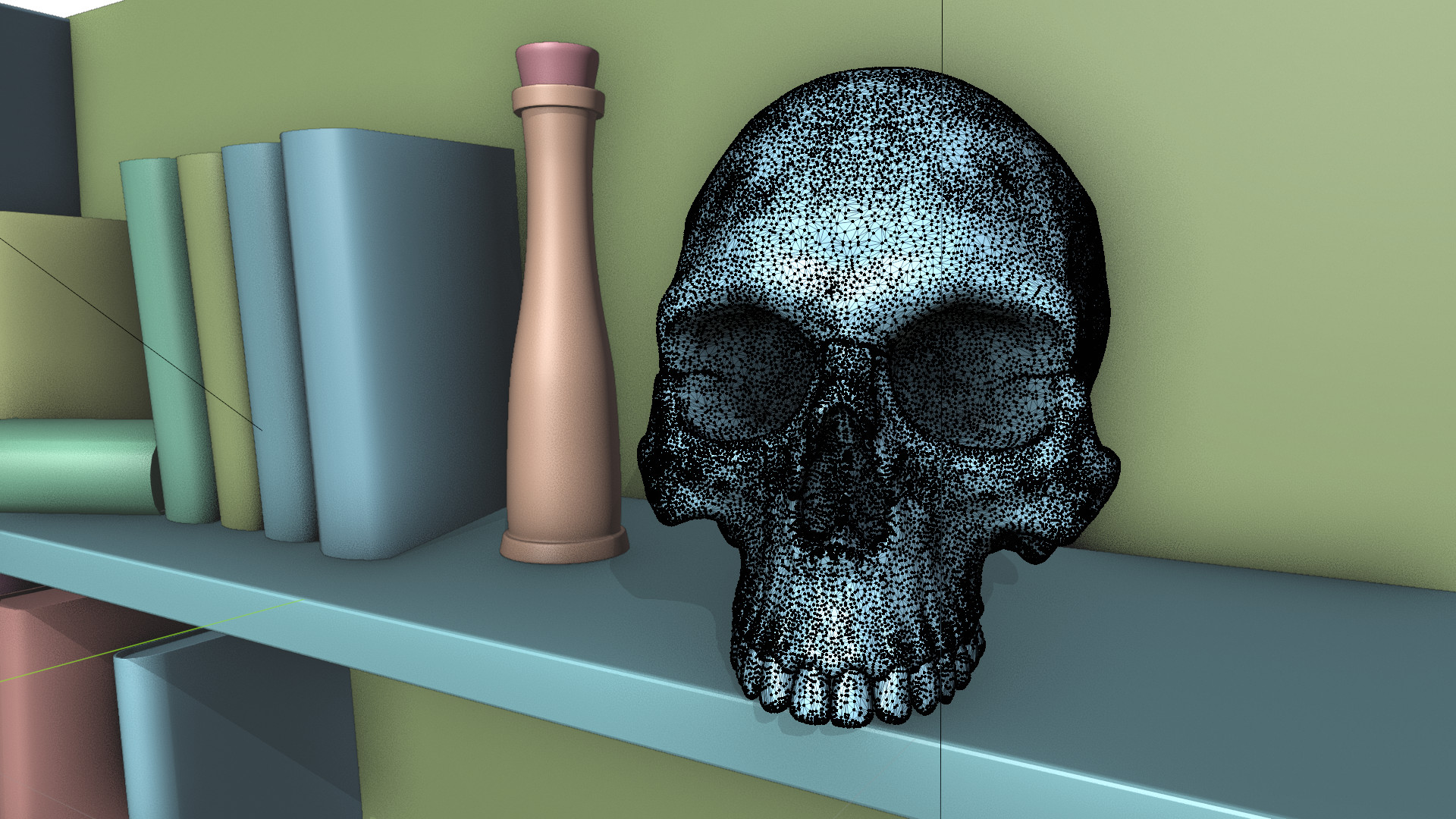
Situationally, like the skull in the books scene, using a UV workflow isn’t always the most effective method for complex objects like that. It’s a very dense mesh so I passed the Ambient Occlusion through a ColorRamp mixed with a seamless texture for the color and just the seamless texture turned greyscale through a different ColorRamp into the Normal through a bump node.
The real key to this one was using the Object output of the Texture Coordinate and switching the image from Flat to Box and increasing the blend to something really high. I decided to not re-topologize or go with a lower poly version of the skull since this was an up close scene.
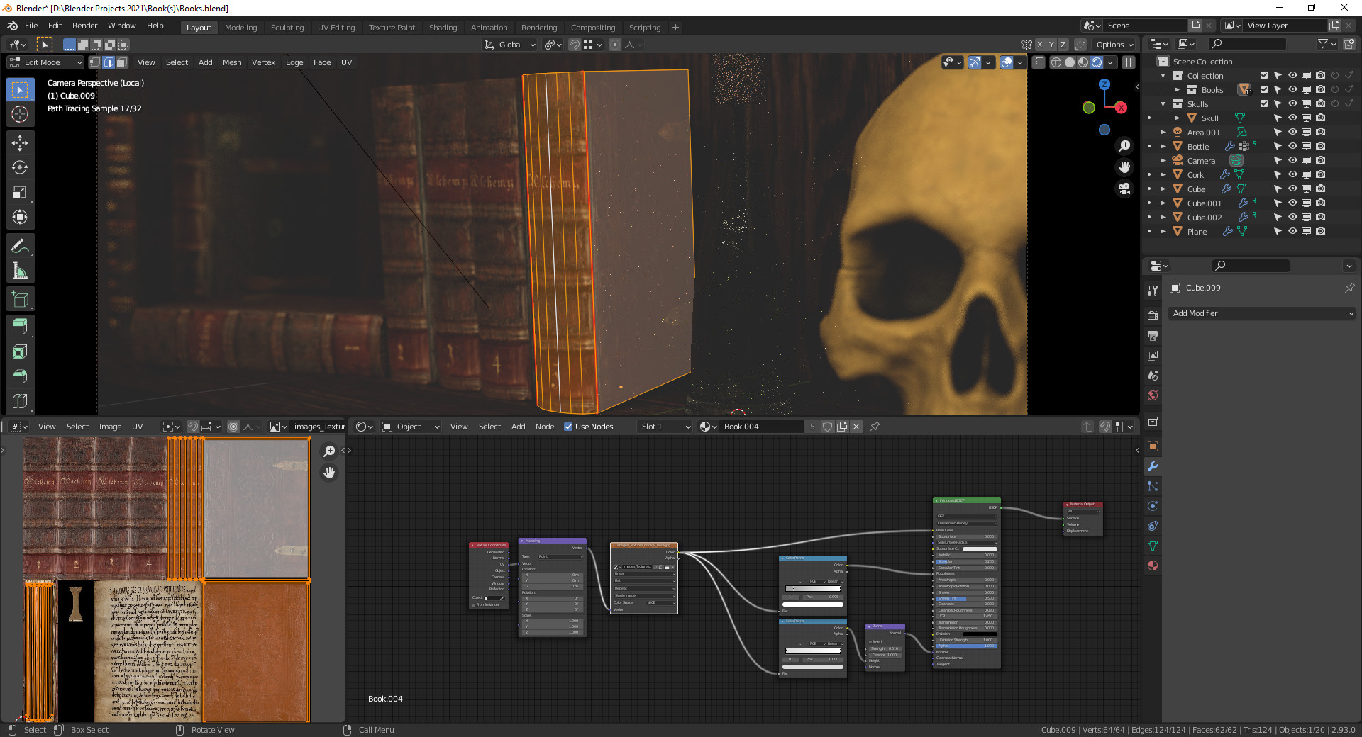
The books are simple shapes with a photoreal image texture. I passed it through a ColorRamp for the Roughness and Normal and I did use UVs since they are just a modified cube and it was really easy to unwrap them. Balancing the Secularity and Roughness goes a very long way for making things appear realistic and can take a lot of time to get just right.
The wood for the book shelf is a material set of images I got from polyhaven.com.
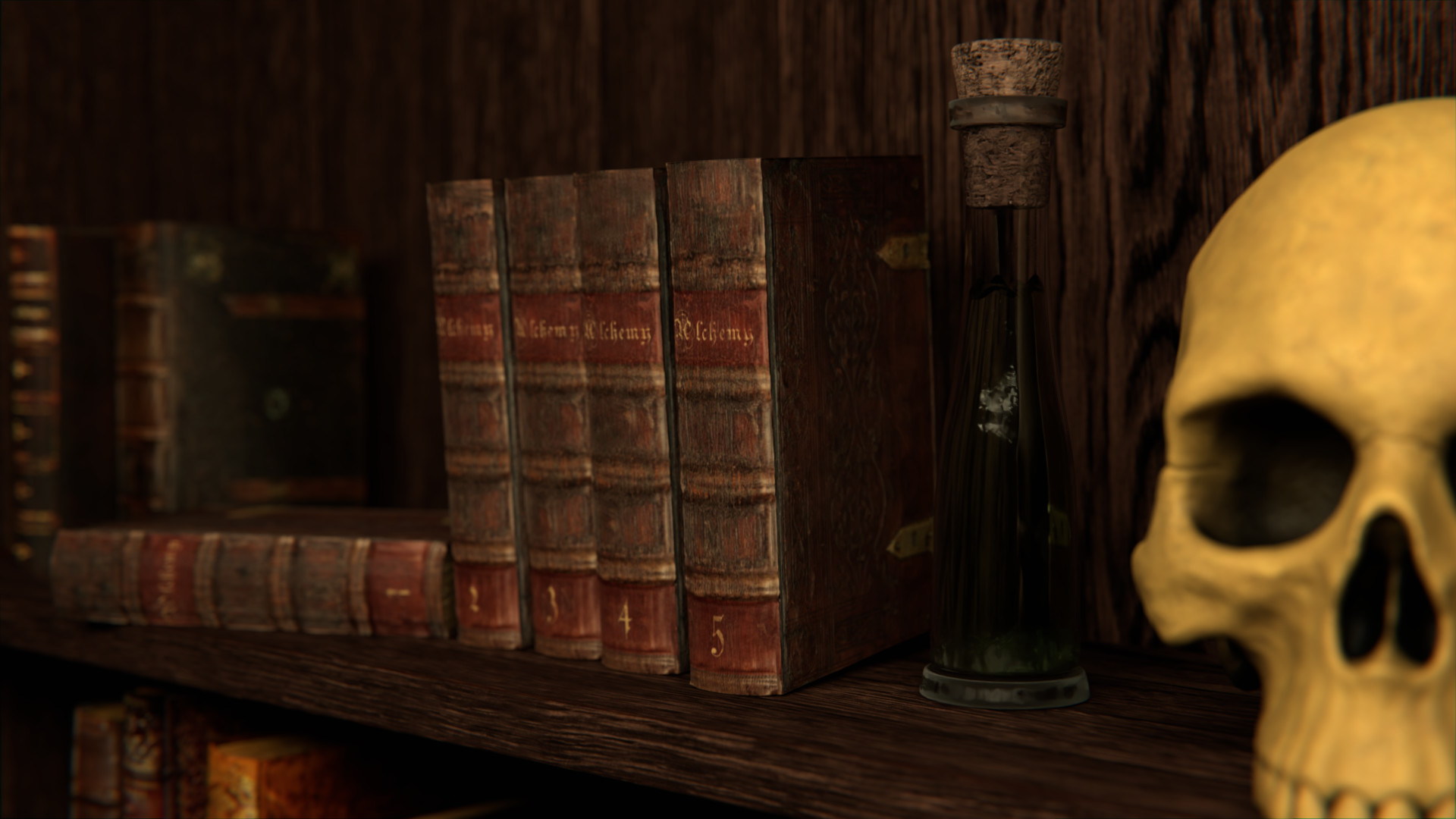
The lighting in this scene is just a single Area light. Again, lighting is one of the keys to unlocking a photoreal setting since that’s what really brings out the details though highlights and shadows.
Lastly, to bring the scene together in Blender, I worked with the Camera, just the Depth of Field Distance and the F-Stop. The camera and light settings I think took me the longest to get familiar with and learn about when making things look more realistic.
After rendering, I Denoised and used a Lens Distortion (again, an extremely low amount of distortion). Part of the subtle, but mentally noticeable things to add to the realism of the final image. Lens Distortion adds some chromatic aberration which slightly distorts the colors along the edges of objects.
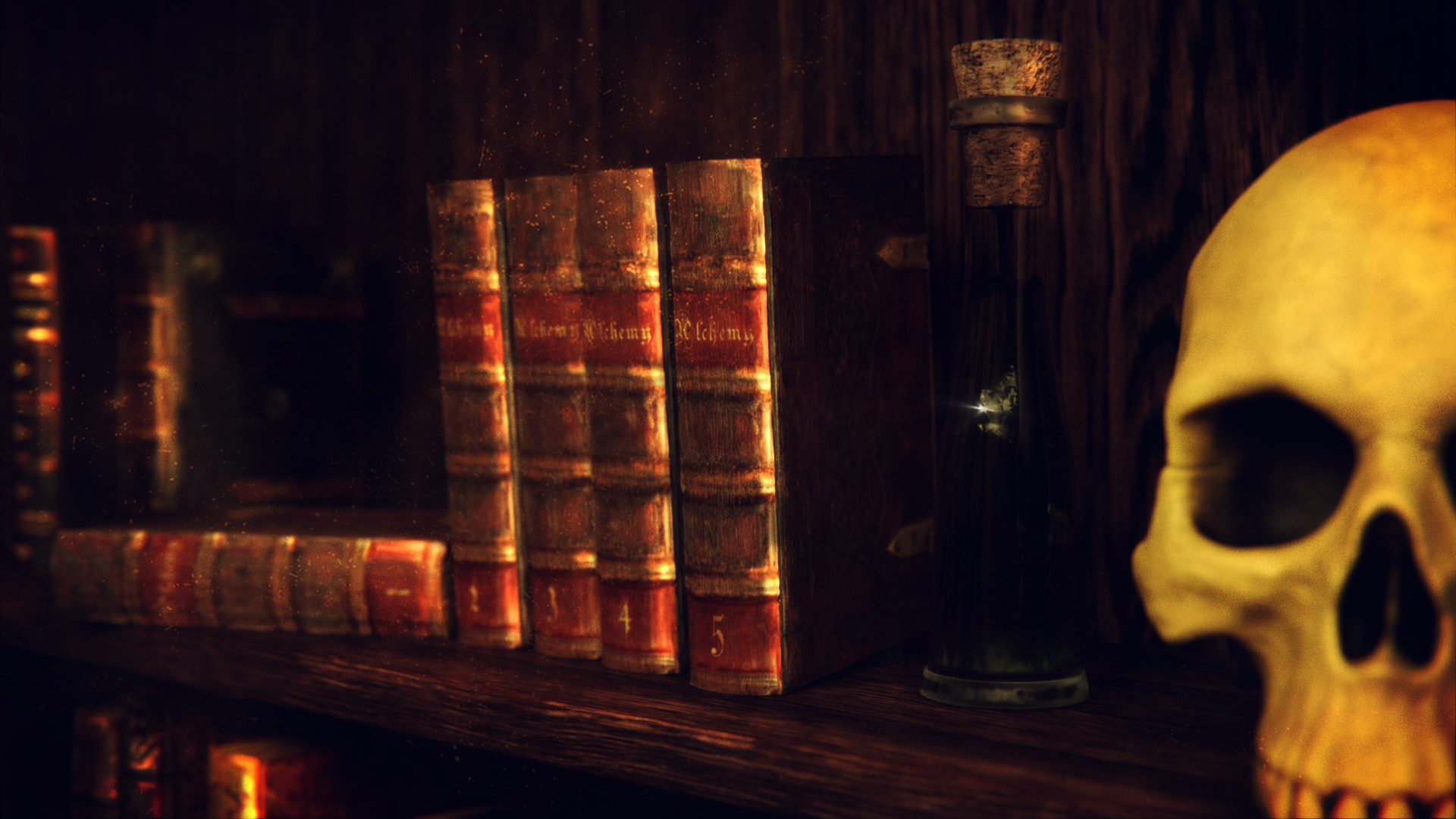
After that I took the image into Krita, it’s basically a lot of Overlay and Addition layers to enhance the highlights and shadows, add some dust, film grain and vignette I will show the raw image that rendered out of Blender and then the final after the post processing.
Wow man, kudos to this detailed explanation, this really helps me to better understand the workflow of of making and modeling 3D.
It’s cool to understand that the books are simply a cube with no extra mesh touches and it’s “material based” vs the skull which gotten much more work with the mesh. would love to see a “Raw” object view mode of that.
Couldn’t help but peep into the stats at the bottom of the screenshot, 6M verts is a lot.
Doesn’t it lag the substance painter within blender?
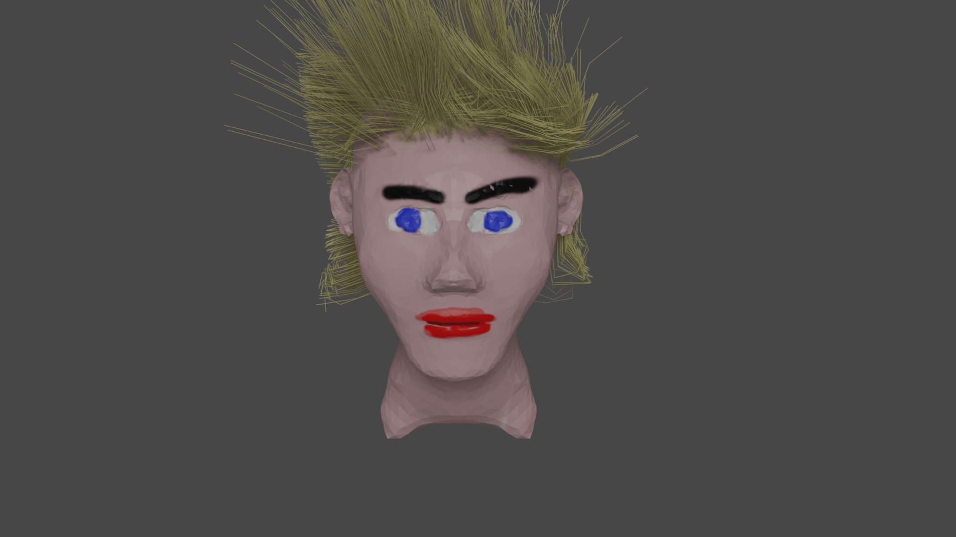
I’ve tried (with no luck yet) to sculpt a face and gotten only as far as aliens
Keep working at the sculpting, you’ll get better with time and practice for sure.
As far as the vert count, it doesn’t really slow things down until I get around the 14 million mark. Seems like it might have bugged when I had it open that time because the scene actually only has about 1.5 million verts.
Here are the solid view of the scene and edit view of the skull. After the sculpt, I used a remesh, then decimate to make it a less dense mesh. Still pretty hefty though.
For a second it looked to me like ants were crawling on that skull…
Awesome work man, I can see how some meshes really need that extra attention to get the proper detail
Really, I could have taken the time to bake the details into materials to use on a lower poly mesh, but I decided not to do that in this scene. It’s all preference too, I could have added more detail and some displacement to the books if I wanted to make them higher poly objects.
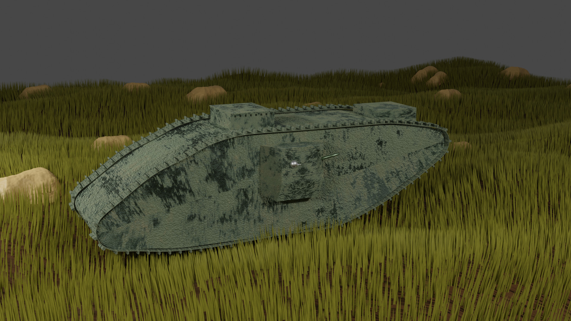
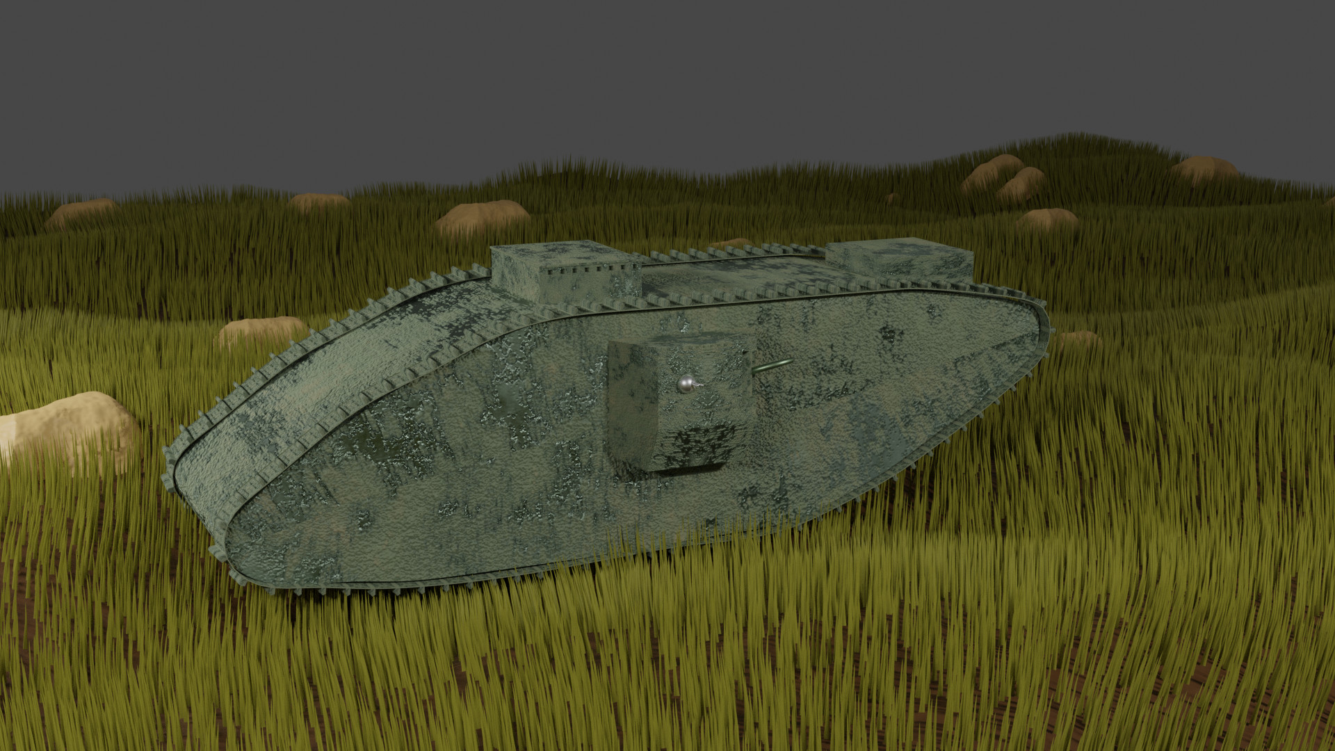
So, Here’s something I’ve tried to create that is with some sense of realism.
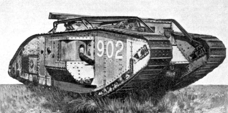
I played battlefield and saw a cool tank from ww1 and thought to myself, let’s try and render that.
This is still a WIP, but I’d love to hear your opinions
It’s a fine version of the tank. You just need to get through the course further learning more controls and techniques. Finding or making good textures can make a world of difference too. Currently, your tank seems covered in moss. There are much better ways of making grass too. Not hard but you need to have learnt how.
Thanks for the feedback,
I’m continuing on the course but I also try things on my own to sharpen my skills
The grass is somewhat lazy particle system because I’ve wanted some perspective for the ground and surrounding area
And about the moss, Yeah, I’ve tried a few approaches to make it look more rusty, will share more as I progress