Hello everyone!
I’m here with a small test on how to make your pixel art look even better in Unity in very easy steps.
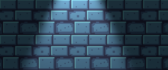
Here’s a simple brick wall:

As you can see, it doesn’t look particularly bad, but it doesn’t look professional, it’s missing something, even tho the wall interacts with the light properly, the light is not interacting with the bricks at all, it’s just there to reveal the wall, making it look quite simplistic.
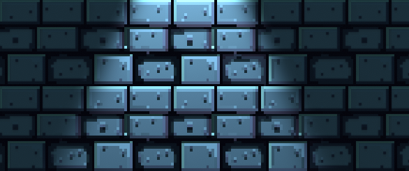
To make the light interact with the bricks properly you’ll need to create a normal map for the texture and an occlusion map, which are fairly simple to create, just import your texture to any image editor software like photoshop or, gimp, both have filters to create those sort of maps with the press of a button. Here’s the difference:

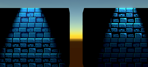
As you can see, the improvement is huge, but that’s not all you can do, if you add some post-processing effects the look improves dramatically, here’s a side to side comparison of both the pixel art texture without any maps, and with normal and occlusion maps.
As you can see, there’s not just an improvement in color and lights, making it look more 3 dimensional, even if it isn’t, but also on other effects like bloom, you can barely see it in the left wall, but it is quite noticeable in the top right wall.
Adding normal maps and occlusion maps can take your pixel art to the next level, try it out in your next project!


 )
)