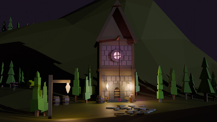
Hello, I wanted to share the first project that I have made. It’s not perfect by any means, but I fell in love with the low poly look.
Maybe have some suggestions on what to fix or add? About the hot air balloon, I just thought it gave a little character to this wizard house. Haha
Also maybe could give some advice on lighting, struggling to make the right atmosphere.
Adding the balloon is just a way to improve the composition by introducing symmetry.
And maybe not everything needs to look low poly, like your balloon.
Activate smoothing on the balloon to lose the facet (industrial) look.
If you like you can add at certain places more details, like a water well, a bench, chickens … so much to do 
It’s a nice, detailed project. Well done!
But there is more to learn, hop on to the next challenge.
Very good scene.
Hot air balloons would have a different shape. Probably also bigger in relation to the basket to lift anything.
Lighting is fine night scenes are always tricky you have to have a reason there is any light! Th egeneral ‘moonlight’ seems about right.
It’s apparent right away that time and effort were put into this. The house looks clean, the stones are placed with care to avoid the duplicated look, you’ve got several different types of trees and other plantlife, and FedPete’s point about the balloon adding to the composition is quite accurate. Without the balloon, the image would’ve felt a little off, and you may have felt compelled to angle the camera down a little further or put a moon there or something.
If you haven’t already, check the very end of the beginner complete course; grant goes over the basics of 3-point lighting there and it may give you some ideas. That said, I’m with NP5; I don’t think you’re far off with this, because if you start adding too much ambient light to this scene, it will take away from the lighting contrast created by the lamp post and house (and your trees have a single shadow each, which is logical for an outdoor scene). Keep in mind that the absence of lighting is also lighting! You could maybe add a small flame under the balloon (assuming it’s not powered by magic), but I personally wouldn’t add much else to this one.
Great project!
Very nice composition and beautiful scene 
Regarding the light, I would try to soften the “external” light (be it moon or anything) because it “kills” the effect of the lights directly visible in the scene and competes a bit with them. Of course, you may find a night like this, but it’s not the usual  . You may even see that there is hardly need for it to have a good, convincing, cozy light (maybe another street light would do it? a few stars that self-explain your moon light?).
I think we all like to show all details that cost us so much effort, but don’t be afraid to try to make lighting a bit more selective. Lights also help to “paint” what you want people to look at.
Thank you, yes you gave me an idea about the stars! And I will definitely look into making the light a bit more selective : )
@NP5 @CoreyKnecht thank you all for the feedback! Firstly I will fix the ballons shape because I just googled it and … what is mine HAHA Also will add some more objects and maybe even animals ! Also will re-watch the course about the lights and crate my next project with more lights related : D
It’s a really nice scene.
Try to keep in mind which object is the protagonist of your scene and decide where to add more detail and create contrast around it so the viewer immediately focuses on it, because as it is right now, at least to me, the balloon fights for a lot of attention. I’m not a huge fan of symmetry because it leads to that sort of issue.
I loved the second picture, it really makes the wizard house shine. The hill in the back prevents the house from blurring with the purple sky, and it also creates this amazing contrast, the shadows’ direction also helps a lot with that. The only thing that I’m missing from the house is that it isn’t clear that it is a wizard house, the door and arch make it feel more like a tower outpost or something along those lines, but that’s probably just me.
I personally like the lighting in this scene. There is sufficient ambient light for a dusk or night scene. The lamps on post and front of the building are actually lighting [ light objects for Evee] the scene. They light a path to the front door which focuses attention well on the building.
I would certainly shade smooth the balloon however given it is low poly scene it can be a fantasy balloon with a large basket for balloon size. You have a bit of a spiral going there which looks good to me.
If you go into the camera object properties you can add composition guides to you viewport to help. Reading up on these in the manual [also wiki] would give you ideas for composition but I think you have done a good job naturally!
Thank you, I understand your point and I will try to make this wizard house more like a wizard’s house. Maybe I should even add a wizards to begin with haha
Oh wow, that could be very handy for me the composition guides. Thank you !!


