Low-Poly Mega Man

Working on a Low-Poly Mega Man for this week’s collab challenge. Check it out, it’s open for everybody!

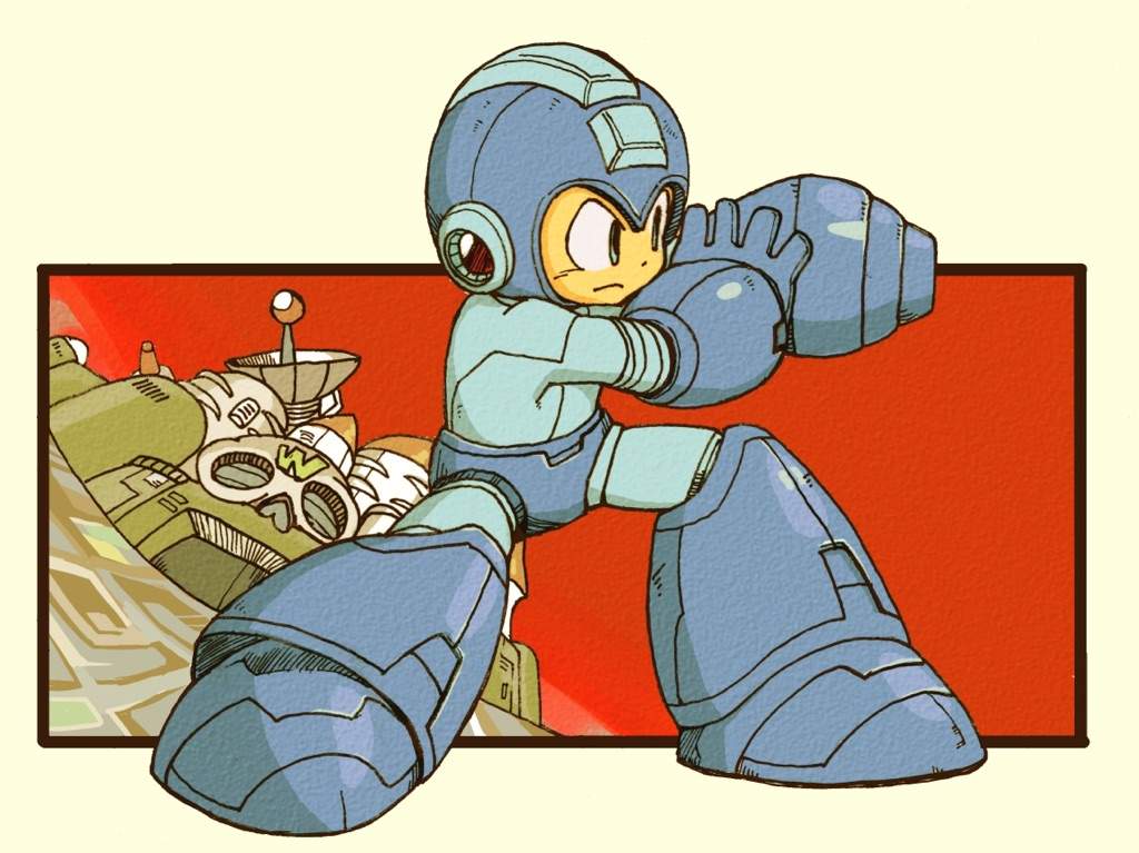
Reference Image:

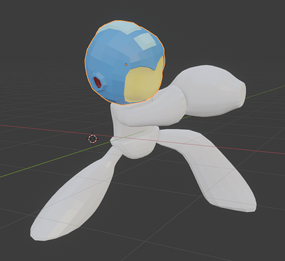
Progress Pic:

Got it blocked out and made a basic head. Going to work on the other body parts one by one. Probably do the arm cannon (M-Buster?) next.

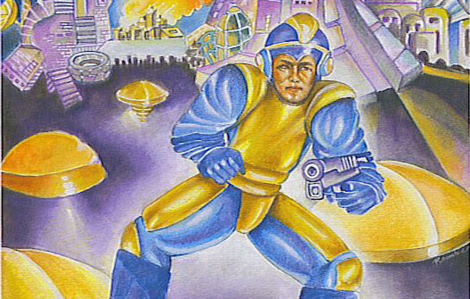
Bonus: Box art for the first Mega Man game:
mmbanner

LOL kinda goofy, but cool style! It was just a dude with a gun! :rofl:

6 Likes

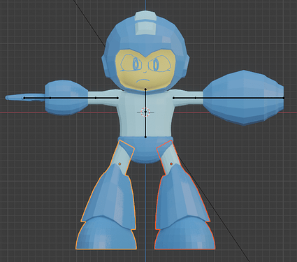
I decided to make him in a neutral pose, then pose him with an armature. Then later I can make him a full character if I want.

Here he is with body parts complete, and partial armature.

3 Likes

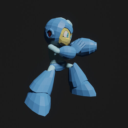
Finished Armature, texture painted a simple face, and made the action pose like in the reference.

2 Likes

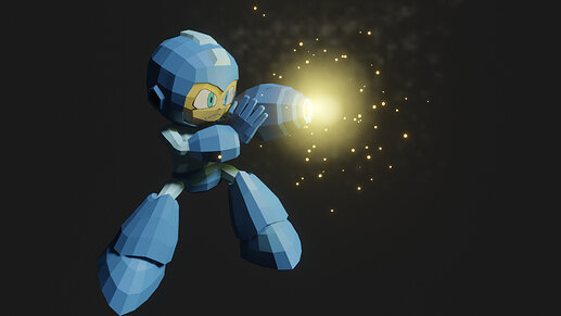
Power it up!

2 Likes

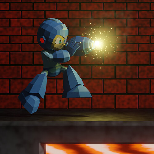
Final Result

Though it feels more like a stopping point than a finished product. As I said in the collab thread, low poly was fun, but challenging. At some points, I wasn’t sure how to proceed to make it look better.

If I were to work on it more, I think I’d add the segmentation lines on his clothes/armor. Normally I’d do those with a bump map, but I’m not sure what’s the best way to do that with low poly.

It was fun to try something new, and it definitely piqued my interest to try some more low poly in the future. Just not sure if I want to dive into that now or at a later time.

Any suggestions or other feedback is welcome as always. Any tips or ideas about this or low poly in general?

@Ethan_Martinez @Jaco_Pretorius

4 Likes

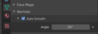
Found that auto-smoothing the normals created a nice faux-toon-shader effect in my low-poly models. Play with the Angle parameter to try different effects:
image
Megaman seems to be floating in the air… maybe make his pose a more obvious jump or leap?

1 Like

Depends on what sort of style your going for, I personally go for the bright, cartoonish low poly style, I recommend watching Polygon Runway to learn how to do this style. As for how to increase the segments, I have no idea :sweat_smile:

1 Like

Thanks for the feedback, @Ethan_Martinez and @Jaco_Pretorius.

I’ll have to try that!

Yeah I was struggling a bit with the pose. The original pose is based on the reference image. Then I tried to make him standing on the ground, but the way I had to rotate the feet legs made the silhouette a lot less dynamic, so I put him off the ground a little bit. Should be an easy tweak to make it a more obvious jump.

I’ll have to check that out.

For anybody who doesn’t know about it, come check out our weekly collaboration challenge! It’s time to vote for this week’s favorite. Anyone can vote, and anyone can join in next time!

2 Likes

I played with this. It seems to function identically to the Edge Split modifier, but I’m not sure.

Here it is with a Low Angle (about 26 degrees)

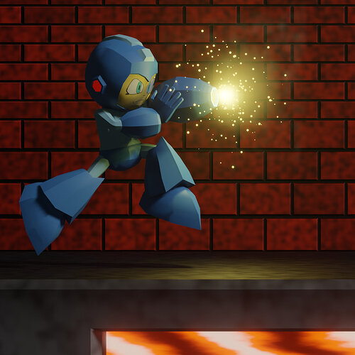
And here it is with a higher angle (Somewhere around 50 degrees)

I think I like the helmet and boots in the top image, but the arms and upper legs in the bottom image. There’s got to be away to apply it more selectively.

Both images also have a new pose. I tried to make it more of an obvious jump. I think it’s better, but still not perfect.

2 Likes

Edge-creases are used while calculating the auto-normals, so you can get some control from those.

1 Like

Privacy & Terms