Hi people!
I’m new to this community and actually to the Blender, will be glad to get some feedback:)
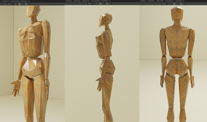
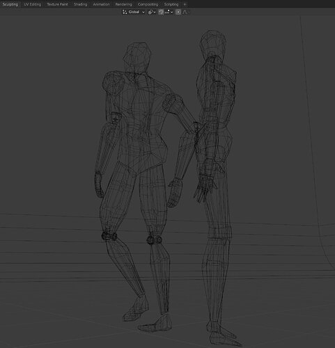
My low poly shape- was trying to make it simple, however, the human body is one of the complex forms. Still working on the joints, have in mind to make a series of low poly by gender and age:)
for now just the first one! Shape of blocks 1|690x407
Welcome to this site.
Just drag and drop images into the text entry box here, then they show up in the post.
If you are new to Blender and any other 3d modeling, then as you realise humans are very complex, not least as we are so used to what looks right without thinking about it. Until you need to model it! Really not the place to start when new. Follow through the course, learn up the tools it has to use. Topography is very important to human and animal modeling. You need to get loops right, and in the right places.
Although you probably never wanted to make the items the course directs you to, they do so in order that you discover the tools to model with. Humans are late in the course and just the head alone to learn the means. Actually the head is best in the older 2.7 version, 2.8 course relies only on sculpting.
Hi, thank you for advice and welcoming! My background from fashion industry so my passion to human body is really strong, couldn’t resist to try out this task:)
loops was really one of the time consuming parts
Thanks again!
Your artistic eye is evident. Seems to me you’re doing pretty well, so I’ll just congratulate you.
One thing that I find strange is the protruding “rib” (?) below the breasts, maybe it’s anatomically correct, but that bevel strikes me as odd.
Keep it up!
Hi, thank you for your comment and for " an artistic eye"! Yep, seems that some of the small details got a win over the whole shape, got lost in woods of details:)))
Thanks!
Hello people!
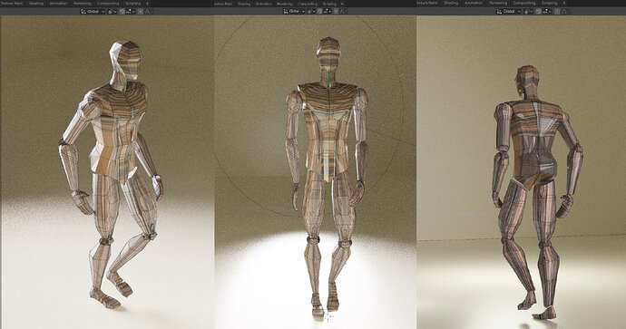
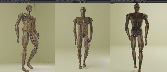
Here is my next step- a low poly body fellow.
Take a lot to figure out some of the muscle units, but the decision was made - several bodies, so work must go on.
I find this project on some stage not very productive in terms of awesome features of Blender, covering just part of modeling skills. But I change my mind during the process, actually, it’s a great exercise in understanding shape, volume, and plane( in my opinion:))
Here is what came out of it. All feedback welcome!
In the first row, I was trying to render the image scene, the second one is in the material preview mode. Still working on an understanding of the lights setups.
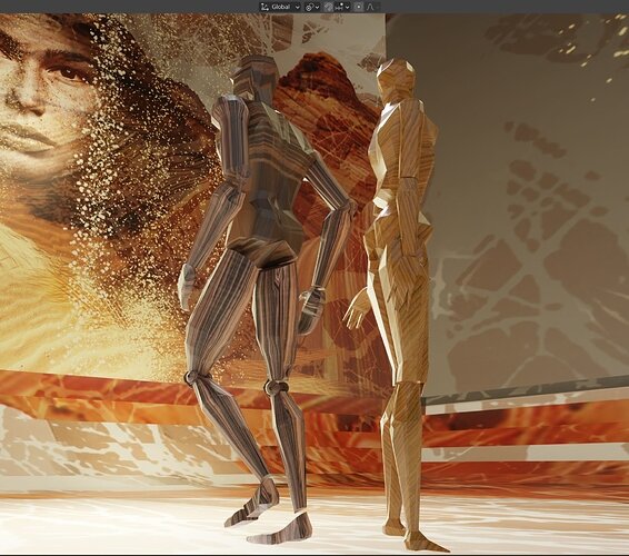
And in the end, I came up with an idea for the scene composition, take a look:)
Yes, many students start with Blender within their mind awesome designs. After the first lessons, they start working on that project in their mind. Understandable but leads to many questions up front!
But the toolset of a 3D-Artist, including Blender, is massive. But first, you need to understand the basics of 3D development. And yes, these courses are very very helpful in helping you get acquainted with Blender.
As I see your modelling work and the direction it takes. I can imagine you need more information. But the Blender basics still apply. But the next steps in the process are needed. So share your work. Some of us will guide you through it.
As I see your Blender work process, we call this block modelling. Building the basic shapes. The next step is sculpting applying features like muscles, facial expressions, etc. This is a tedious process. After that the rigging process. So you can pose and animate the model.
And then the tasks of lighting, texturing, clothing, animation … etc.
Most of these aspects will be explained but in a superficial manner. Meaning you know where to find these functions, but you need to study more to be really experienced in that matter.
Don’t give up! You showed us promising work. We can learn from you!
Hi FedPete, thank you for your inspiring words and support!
It’s really a true word that we get caught within our artistic vision and sometimes( mostly always:)), couldn’t move on to the next stage. And it leads to many questions up front and a desktop filled with images that will be never shown because of a lack of our satisfaction:(
I’ll keep working and sharing my work, thank you again!
Hi Natali!
I see you continue down the path of exploring 3D artistry with the lens of the human figure, and let me tell you, it’s a delight to stumble upon your posts on the subject.
Like @FedPete pointed out, we can learn from you, but also… we find a travel companion in you. So, thank you!
Now, speaking of the images you shared, I find them so pleasant to the eye, with the appealing quality of sketches done right that so often absorbs our aesthetic imagination.
On the only render you present, I think that there are some great moments on the subject to the right -the highlights look beautiful, but then, the one on the left suffers a bit, because light seems flat in comparison. You also created a really intricate and elaborated background that I think could benefit from depth of field or lighting adjustments that provide contrast with the subjects. Does this make sense to you? I hope so.
Thank you for sharing, looking forward to seeing more!
Hi Age401!
Thank you so much for your feedback, it meant a lot to me! Not only as a creative person but also as a human! I try to do something that will have some inner thoughts:) some meaning, if I dare? Through this journey( learning new stuff) I’m trying to coping with my own vector of life and put some more into it:)) and really glad that you and others find it eye-catching and pleasant, thank you!
About render I present, it makes a big sense to me. I was trying to set up three-point lighting in the scene, playing around with fill light was most challenging.
The fill light makes the scene alive, but the meaning was different- the accent was wrong I will say. It makes me change a camera view at the last second, to stick with the first idea, and because I already spent a ton of time on it I decided to give a shot. So the fill light becomes a key one, but I’m not decreasing the power of the actual one. The whole scene is placed inside of the cube and it could be that the power of all three lights needs to be decreased also, too many bouncing rays. I’ll try to do better in the next one:)
Looking forward to hearing from you and wishing all of us inspired and productive hours!
Thank you!
