I cont want to sound too harsh, sorry for that - I generally think you did good job and the effort was well worth it, as these objects could work very well for many nice scenes and games. But as you asked for feedback, here are some suggestions:
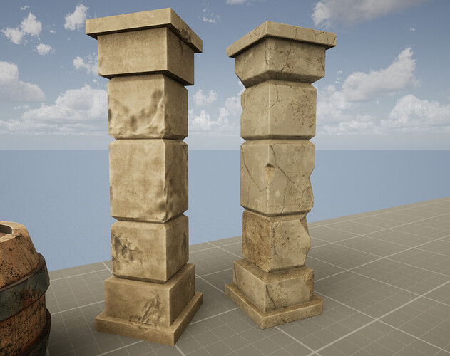
The problem I see here is that the damage is not 100% consistent with the object.
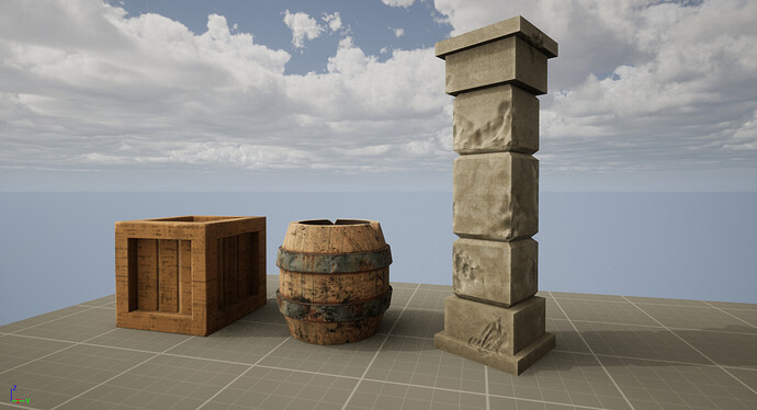
Lets take the pillar: it looks kinda like limestone, but in no circumstance I can imagine limestone to get damage like that. Well, I do - if it was treated with acid  Check out something like “ancient ruins” or “roman ruins” on Pinterest to see how stone looks after 2000 years and try to apply it to your pillar (its not easy). And normal maps - yes, probably a little too much, especially on the corners - edge nearly always shows the truth
  (TLDR: damage here is too soft, too liquidy so to say
  )
)
With the barrel - it is dirty as hell, corroded and splattered with oil all over the place, but the wood beneath it is pristine. You’d probably want to apply some wear to the edges, like they will get brighter and usually there is no corrosion on the edge itself. You have the most rust build up at the edges of metal rims - that’s not correct. There is also a little issue with how the planks are running up. (But I like this one to be fair, I feel it got the most love among other objects and it shows.)
The same goes for the crate, although I can see some wear on top of it on the edge, but I dont think its consistent along entire object. Also to be fair, that wood pattern is very strange  The frame looks as if it was cut from one monoblock of wood, but it should be made out of planks, right?
You generally need to think how the damage and corrosion was applied. Maybe you can also think about dust? How it settles on objects and what it causes. Giving all 3 different objects touch of the same dust (for example desert dust - its very characteristic strong, light color dust) might cause them to be more consistent between them.
What is probably a little strange, but I think good place to see how to damage objects is to lookup how modellers paint miniatures  On youtube there are hundreads of tutorials on “miniature painting weathering”, that might give nice insight. But well, this is a little far from 3D, so you might not be interested in that.
Problem with realistic assets is, that the closest you get to the realism, the more precise you need to be in details to keep the object believable. You also have to keep one level of precision along entire object, as for example if you have great looking rust on your barrel, anything a little less perfect will immediately pop out.


 Check out something like “ancient ruins” or “roman ruins” on Pinterest to see how stone looks after 2000 years and try to apply it to your pillar (its not easy). And normal maps - yes, probably a little too much, especially on the corners - edge nearly always shows the truth