
14 Likes
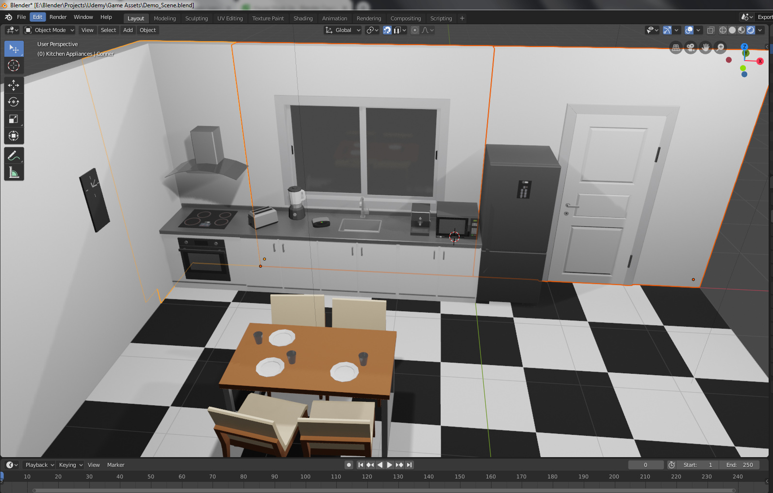
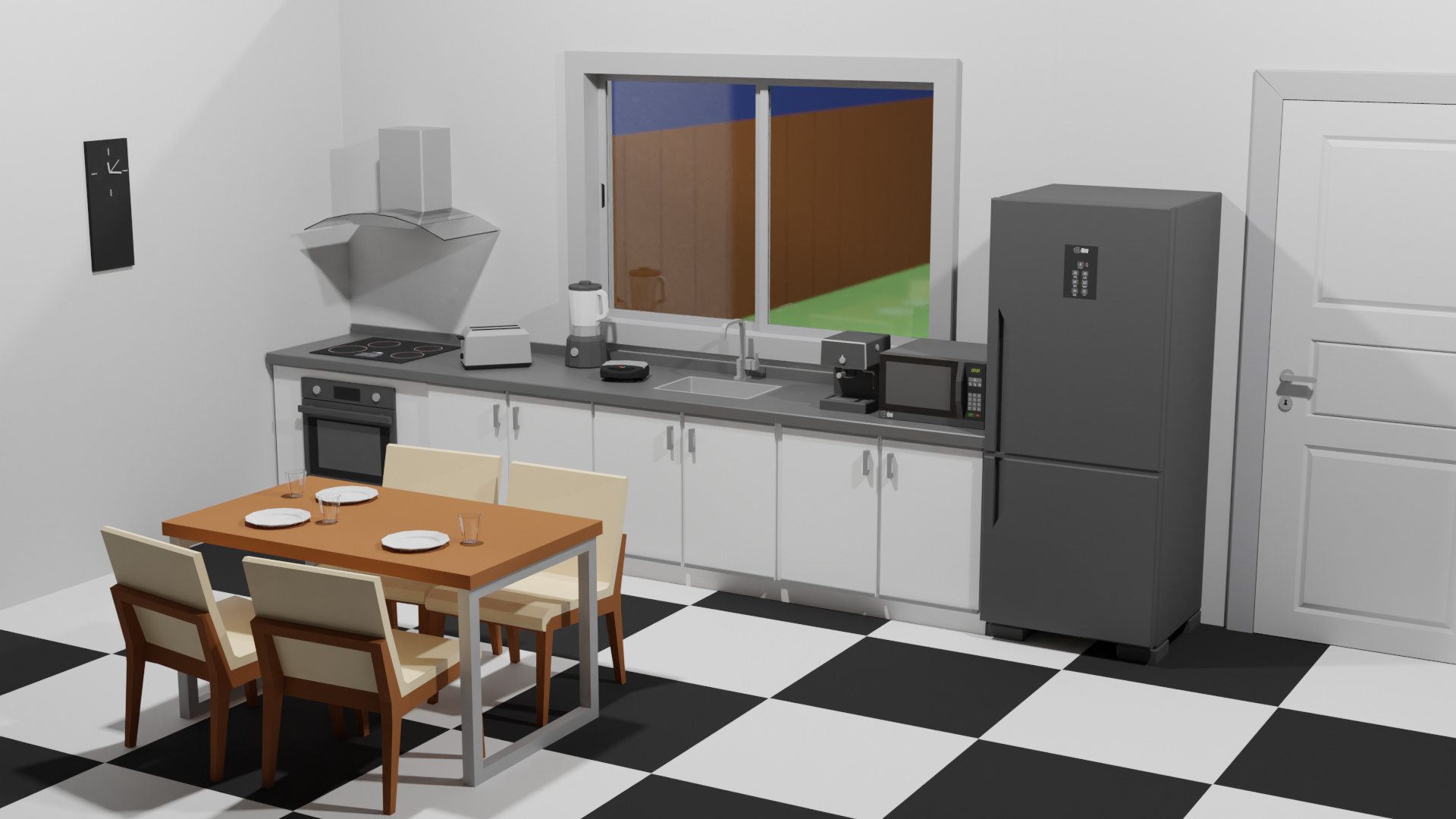
Very nicely done, especially all those nice props. My only suggestion is, maybe make the tiles on the floor about half their current size. In a real kitchen, those would be really huge. They look like each is about half the width of the table, which seems out of proportion to me.
Otherwise, I really like it. 
3 Likes
Yeah now that i see better they really look huge. xD thanks for showing me this. I will fix it. 
I am thinking of changing the floor completely in the future, but i still haven’t decided on how I’m going to do it. any suggestions? ^^
Well, the floor doesn’t necessarily have to have that type of “tile” pattern. You can always pick an overall pattern, and it can have, for instance, 2 or 3 shades of the same color, rather than such stark differences like white and black. There are sites out there that have downloadable textures for floors, so search for some, and see what comes up that you like.
1 Like
The window view is a bit dull and basic colors; blue, brow, green.
Maybe a image plane …?
Oh. I just created that background to fill the scene. I definitely will not use it in my final project, but it would really look better with an image. 
thanks. I will do some tests and I will share the results here as soon as I can. 
1 Like