Just realized there is something wrong with my canvas, need help

Hello all,

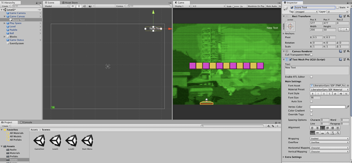
As I was adding in the Text Mesh Pro text to my Cnavas in the lesson I noticed that my Canvas appears to be HUGE. It’s way bigger than my play space. See attached screen shot.

ON the left is my scene with the “New Text” added in at the top right hand corner. On the right notice that the text is in the same position, top right hand corner.

Back on the left in the scene view, notice the tiny itsy bitsy play space in the lower left corner. In the game view the text is in the correct position over the play space. In the scene view the play space is tiny and the new text is way off to the upper right.

Everything plays and works properly. I didn’t notice this issue until I added the New Text and it didn’t appear on my scene but was viewable in the game view. I didn’t see the New Text until I zoomed way out on the scene view.

I must have missed a setting somewhere. Any ideas?

Thanks in advance.

Brian

The canvas is displayed in the scene view with 1 pixel using 1 world unit, thus it seems huge. It is rendered correctly when the game is run. Position your UI Text objects in relation to the canvas and they will appear correctly when the game is run.

1 Like

Thanks again Rob!

I’m really having fun with this class.

Brian

1 Like

For 2D, one thing that you can do is select your canvas in the hierarchy. In the inspector look under Canvas component Render Mode select Screen Space Camera, drag the Main Camera from the hierarchy to the Render Camera while the Canvas is selected. In the Canvas Scaler, UI scale mode select Scale With Screen Size. Screen Match Mode is Match Width or Height then enter a 0.5 value. Don’t forget to add the reference resolution also. The advantage to this is being to see the UI elements and how they are displayed on top of the actual game camera.

3 Likes

Privacy & Terms