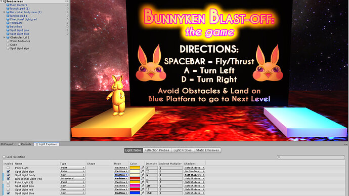
The screenshot with the Unity interface is how it looks before I build & run it (and how I’d like it to look). The darker one is how the game actually looks when exported – the light I have placed for the sign just doesn’t seem to work. I did a bit of Googling to try and fix the issue, I suspected that too many lights in a scene might be the case, so I changed the setting to Ultra in project settings to allow for 4 lights. I left 4 lights active in the scene and disabled the rest. What else am I missing? Thanks in advance for any help!
Hi,
Is this for a WebGL build?
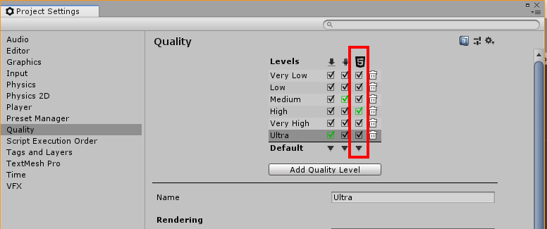
Which quality setting have you set for the build type? Unlike a Standalone build the user doesn’t get to choose, so whilst you may have configured Ultra your build may not be using Ultra.
Yes, this is for WebGL - is there another set of settings for WebGL specifically, since setting to Ultra seems to be ignored here?
Hi,
Under the Project Settings and Quality you have this matrix at the top to indicate which quality settings are available to each build type;
I can’t quite tell because you have’t provided a full window screenshot from the Editor, but is the Lighting button turned on in your Scene view? It’s the button next to the 2D button. The reason I ask is because if it isn’t then the lighting in the scene will be generally ignored in favour of a light attached to the Scene View camera. This could explain what your sigh looks so lit up when in Scene view but not when built. If this was the case you should get the darker view in the Game View also.
The Pixel Light Count could be responsible if you are having difficulties with the number of lights in the scene, what might be good to test though is any difference between platforms. For example, build with Ultra settings for Standalone, and then build for WebGL - compare the two builds. Are there noticeable differences between Standalone and WebGL?
Hope this helps 
Hi @Nebulosus-Severine, is this resolved now?
See also;
- Forum User Guides : How to mark a topic as solved


