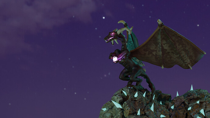
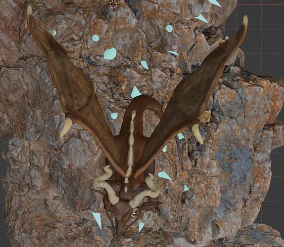
It’s my very first 3D model upload, the dragon. It’s the pose of the dragon who gathering energy to attack from the top of the huge rock. Tell me what you think about my dragon, especially the thing that may need to improve.
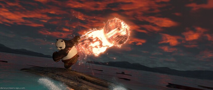
Looking nice! The glow in particular feels just right imo - very easy to get excited and overdo effects like Bloom, whereas this feels controlled. Your scene immediately made me think of this from Kung Fu Panda 2:
Artist’s choice, but if there’s one thing I would revisit a little, it’s the dragon’s skin. The wings look quite good with that reptilian shine because they’re textured like reptile skin, while the body doesn’t have that sort of texture to it. As a result, the body looks more amphibious (frog-like) than reptilian to me. A little touching up using some similar brush alphas would take this sculpt a long way!
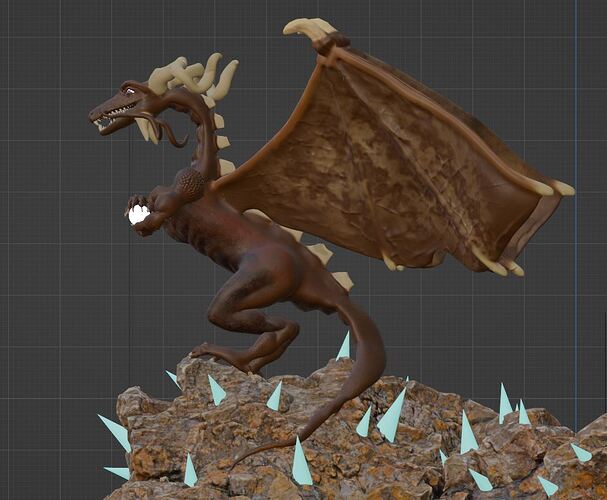
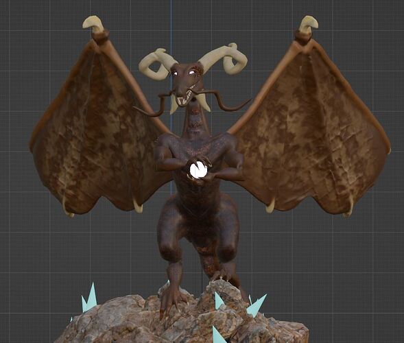
Ah… it’s looks like my bad caused by lighting over there. Here some shot from viewport to see the body texture.
Very cool =)
I might be using the wrong term; I only have a basic understanding of sculpting workflow. The paint is great. I think lighting is maybe the reason I noticed what I did, but what I meant is, the body is smooth and even, compared to the defined wrinkles and creases in the wings membranes (normal maps? Brush alphas? I’m not exactly sure how you would create these details).
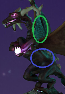
Anyway, there’s no reason a dragon can’t have smoother skin like this one does, it’s just that the ripples etc. in the wings make the smooth skin a bit unexpected imo. The green circle is actually where my eye went first, even before the purple glow, so that set the scene for me. As it is, it’s a great piece! 
