Ink set - dip pen

This is an follow-up of “Dip pen”.

I think I need a pause on this project. Started somewhere in Dec 2019. Working on it with long pauses.
First I created a puppet, for an animation. Then i thought to use it for a project like this. I do re-use a lot of my old projects. It also handy to keep them structured and tidy.

I don’t like the way the pen holder is constructed (not logical). Point is, I want to keep (show) the pen nip. My original idea was to place the pen in the bottle, but this is not practical in use. And no pen nib visible.

Still want to make it less “3D” render and a bit more realistic … but how.
Need to work on the gold texture. But I like my wood.
Maybe adding a sticker on the bottle.

I have no background and I have not the intention to do so. Focus lies on the object. And I think I made the image a bit too dark.

8 Likes

How about cutting a half round groove across the front of the round wood base, as a pen rest. Then you can tilt the pen to show off the nib as you are wanting to. or even change that base to rectangular so the pen lies with base under its full length? Oh, better, add two stylish ‘trestles’ to rest the pen across up in the air a little off the base.

if something is ‘new’ it’s closer to looking like a render people expect. So I would go for aging the model to look worn, scratched, dusty, etc. Not looking fresh put of a box, to help it look realistic.

Exactly, what I was thinking. But what makes things looking old and used. Less glossy, scratches, dirt … It’s difficult, at least. I’m looking for youtube example. And working with texture nodes, is still a bit mystery for me. A lot of trail and error, without any knowledge what I am doing.

Designing this thing is also a journey in such a thing could be build in real. And looking at references.
More usual solution is a hole to put the pen in after use. Easy and keep the wet inkt on the pen not in the open.

I considered this one also. But it’s nice but not logical in use. But I see a lot this kind of solution inf the shop.

Added a different look to my pen placing problem.

First I had an idea to let the figure push something.
But his head is too large, to put his arms around.

Made metal dirty and less glossy, added bumps and dents.

6 Likes

That has achieved your display the nib objective.
Don’t most nibs have some engraving on them, makers name or something? No idea how to achieve it though lol.

It looks amazing!

Also don’t why, but I’m pretty sure that you could sell that to Hideo Kojima for a very high price.

It has engraving, but it’s not visible in the last one.

It looks really nice!

The black background is nice and elegant, but with the ink also being black in a clear bottle it makes it difficult to see. So while I like the black background better than the grey, I see what you mean. The metal on the… baby?.. in the second picture now looks more copper than gold, but that seems like what you intended. Will you add the wood back underneath?

Yes it’s an ongoing process. Mostly due to the fact I have no plan. :wink:
I only want to improve my skill in texture painting and texturing in general.

For example the pen nib, has some engraving. To make this work I needed a bump map image of 4096x4096. Otherwise the bump map has a lot of pixel noise.

But in the previous image you can not see it. No light reflection, because it lies in the shadow. And it is too tiny also. Original crown here:

Thanks for your reply, have fun, stay healthy.

2 Likes

That’s some really good detail. Using a bump map is a cool way to do that.

Works really nicely close up. Perhaps there is a way of ‘cheating’ render it out and use the render as an image to apply?

Baking high res close-up. Good idea!

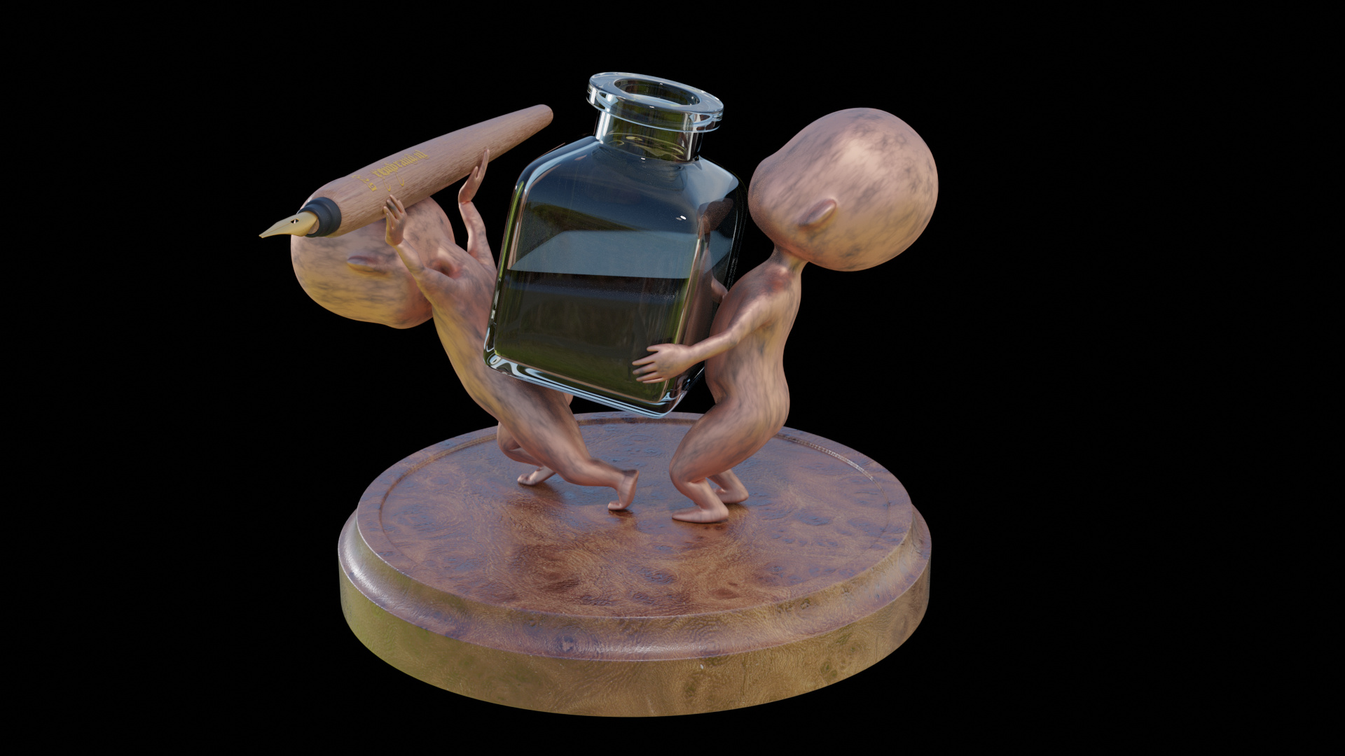
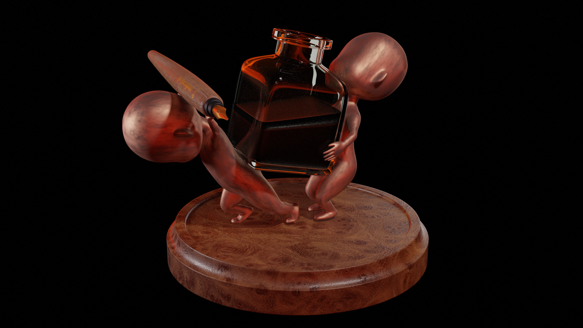
In meantime I worked on this. Using different HDRI maps (red sky and normal landscape).
I need to make the glass looking older (less transparent). And you see, my solution to hold the pen.
And now I thing, the pen needs an other darker color. Now it blends in, in the puppet material.

5 Likes

The transparency does not change with age its rather the surface gets scuffed, wich does then impair the apparent clarity I think. Best of my instinct let’s not pretend knowledge, glass does not ‘go off’ rot etc.

I like the wood base better under red light, but it could just have it’s base colour adjusted instead. the problem with coloured lights for me is the scene it ends up in should dictate the lights. It might be on a desk near a window at sunset though!

Yes pen and coppered figures are all of a one colour effect at the moment. Could easily be paler pen, light wood varnished, slight yellowing. Wasn’t there an example image of one?

1 Like

Privacy & Terms