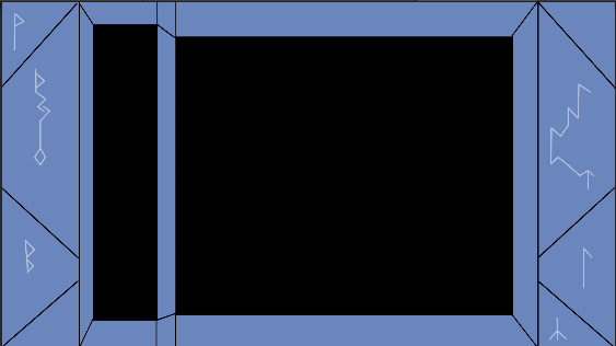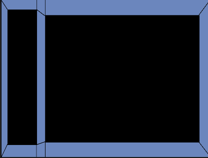

What do y’all think about my setup for the player screen, so far?
First of all - you should be in marketing, you are doing a hell of a job announcing your game!
As for the setup: I can not really imagining how you want to fit it all in the screen unless the player area is somewhat small.
As for the design and the idea of it. I like it a lot, especially having your characters in mind.
Thank you for the kind words. I don’t really know anything about marketing, I’m just sharing the steps for my little games that I make through these classes; as for the characters and the play size, the play space is where the black background is currently. The defender selection will will be in the column on the left side and the rows and enemies will be on the larger one. Like the shooter I made, Major, I made all the art for this one, Tomb Diver.
…and good art work it is!
Thank you. I think I still have a ways to go before I’m especially proud of my artwork though ^^’

