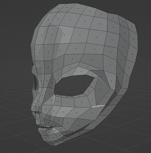
I moved from fish to alien. I make a comment on a previous lesson. I have 8 on the top row. I think that is why I have this weird triangle. I thought about doing a knife cut for everything and try and add another row, but it doesn’t appear to be too bad. I’m going to just keep going with the flow. Let me know if it is something I need to fix.
A quick test could be to add a subdivision modifier and switch on “smoothing”.
If you think, you see strange curves/faces then you need to smooth the mesh.
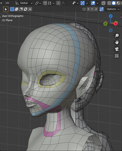
How does your vertices and edges line up with the reference images. If you want to be like the course’s you many want to check on that. If you are going to vary away, there is no issue with creating a few more pole points. Generally the poles are for when you are changing direction of the topology. It doesn’t look like there is a direction change. You could put a loop cut across the faces one row above the triangle and reconnect the rows.
Bit further on but does this help?
The course is an odd mix of reference that is a good idea, showing the topology flow, and then poor quality possibly low res images, such that it is hard to follow in some parts. But then there are mistakes in it too. All very well to use them as ways of teaching later correction but not my personal idea of good. In some parts he then ignores the reference, fair enough saying the point is to know why he is doing what he does etc. but again not that helpful actually.
I’m kind of going with your thoughts. I made a comment in the video where I made the mistake just to let people know not to do what I did. However, I’m just rolling with it.  I think that is what Mr Abbitt is teaching too. I appreciate it and that is why I have bought all of his courses. I will have a weird alien/fish anime character, but I had low expectations on my skills from the start. It has nothing to do with the class.
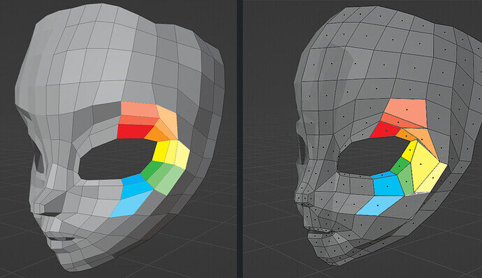
I just finished this lecture, so I could compare our models a bit. I tried to make it visual with color overlays. (Note: these are not the edgeflows Grant shows in the video! Just a little color to, hopefully, make things clear)
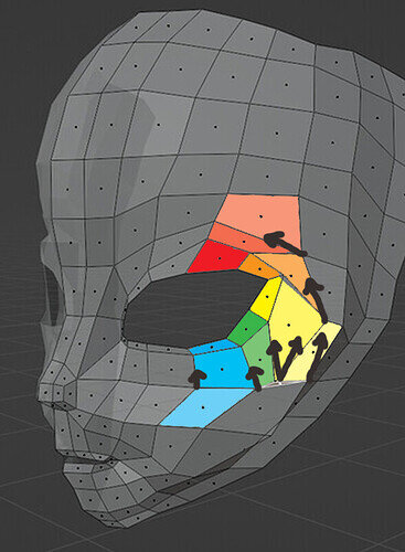
It’s quite the puzzle, but I think that if you move around some vertices, some errors might be better visible and you’ll be able to fix them.
Something like this! The second edgeloop around the eyes is a bit wide. Try to make it a bit smaller and align some vertices to create more clean flowing lines. Some edges make quite a plunge right now, the orange and yellow one for example. Maybe if you made those adjustments, you’ll suddenly see what to do

Looks like you have eight faces across the top when he has nine. The extra topology will allow the triangle to fit in as a quad.


