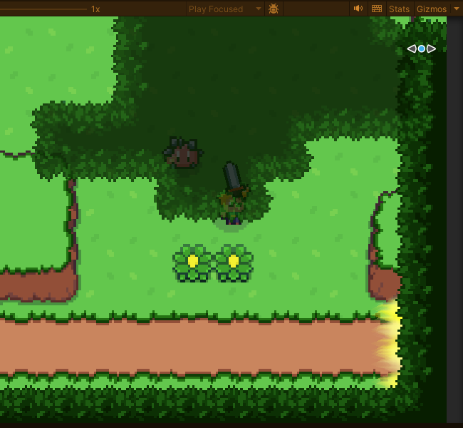
It might just be how I set up my scene, but basically me exit is about the same in the corner.
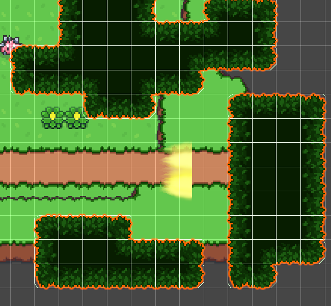
During editing in the scene view it looked perfectly fine
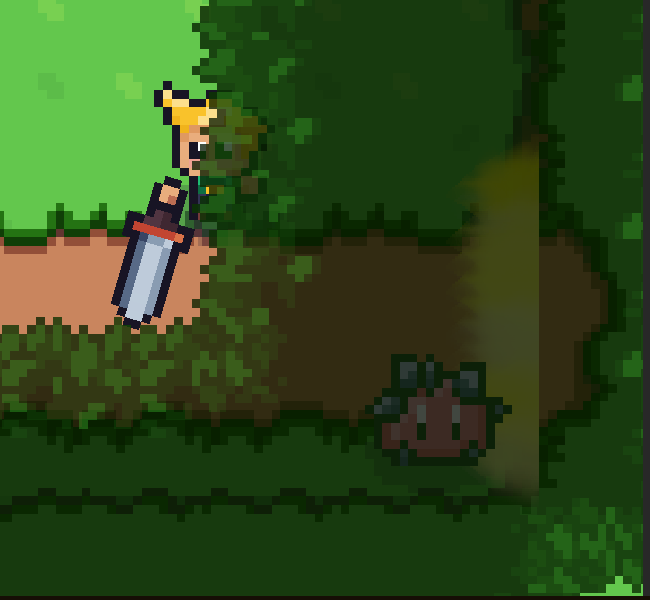
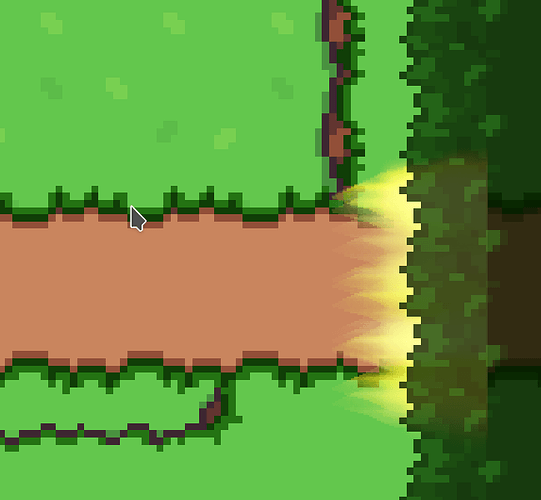
But when playing, I found that the canopy was moving quite a lot over the exit’s position, so unless my character was beneath the canopy it was completely covered and if the canopy was turned transparent the VFX on the exit was still very subdued, and also it made it look pretty badly because now the cutoff on the opposite side became clearly visible.
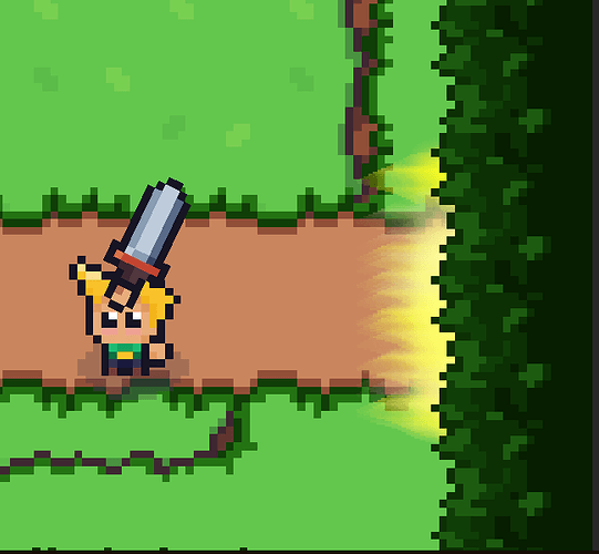
At first it was about at the edge of where the camera moved so it was practically at the edge of the screen until you moved right into it. I moved the exit in a bit but it didn’t help much.
On the other scene it was even worse, here it about just entered the screen when you already hit the exit and move to the other scene…
What I think might work is pulling the canopy back so far that it will about just reach the exit area in play mode and make sure the player won’t touch any of it when he’s close enough, so it doesn’t get transparent and the cutoff of the VFX’s back side becomes visible again, which would be quite a bit away from the position when editing the scene…
I suppose what also would be a good idea is to fit the area exit in a drawing layer that would put it in between the path (cosmetics tilemap) and the hill (foreground tilemap), so it could be enlarge for some good amount to fill up all the room between the two wallls put around the path tiles… This might not change the Canopy placement situation but would allow for the area exit visually being much larger so it’s back side can be hidden under tiles on the foreground tilemap, so one could have some gap in the canopy…

