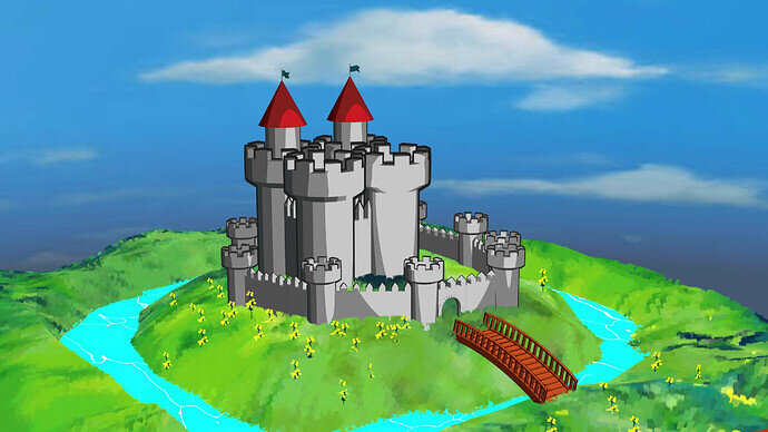
I followed the tutorial this time, but decided to experiment with the materials a bit, as I have been interested in the cell shaded or toon shaded style (I think that is what its called) for a while. I actually found setting the view transform to standard and the look to very high contrast made it look even more cartoony.
Nice looking cartoony castle scene. Looks amazing. I like the sky, bridge, trench with water and the grassy and flowered ground. Amazing job.
Thanks, even though this is a much more simplistic design compared to my other castle, I actually like this one more, I am a big fan of the cartoony style though.
Very good cartoon castle. I have never used the render type. Certainly changing away from filmic to standard is usually better imo.
Thanks for your comment, Do you mean just changing to standard just in general or just for this render type?
Yes I have started doing that. Interesting thing I found is you can change it after the render and it updates. So you can try it and see rather easily.
Oh I see, I knew you could change it in the video editor when editing an animation, I didn’t realise you can just do it will a standard render.
Nor me till recently. I guess in effect it is working like a compositing way, just altering the colour balance.
Yeah it makes sense, you can do all that sort of stuff in photoshop as well I think, altering colour balance all that stuff.
