
1 Like
Too me, it’s not recognizable, without a context.
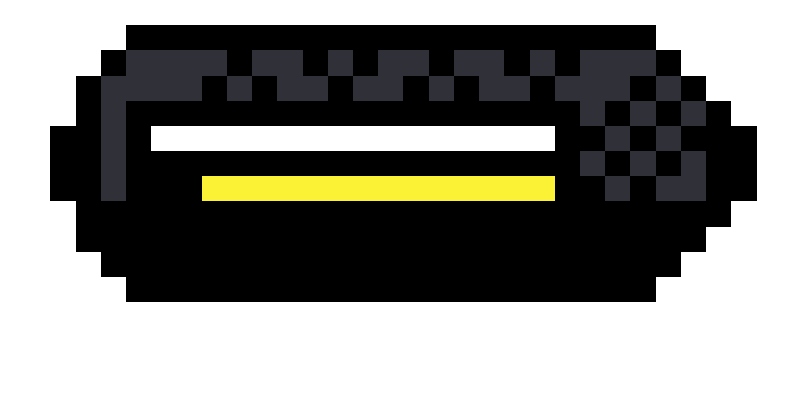
What are your thoughts knowing it’s a health bar? Did I miss something? What could I improve?
1 Like
It’s a sort of gauger, which has specific visual elements. I miss that.
Now it looks like a toaster from above.
- add markings
- use distinctive colors (white vs yellowish)
- keep it clean, remove unnecessary visual noise.
What do you mean by markings? By distinctive colors you mean colors that contrast more? I was trying to do that with black and white, wasn’t sure what to make the secondary bar though. Visual noise being the dithering? He does that in the video so I was trying to do it too.
1 Like
like every gauge, the level of … 0%, 25%, 50% etc…
I know, but it needs to be functional, not distracting from the real function.