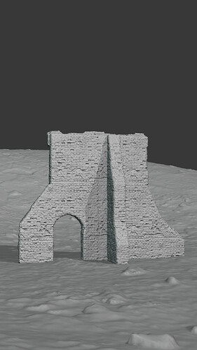
Try telling everyone what it is, how you made it, what you MEAN by make it real.
- Improve lighting
- Check material (too strong bump map)
- Check camera
- Ad tiny details (grass)
- Use a better scene composition
- Increase bitmaps sizes
also check the setup of the original course
that is helpful
- The rather straight diagonal edge on the left side looks off; on the right side that edge is irregular - much better, the wall is broken after all.
- You added irregularities to the bricks, but just that. Maybe add more variety? A hole somewhere, some overgrowth, etc. Old items such as a rusty pushcart might help, as they add to the feeling of “abandonment”.
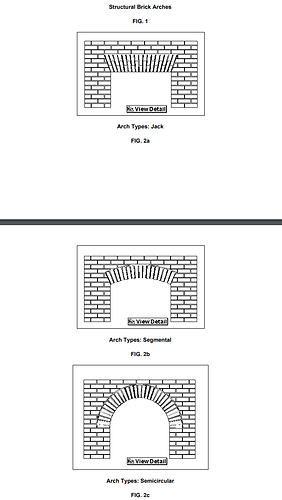
If this is course material I don’t know which course? As a model of a brick ruin it’s pretty good. Perhaps the structure of the arch lintel is not so realistic? Usually bricks in arches are wedge shaped and lie side by side around the edge of arch. I quite like it as it is already.
Here is an excerpt for educational purposes from a site called gobrick.com as an example.
PS the items listed as triangular and gothic are more typical of Medieval times in the document. 31brick-masonry-arches.pdf
If I can remember it correctly, it is a course from Rob Tuytel (not GameDev).
I agree with some of the other guys with regards to checking the door lintle. Also, the left most wall is too intact. It is an almost perfect line which seems odd compared to rest of the ruin. Otherwise, it looks interesting and well modelled.
That is correct
Yes very distinctive and I suspect the course goes on to do a lot more environment as I recall it.


