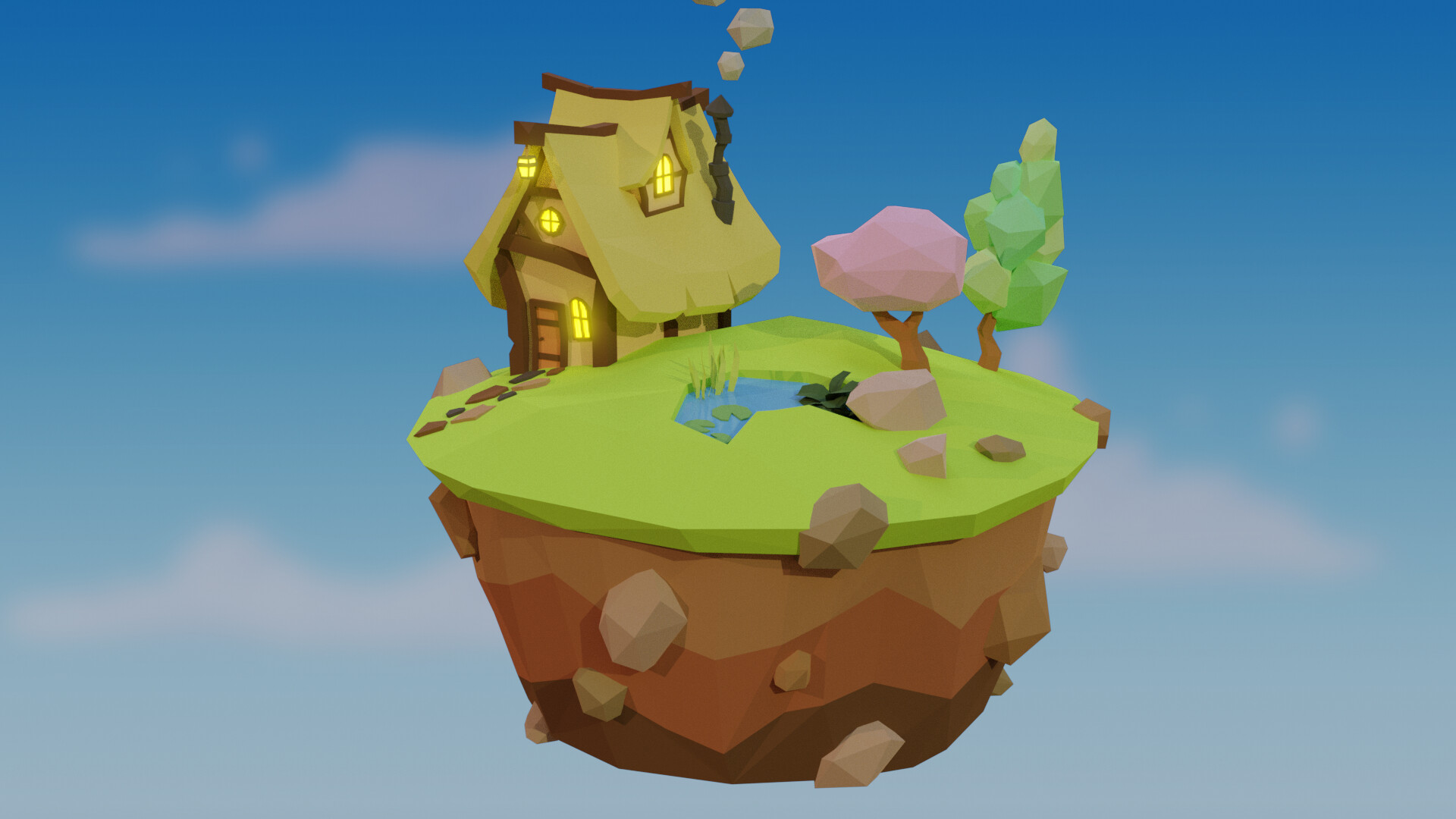
So I finally finished this course! I can’t help but notice, when comparing the images, Grant’s just looks like it’s higher quality in general. Like It just looks more life-like, and less flat. I feel like it might partially be because it looks like his has more pixels (how can I adjust this?), but it might also be the lighting and just my model and colors in general. Like I think my lighting and colors might be too green. Are there any tips As to how I can up my quality?
2 Likes
I suspect it is lighting and colour use that will be the main difference. Your modelling looks fine for what the course was showing.
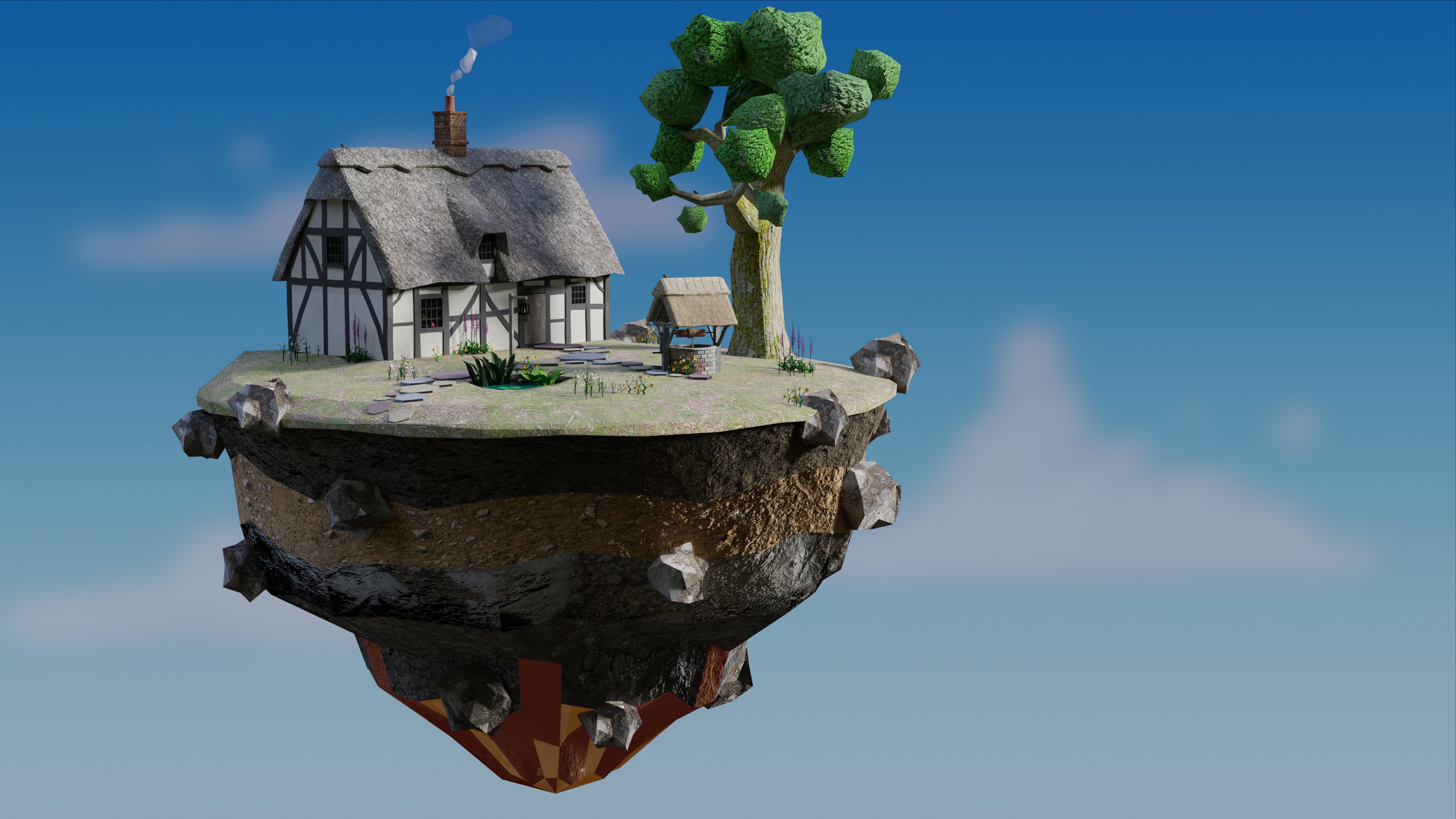
Here is what I made, having more experience and knowledge of textures and materials. However basically the cottage only used the same modelling methods and tools. Only the well in front used a circular array which was not used in the course.
2 Likes
It’s lighting and maybe the colors used in lights.
You are using a sun lamp and environmental light.
It can flatten (brightness, contrast).
If you have Photoshop, Krita, or GIMP then do auto-balance …
1 Like
Yeah, I think your right thanks. I tried messing around with it and I’m a lot more satisfied. Your’s looks awesome!!
1 Like
Huh, thanks. Are there some other kind of lights I can use to avoid flattening? Or do I just need to do it in a photo editing app?
1 Like
Using photoshop is just a quick and dirty solution.
To do this in Blender you need more Blender lessons.
- Use Blender post composition
- More light knowledge (environmental HDRI), Area lights, or Sun lamp(s). … so much possibillities.
2 Likes
This topic was automatically closed 24 hours after the last reply. New replies are no longer allowed.