8 Likes
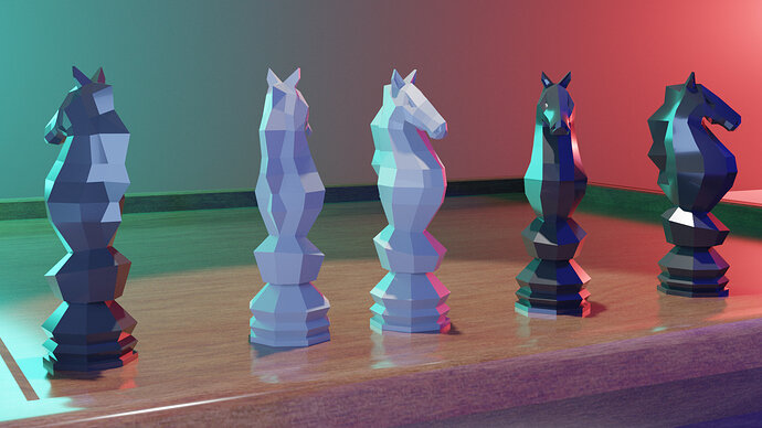
The smooth shading is a bit awkward on such a low poly / angular model. I think the flat shaded looks better in this case. Love your design!
1 Like
The pieces are, for me personally, more sculpts, than chess pieces.
More resemblance with a seahorse.
Nice wood texture.
1 Like
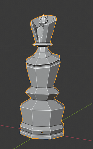
Yeah, I know, I wanted to make them in stylized style. For instance, here’s my queen, tried to stick to more dynamic, interesting outlook.
2 Likes
I understand, and also the part of creativity.
But the main feature, the top, is the most significant part of the chess piece.
It identifies the piece. But most attention goes to the base.
But, this is creativity. Blender fun! So go for it! Explore!
1 Like


