Having trouble with final frontier lecture

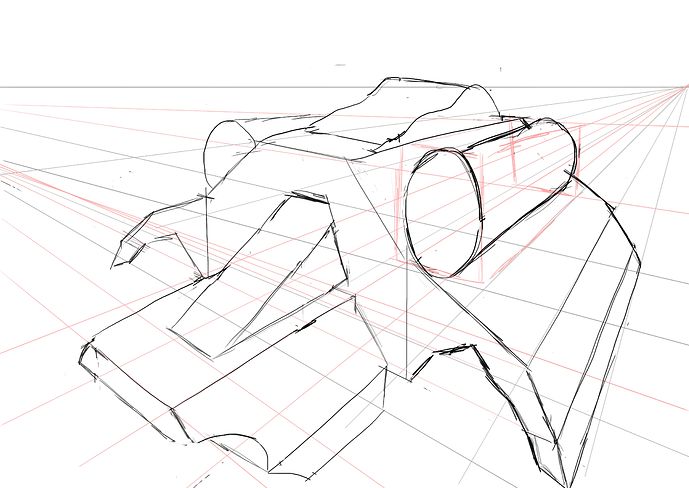
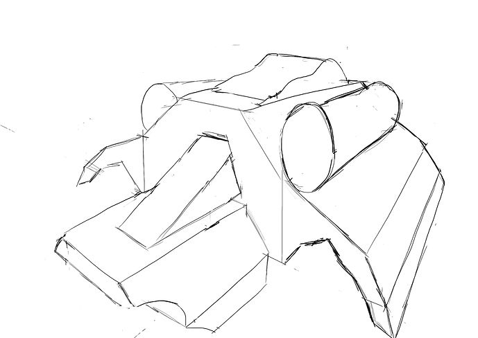
Does anyone have some insight/advice on where I went wrong on the initial perspective? I tried to keep vertical lines straight for the two point perspective, but I seem to be skewed a lot higher than Grant in the lecture. I also ran out of room, I’m not sure if I just overshot on the initial boxes for the base of the ship.

Also Grant do you have any lecture videos here or on youtube on getting yourself “unstuck” or kind of fixing perspective errors if you find yourself running into them? I tried to judiciously use guides… but I may have excessively done so I don’t know if it really helped me here.

Programmer by trade first drawing course for background on me.

3 Likes

Not so sure what you mean. But the camera perspective is high.

It’s because your vanishing lines are too wide apart. The first (top) and lower (bottom) ones.
Then you get the effect of a macro lens, zooming in on the subject.

The square, painted by the red vanishing lines, was the cube for the spaceship. You wend far beyond it.

Also, if you increase the distance between the two vanishing points (laying outside the paper). The distored effect (but also depth) will disappear!

Have fun, experiment different vanishing points!!!

2 Likes

Sorry for not being clear. My problem is exactly that the camera perspective is higher than in the lecture and I’m not sure what I did that caused that.

To clear up some of my confusion, you mean the distance between the lines that go to the vanishing points right? I need to use smaller distances between these diagonal lines? Or do you mean that the vanishing points themselves are too far apart (the horizon line is the horizontal line, with the right vanishing point on the page, and an imaginary one off to the left of the page).

Sorry for the color confusion, I didn’t realize that using red for vanishing lines was important initially - I thought it was just for viewer ( in lecture benefit) I only started using red after I kept getting confused between guide lines and the other layer. The red square guides are for the “booster” cylinder that you see drawn there, not for the initial spaceship. Do you think that the size of the spaceship is also too large for having a “lower” camera perspective? Or does that size not matter as long as I get the vanishing line width correct?

Thank you for your time and feedback.

2 Likes

Yes, I think both.

  • Less distance between the diagonal lines.
  • More distance between the two vanishing points. Which will also flatten the distances between the diagonal lines.

Many variables. Choices only made by experience and experimenting. In that part I can only say, draw a lot.

But keep having fun.

1 Like

excellent work. In terms of fixing perspective issues. Its mainly about going back to the guides however your actually doing incredibly well and its just a case of keeping going and trying different things. we do lots more of perspective stuff during the course so you’ll have lots of opportunities.

3 Likes

This topic was automatically closed 24 hours after the last reply. New replies are no longer allowed.

Privacy & Terms