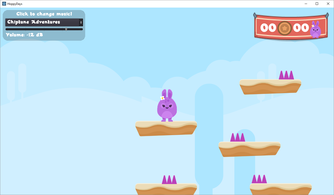
Before I forget, here’s my current GUI. It’s still a wip for sure: http://godotproject.tailormadeworld.com/HoppyDays/
3 Likes
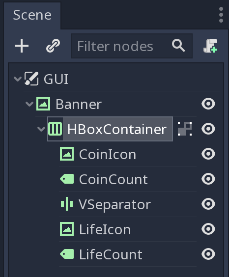
I fumbled around and discovered the VSeparator control. I liked a little space between the items. It has a visible element, but easily dealt with by changing its alpha to fully transparent.
1 Like
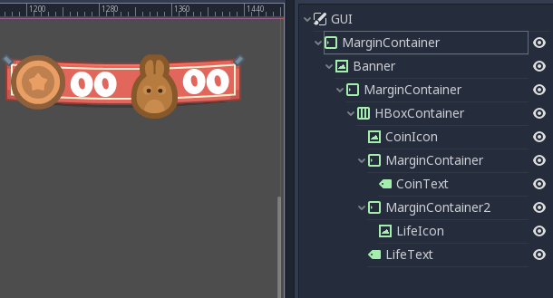
I wanted to keep the icons larger than the banner 
I used MarginCointainers to fine tune positions of things inside the banner.
The topmost MarginContainer handles the anchoring of the object in right corner giving 40 pixels offset from the corner

1 Like


 and Hoppy loves carrots.