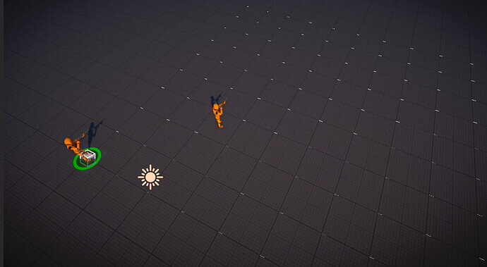
My grid marks seem to be off. I have the same code and used the same material for the grid but it still appears off. Any insights?
Are the grid marks off or is if the background texture? Create an empty game object to see if the positions are correct. If the character is on 0,0 then the marks are correctly positioned, it’s the grid visual that is offset.
Did you use the exact same asset pack from the resources or did you pick up the complete asset pack directly from Synty?
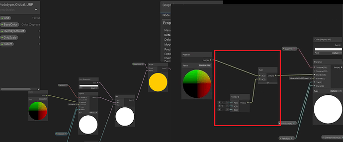
On the Lecture Unit Base Setup I talk about the modification I made to the original grid shader to shift the grid by a bit. If you download the assets from the resources of this course then it already has that modification, if you download the original pack from Synty then you need to modify the shader graph to get it offset.
I have the same issue where the grid is not offset like you show in the video.
I have followed all the instructions and downloaded the assets from resources on this course.
When I open shader graph it does not look the same as it does here in your video
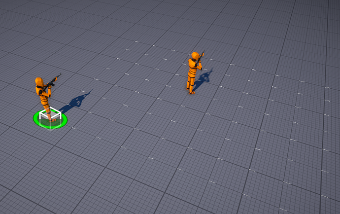
I have the same Issue, just to show what is the diference, I have uploaded a screenshot between what I see on unity versus the video.
I re-downloaded the assets right now and it’s all working correctly. Did you accidentally open the “URP_ExtractMe” package? If so then it will overwrite the changes that I made to the shader.
If you do that then apply the changes just like you see in the video “Unit Base Setup” at 6:18 or what is shown on the screenshot by @Pedro_Iniguez
I’m not sure I’m seeing the same thing either. Based on the “Unit Base Setup” lecture, I would think that my units (one at (0,0,0) and the other at (4,0,4)) would be shown in the middle of the major grids. Here’s what I’m seeing:
BTW, I’ve checked the shader used for the grid - I didn’t alter it from the downloaded materials and it does look just like the video. When I tried to fiddle with it to remove the offset, it made no difference, so I’m a bit baffled (but definitely not a shader expert). Ideas?
Yup what you’re seeing is correct.
The change is on the grid thick lines, by default they meet on each grid position, my change was to make the grid position be inside each thick line square, I think it looks better that way.
This topic was automatically closed 24 hours after the last reply. New replies are no longer allowed.


