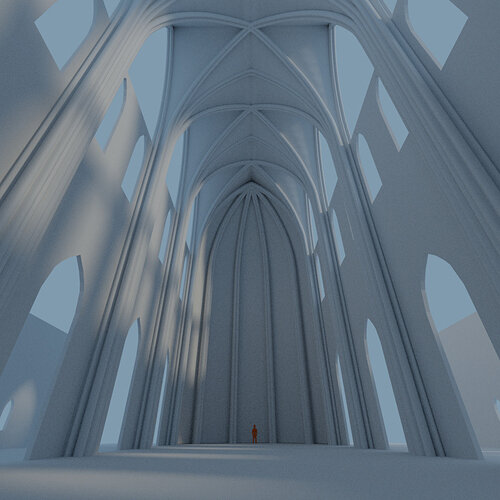
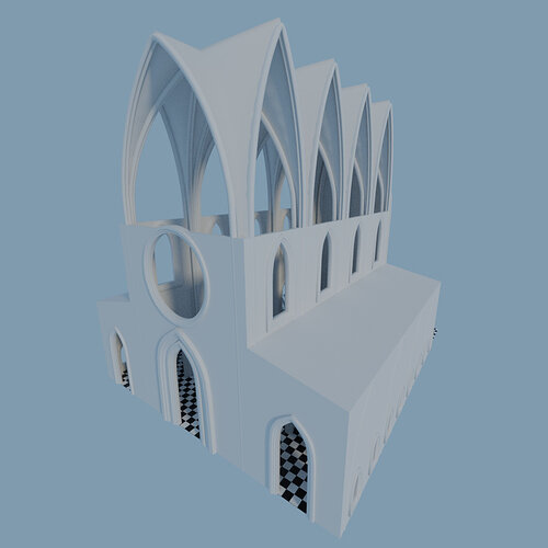
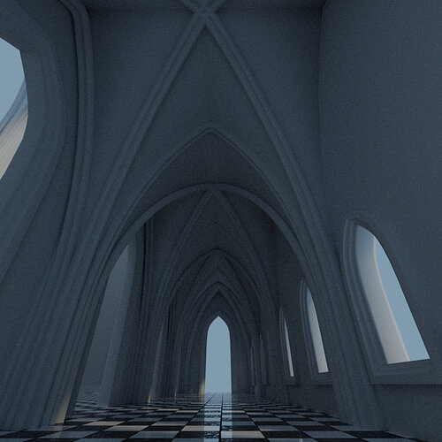
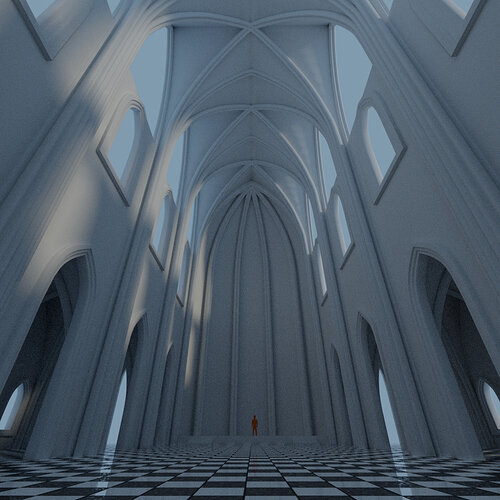
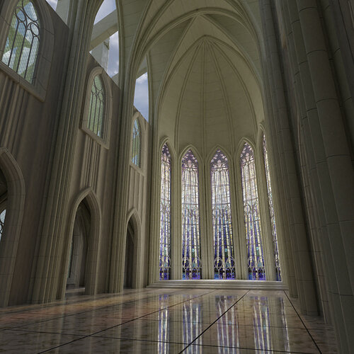
Gothic Progress

As I did with the Bunny scene, will also centralize the posts regarding the Gothic Church scene here :wink:

This project might take a while to look really good…

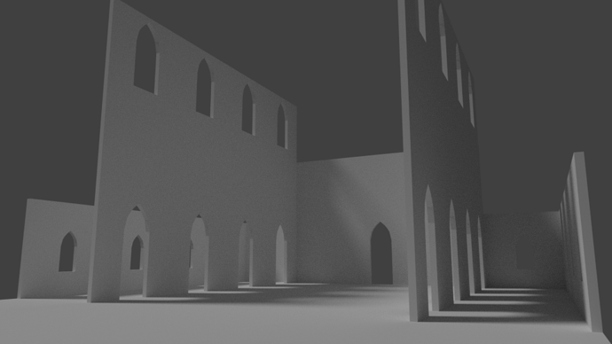
Anyway, just started It’s still under construction with LOD A

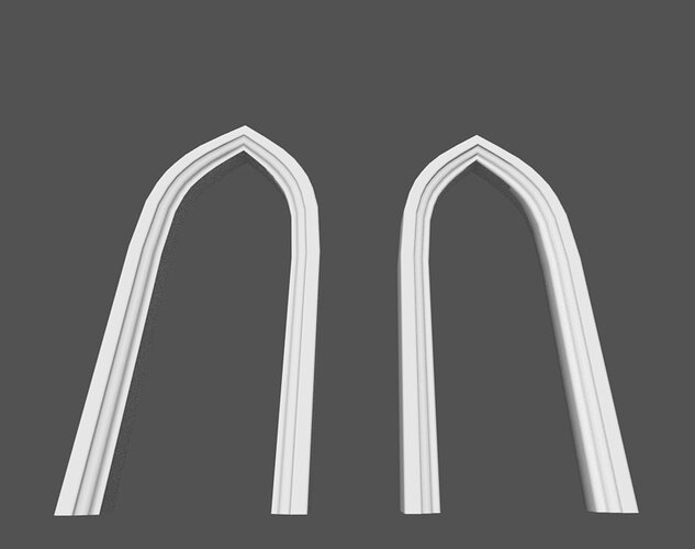
These archs are almost 4 meters high… do you think it’s high enough?

Think of pilling up the wall in three levels… the arches on the floor + pillars, then comes wall with some ornaments, and then some larger windows with stained glass.
From the pillars extends the structure of the archs of the ceiling…

3 Likes

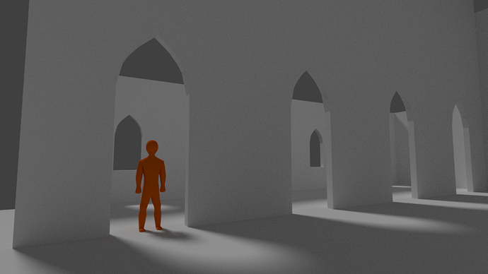
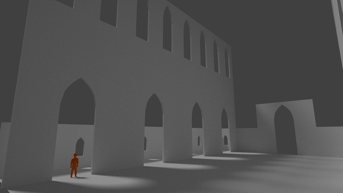
Added a manequim 1.72m tall to test the proportions…

Maybe the archs need to be larger and higher?

Edit:
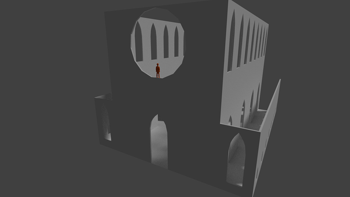
Yeah… probably twice the size is more reality fitting… also increased the size of the large windows.

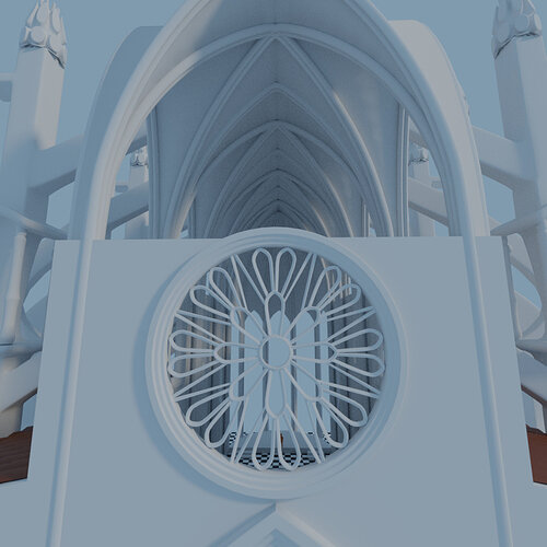
Added Circle Window

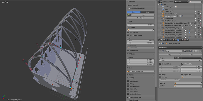
Ceiling Archs - Array of Curves Test


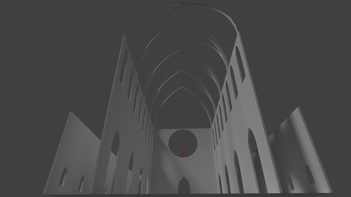
LOD A Ceiling


Another update!
Tried to apply a simple Bevel Profile to the Curves my arrays were going haywire! Couldnt get the curves to allign properly with the divisions of the walls, was trying to align manually changing the Relative offset values… Everytime I tried to increase the size of the Bevel profile the stuff were misaligning… I was like “what the hell?!”

Turns out… I forgot to apply the transformations! and because of that the scale from each part of the array was slightly increasing, thus misaligning…

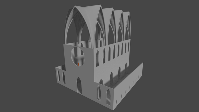
Long story short… Made the ceiling and altar walls structure, brought the curves way down to create “pseudo Pillars”

LOD2 Starts Here :smiley:
Made the Bevel Profile for the curves of doors and windows.

The Aisles roof gave me some trouble… dismensions problems… But I was able to fix it :wink:

Still figuring out how i’m going to do the roof of the main part…

Oh just for fun, applied my material of the chessboard I created in the other lesson :smile:

Things are going to get crazy when I make the Flying Butresses :smiley:

2 Likes

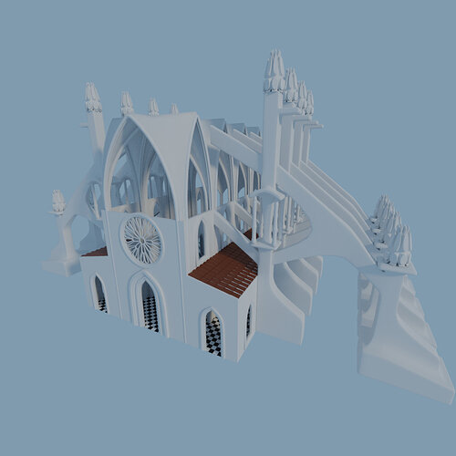
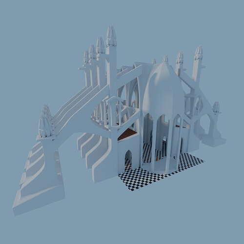
Well… told ya things would get crazy… maybe overdid it… lol

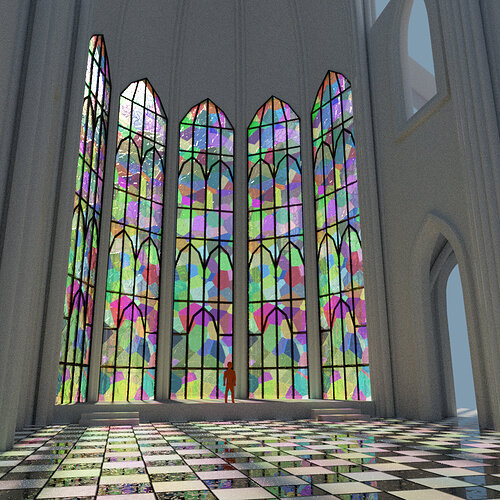
The Altar will have very tall glass windows as you can see here:

I know there are stuff that is not touching anything, but the top of the church is still to come…

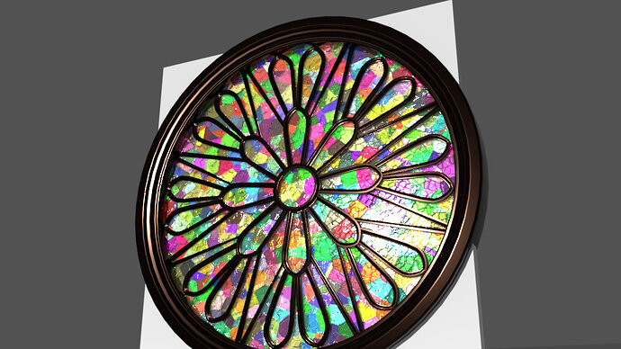
Also made a Rose windows, that the glass will come later…

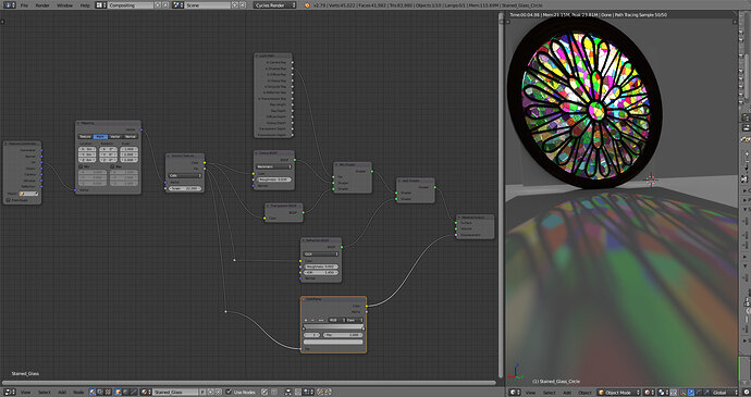
So… Went ahead and tried some Nodes for Stained Glass using voronoi, but I can easily change voronoi for an Image Texture node later :smiley:
What do you think?

5 Likes

This is really coming along very nicely. I can’t wait to see this textured, as all white makes it hard to see the detailing. Oh, and the Voronoi looks nice for the Rose window.

1 Like

Thanks @Miss_B, I’m still deciding what materials to use and not even unwrapped the walls yet lol.
I didn’t really envisioned the colors of the church yet… Planning on the fly lol (yeah… I know it’s bad)

Probably will work on the frames of the other windows tonight and test some more glass.

Btw, found a really nice way to make windows Frames with Wireframe modifier :smiley:
But maybe i will convert to curves after…

Ohhhhh, if that’s Hengen Vaara’s Gothic Window tutorial, which is written in Russian, I did that tutorial last year when a Blender user friend of mine posted about it on one of the 3D graphics forums I hang out on, and it was fun. Even did a second one with the same method, just my own design, and it came out pretty good too. That was a fun tutorial to do. Luckily all the screenshots made it easy to follow, since I don’t speak Russian. :wink:

Actually no lol, found the wireframe could be useful for this out of curiosity!
It was like… “Hum, what does Wireframe modifier do? *applies the modifier* Oh! That’s nice! May be useful to make windows frames, grills, fences…”

But i’m curious about this tutorial now!
If you have the link post it please :smiley:

Unfortunately, I can’t find it, but I’m going to ask my friend if he remembers it. He may have it bookmarked. Now, of course, I’m kicking myself for not bookmarking it.

I’ll let you know if I find it.

OK Capa, you are in luck! I went to the forum where my friend had originally posted the link, and did a search of the archives for posts I had made back then. Once I found my post, I was able to scroll up to my friend’s original posting of the tutorial link, so here it is:

Gothic Window

This is one very large graphic file with text in Russian under each of the screenshots that make up the graphic file. I had no problem figuring out what was being presented, and since you’ve gotten this far in this course, I don’t think you’ll have any issues either. Just check over on the right side of the page where there will be a link button titled “Download” with a down pointing arrow, and you’ll be able to save it for yourself.

Of course, if you click on the image at the top of the page, it will enlarge enough for you to see it, but I always prefer to have it locally on my hard drive for future reference. Anyway, have fun, and I’d like to see what you come up with. :wink:

3 Likes

Thanks miss! That’s an interesting approach on the Rose Window.

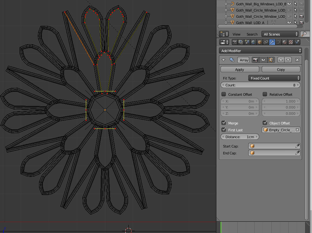
For my window I was lazy and used the curves already done to detail the doorways and duplicated some to create one section, then I used the techniche used to make Car Rims :smiley:

Array with Empty in the middle, uncheck the Offsets, Increase the Count and Rotate the Empty till all the sections match, Merge, First Last.

Changing topic!

Looking some stained glass stuff I noticed that my pieces were too large lol and that each color of a stained glass image is made of several pieces of the same color.
So I added a MixRGB node that “merges” 2 Voronoi, one larger and one smaller, this way I can have the delimitation of the colors and the smaller pieces inside.

Maybe looking the picture below will make more sense…

Tweaked a little more the material so more light passes through, it was making the scene too dark and too noisy…

And here is a render of the glass windows of the altar which you can see the Windows Frames I did using Wireframe modifier. Too much jagged to look good, applying Subsurf don’t work very well with wireframe, so most probably I will make the curves…

2 Likes

Yes, I think in this instance, curves will definitely work better. The funny thing is, with the two windows I came up with following that tutorial, I then used subsurface, and the first one, like the tutorial, wound up looking like a table top. :wink: Fun, but for sure not what I was looking for.

1 Like

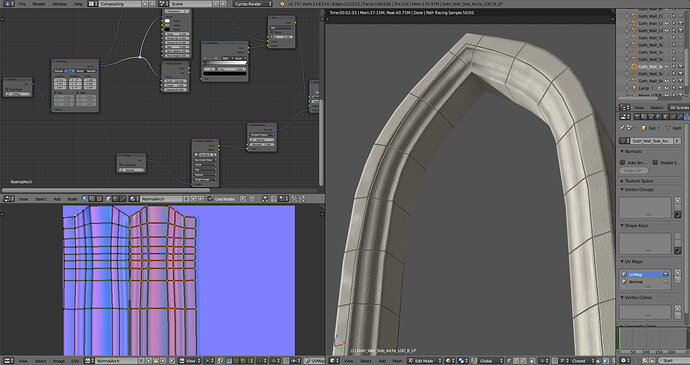
The power of normal maps!

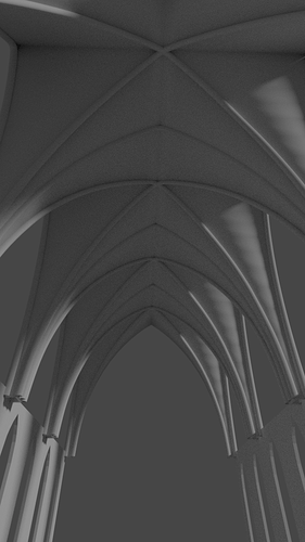
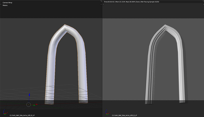
Tried to bake the normal of one of the Archs! And it actually turned out pretty well!

This is the LP model vs Rendered

The HP version has 1296 Tris and the LP version 216 Tris :smiley:
Now the Classic question: Which one is which!?

1 Like

Wow this gave me a lot more trouble than I expected!
But the trick to using 2 UV Maps saved me!
Leaving the UV of the perfect baked Normal untouched while on the other I could move the Bricks to line up!

But since this is ready… “Is time for a challenge…” Do the UV maps for every other archs and walls I have in the scene lol

1 Like

I should be working on the windows frames, but so much stuff happened, that I not even touched them…

HDRI Environment Texture and lighting sources, which made me realise the Stained Glass was too bright and needed to be fixed.
Trying to make the roof needed a New model for the ceiling…
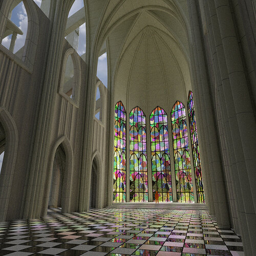
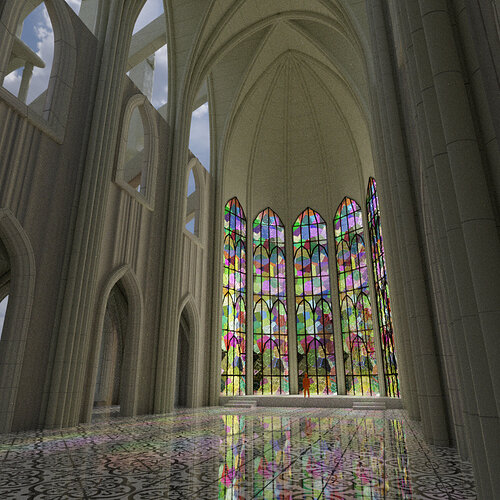
Materials test for the “columns” and ceiling, some floor materials…

And then the question… which floor of these should I use? Or something else?

1 Like

I like the last floor the best, mostly because you can see the windows more clearly than the first, and the second one the pattern of the tiles isn’t as easily visible, because the windows are more clearly visible than the first, so they’re fighting to be seen. All three are nice textures, but I think I’d use the first two in different buildings than a Gothic Cathedral with such outstanding Stained Glass.

Then again, that’s just me. Others will probably make different choices.

1 Like

Thanks for your input miss, the mable certainly makes it look cleaner, was not sure if was the more fitting. Now i do :wink:

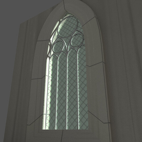
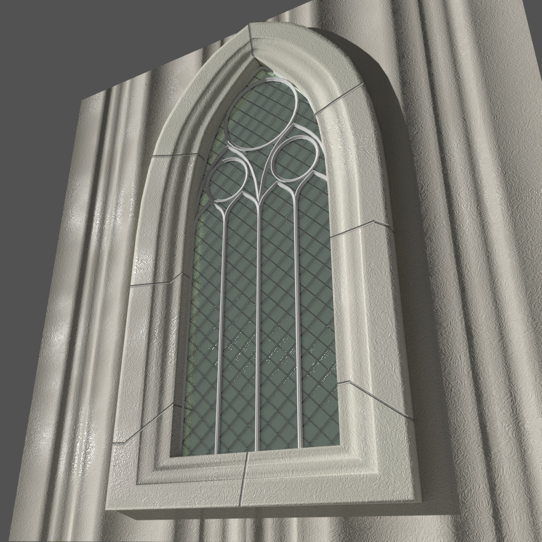
Trying some windows now

Window_Green_Glass_Out

3 Likes

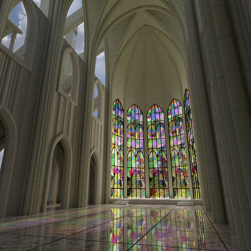
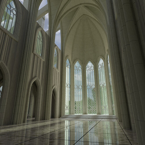
Hum… The Stained Glass in the previous renders is just a test of the material and requires an image of the drawing of something to be actually good, but maybe without it is more pleasing to the eye?

Edit:
Test with an image…(ofc it doesn’t fit the window frame pattern, but this was a quick test with one image of the internet.

5 Likes

Yes! I think looks lovely like that, you can really see the windows details and it has more charm now.
You can even go with different floor now. Great job!

1 Like

looks really amazing!!

1 Like

Privacy & Terms