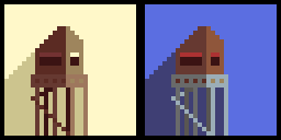
Wasn’t quite sure how to draw a bad version without just choosing colours that would make no sense, so instead I stuck with the basic palette and did no shifting for the colours on the right hand image.
I really love the left hand image and that sort of forgotten memory, sepia tone.