[Game]Space Battle inspired from Laser Defender

Hi everyone!

Do you remember the game “Laser Defender” from Unity 2D courses with Ben? Well, this game gave me an idea to expand it much further. And few days ago I published a new game, called “Space Battle” on Google Play store.

Space Battle
https://play.google.com/store/apps/details?id=com.GG99GameStudio.SpaceBattle

This game is a paid app.

Will you be able to battle your way to get in global leaderboard? :slight_smile:

2 Likes

This looks fantastic Guntars, well done! The graphics look really crisp and I like the story you have going on at the beginning.

I noticed that there are a couple of minor grammar errors in the text, nothing major, but might be worth running through something like Grammarly just for some additional polish.

I have started my first game so will update later with anything else :slight_smile:

I didn’t use one of your codes, purchased your game instead, the demo video on app store suggested to me it would be worth it, plus I figure its the least we can all do to support each other right? :slight_smile:

1 Like

Thank you so much, Rob! It means a lot to me, to receive such a great comment from you! :slight_smile:

I will definitely check for grammar errors, it seems that I really need some extra help to find them all!

I really hope you will enjoy this game and would give me some hints and tips to improve it more! :slight_smile:

I already have a list of improvements from other close players and will start to fulfil it as soon as possible :slight_smile:

And thank you so much that you have bought this game, I really appreciate it. And I do the same thing, because I have understood that it is a hard work to create a good game :slight_smile: and we all need a support!

P.S. Hope to see you in the leaderboard :slight_smile:

Spotted a couple of things which I will mention here in case they are of use…

There is an option to Skip for the rake off, but in the missions there is no option to Skip the dialog/instructions. This can get a little bit frustrating when repeating the same level over and over.

The player can take damage from asteroids during the dialog at the beginning of the levels, concentration is focused on reading and thus the player can lose their health before actually starting.

I like the accelerometer controls but I am not overly keen on having to effectively drag the enemies back into the play space by moving to the opposite side of the screen. It’s a clever way to incorporate the enemies reacting to the player movements but I feel this bit spoils it.

In the level where you try to catch up with the enemies who are heading to your base, and you reverse the game so the player is ths top the enemy ships don’t shoot at you until they are off of the top of the screen making it harder to dodge their shoots as you can’t see they are firing. I would make this an avoid/destroy them only level and not have the enemy ships fire at all here.

In the level where the commander commits suicide, this is triggered only when the player has shot enough of each enemy type. I repeated this level several times because although I destroyed enough of each enemy type the dialog then caused a distraction and I was killed by enemies which were still appearing and also asteroids. As above, it may be worth considering not allowing the player to be killed during these cut scenes, or stop the enemies from spawning and also the asteroids.

It isn’t overly obvious what you are supposed to do when you run out of ammunition. On one level I wss able to complete it by getting the enemy ships killed by asteroids, but this wasn’t overly obvious as a choice.

The dialog font size is quite small on my mobile (Galaxy S6), but with the transparent background in the dialog boxes the star field, enemy ships, the player ship and so on can make it hard to read the writing.

I obtained a power up which gave my triple lasers, nice, but I didnt personally like that my ammo dropped by 3 for each time I fired. It makes sense that it does as you are firing three shots but this takes away from it being a power up to some degree because its still costing me that same and I didnt seem to have an option/choice about it so had to watch my ammo drop quickly.

Three ships at once in a couple of levels feels a little odd. I think perhaps because you are controlling all three and they all move at the same time in the same way. See if you can find a YouTube video for Xenon 2 Megablast and watch how the power up works, it flies next to the player ship and responds to the player movements but with a kind of delay. This might work for these two additional ships and will give the illusion of them being flown by other pilots otherwise the player just assumes they are all themselves and then that leads to it not making sense sense when the middle ship is destroyed, one or both additional ships are still alive but you get a Mission Failed message.

The level which introduces the swipe up and swipe left/right for the rockets and shields, this reduces the player’s stock of these items, seems a bit unfair. Perhaps consider a refill after the player has tested the functionality.

Why does the main player ship show the shield bar vertically instead of horizontally, like the shields for the additional ships?

Enemy formations - despite the different enemy ship types the formations and movements seem similar on every mission, gets a little repetitive.

Happy to help on the grammar side of things but I wouldn’t have time to play the game throughly and catch every issue. If you want any help with this just PM text/dialog and I will review for you.

You have developed a great game here which is visually stunning and is fun to play. The above are just some thoughts/comments from playing the game which I offer as constructive feedback. I hope they are of use. :slight_smile:

1 Like

Hi, Rob!

Thank you so much for such detailed review and comments! :slight_smile:

In a few days I have planned a new release (v.1.0.5) and there will be a skip to action option in all missions, if player doesn’t want to read all the dialogs e.t.c. So this will be fixed!

You are right about losing health from asteroids while reading the dialogs at the beginning of missions. I’ll fix that player ship is immune at this time.

Maybe I have been exaggerated the 7th mission, when everything is up side down and will remove the option that enemy ships are shooting from above, that is a very good point! Thank you!

And yes, I could make that player is immune and stop the enemy spawning while the cut scenes are played.
I have heard from others also that this would be much better! :slight_smile:

Right now, when you run out of ammo, there is a warning sound and a small animation. But it seems I could make more obvious sign that player has run out of ammo, rockets or immunity!

I could make dialogs that they take full width and are in bigger fonts. I was afraid to add more background because of covering enemy ships.

Well there is one point about triple laser and ammo that I took in count. I wanted that player has to purchase ammo in Survival mode by using their achieved points, so that they have to keep an eye on it. And even when you have the best ship and a lot of points, you still have to remember to purchase an ammo.

I will definitely check this game Xenon 2 Megablast. Because I don’t really like either how these supporting ships are moving. I could improve their movements at least with a little delay and some custom direction change. Very good point! Thanks :slight_smile:

Your ship is always in middle when you have other helpers. Only your ship has a bar, that shows status of shield and it is vertical. It reads much better than horizontal. But other ships have only a health bar but not the immunity shield bar, I thought that it would be too much to add them a second one. Maybe I was mistaken.

There was a plan to customize more the movement of enemy ships. I could add that they move in random directions also for some period.

I checked almost every phrase in Grammarly, but anyway I am not very confident that there are no mistakes left :slight_smile:

And again! Thank you so much for your time!

I will work on this game and I will take in account your suggestions :slight_smile:

So, in next releases there will be some of them included :slight_smile:

Hi Guntars,

Thank you so much for such detailed review and comments!

You are very welcome :slight_smile:

Right now, when you run out of ammo, there is a warning sound and a small animation. But it seems I could make more obvious sign that player has run out of ammo, rockets or immunity!

It wasn’t so much being aware of the fact I had run out of ammo, more of needing to know “what am I supposed to do now” etc… that was the bit that wasn’t overly obvious… should I just crash into an enemy and restart, should I try to get them hit by asteroids, etc etc.

I could make dialogs that they take full width and are in bigger fonts. I was afraid to add more background because of covering enemy ships.

I think maybe the aesthetic design needs to be worked out after you decide whether the player should be able to “play and read” or just “read” etc. e.g. perhaps the player can still move the device and the ship moves side to side, but they can’t shoot, there won’t be any enemies, nor any harmful asteroids (they should still fly around to make it look active, just not collide with the player), this would give the player the opportunity to read the dialog but outside of the action. Alternatively, do you want the player to be trying to read the dialog and trying to play the game. I think the former would be easier on the player, the dialog would then offer an opportunity for the player to rest also which can be important, helps reduce stress levels before starting the next level etc.

Based on your decision here you could then modify the dialog boxes as necessary. For example, if there are no enemy ships when there is dialog, you don’t need to worry about having a background in the dialog boxes which would have previously covered the enemy ship. :slight_smile:

Well there is one point about triple laser and ammo that I took in count. I wanted that player has to purchase ammo in Survival mode by using their achieved points, so that they have to keep an eye on it. And even when you have the best ship and a lot of points, you still have to remember to purchase an ammo.

I’ve not spent a lot of time in the survival mode yet, I’m guessing that’s the only mode which gets you to the leaderboard?

I could improve their movements at least with a little delay and some custom direction change.

That would probably be all they need and is pretty much what I had in mind.

Here’s a link to a rather chaotic bit of game play from Xenon 2. If you look closely at the player ship they already have a couple of power-ups, one strapped to each side of the main ship which move at the same time etc… but there is also a “ball” which is moving around behind the player ship and firing.

It is responding to the movements of the player but not at exactly the same time, it gives the feeling that it has a bit of self-control. If you could apply something to your additional helper ships, they would feel perhaps more like “wingmen” which are flying “with” the player, but are not directly controlled by the player. It would also mean that the player can’t move all of them at the exact same time in the exact direction (using them like shields etc)

(fast forward to 34:28 if my link doesn’t take you to the right spot)

Your ship is always in middle when you have other helpers. Only your ship has a bar, that shows status of shield and it is vertical. It reads much better than horizontal. But other ships have only a health bar but not the immunity shield bar, I thought that it would be too much to add them a second one. Maybe I was mistaken.

Depending on how it goes with giving the helper ships a bit of individuality with their movement (above), you could always consider placing them slight further down the screen, making the middle (player) ship in the front position, this would definitely give some additional affordance that they are “wingmen” so to speak.

On the healthbar/immunity bar, you could consider using different colours perhaps also? For example, it may be easier for a player to recognise a green bar as “health”, and if it changes to “red” or maybe even “amber” and then “red”, they know they are in trouble.

With the immunity, I guess I’d be thinking “ok, what makes my ship immune?” The obvious answer to this has to be some form of “shield” for “force field” etc… you could consider having a dotted outline extended out from the ship which perhaps pulsates, and as it is wearing off it pulsates faster. This may give the impression of a “shield” / “force field” which provide the immunity, rather than having to have a vertical bar which, really, is an indicator of when your immunity is going to wear off. Again, just a thought. For example;

image

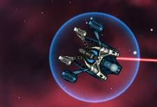
But maybe rather than having a perfect circle, have the outline of the shape of the ship, that could look really nice and would give the affordance that you are trying to convey.

And again! Thank you so much for your time!

You are very welcome, and remember, they are only suggestions, you don’t have to agree :slight_smile:

Really like what you’ve done with this game, it’s come a very long way since the stock Laser Defender - well done :slight_smile:

1 Like

Just got it as well, I’ll be sure to leave a review here and on the Play store once I’ve given it a spin.

:confetti_ball::confetti_ball: Big congratulations on releasing your game.

2 Likes

Hi Brian,

thank you for choosing my game! I really appreciate that!
I’ ll be waiting for your review on the Google Play store!

I hope you would prefer the game and would have a great time while playing it! :slight_smile:

Hi Rob,

last night I was working on skipping the dialogs and instructions in missions. And I really hope that I would manage to finish it this night and would make a new release. And I would like to redesign the pick-ups menu on the left side. Could make it more obvious and readable.

Yes, the only way to get in the leaderboard is to share your results in Survival mode. Before, you have to purchase a ship and ammunition!

I watched this video (Xenon 2) and this is a very good way to make supporting ships more vivid and realistic! Thank you, I will implement that kind of feature also :slight_smile:

I will share the news concerning the game very soon :slight_smile:

1 Like

I will look forward to seeing any updates.

One other thing, which I have forgotten to mention twice now, during the dialog at the start of the missions there is a pause buton (bottom right) and a retry button (bottom left). The retry button is enabled which means you can constantly keep restarting the dialog. It feels like this should have been a Skip button, as mentioned before, to skip passed the dialog. Clicking retry before you have played is obviously a bit odd - and I will always be that guy :wink:

1 Like

You are right! This could be more comprehensible and less misleading! :slight_smile:
In the cut scenes before missions, there is skip button on the right. Maybe it is better to move the Skip/Retry button to the right and Pause button to the left side, it could be more intuitive! :slight_smile:

Thanks again, Rob! Will report about the updates soon :slight_smile:

1 Like

That does sound like a good idea and I think, as a player, where I would perhaps expect them to be.

:slight_smile:

1 Like

I’ve played it for about 20 minutes, and so far I think it’s a well put together game. I want to spend a bit more time with it first (at least play the main levels) and give it a full overview before I leave a review or post any critique.

Again congratulations on releasing a game. It’s on my bucket list as well and seeing others achieve their goals gives me a lot of motivation.

2 Likes

Of course, take your time Brian :slight_smile:

I just wanted to mention that a new version has been released! And now you can skip dialogs and instructions and start immediately with action! :slight_smile:
And I changed a little bit pick-ups menu, now it is easer to see your inventory!

Thanks! And have a nice time in the game :slight_smile:

1 Like

Hey Guntars, I saw two releases, the second one I think may have undone some of your work from the first? I mention this because what became the “Skip” button for the dialog has seemingly reverted (I think) to “Retry”. Specifically I was playing mission 9.

On that note…

The “Retry” button, it feels a little odd that it is visible during the level being played, it feels like it would be more suitable when the player loses, e.g. “Oh, you’ve lost, want to try again?” as opposed to being able to press it during the level itself. It kinda gets in the way and I actually hit it the other day thinking it was a “Skip” button only to have to watch the dialog again! :smiley:

A couple of other things…

When I lost, in survival I think, I chose to restart but it instantly restarted the action - I thought it might be useful here to give the player the ability to purchase more ammo/rockets etc before restarting. Currently you have to come right back out and then go back in to do so.

Before the most recent update I still saw enemies shooting on the mission which is reversed, where the player is at the top of the screen. Haven’t checked the latest update.

Leaderboard question… after each attempt I get prompted to share, but having done so multiple times it looks as if only my best score is displayed, which makes perfect sense, but I wondered whether it may make more sense to not display the option to share unless the player’s score was actually better than the last one which they had shared? Otherwise you tend to share it, run off to see your name in all its glory and then realise that you didn’t do as well as last time and as such what you just shared didn’t show up. :slight_smile:

This might be a personal preference, perhaps if more people provide feedback you can gauge it, but I find the buttons for “Pause” and “Retry/Skip” are a little bit too far into the corners at the bottom of my phone. I confess it isn’t the biggest of screens as mobiles go and I do also have large hands, but it means sometimes I go to press the button and hit the edge of the case on my mobile instead and don’t make contact with the button.

On the buttons front… I have noticed that various selectable things don’t always select first time, they highlight, but it often requires a secondary press to action them, the tabbed heading for “Survival” as a game mode is one example of this and the other buttons do it also. Just a heads up.

I may have also seen some power-up collectables defying gravity, happened a few times and since the first release you shared here. Sometimes, but not always the falling power-up seems to move back upwards from the bottom of the screen - this is quite handy if you have missed it as you get another chance, but it looks a bit odd. I don’t think you have a kind of “magnet” effect in place on the player ship, e.g. where the power-ups are attracted to the player without them having to be in direct contact with them, so can only assume its a collision based issue perhaps?

1 Like

Hi Rob,

yes, I had to make two releases, but actually only the first one (v.1.0.5) was the intentional. The next one was more like a bug fix. It would be better that I would have called it v.1.0.5.1.

In these releases I only managed to create a skip functionality in all missions, except the third, because it doesn’t need it.
Now it works like that - at the beginning of mission, on the right side there is a blinking SKIP button. When you press it, there is a quick fade and action starts. If you prefer not to skip, before the last dialog, the SKIP button is replaced by RETRY button.

I could make these two buttons bigger and with a bigger margin from edges.
I wanted to keep RETRY button in the gameplay, because there are some situations when you run out of ammo or your ship is too damaged and player wants to restart the game. But I am not really sure if it is done correctly and intuitive.

I’ll check other buttons, but it is true that sometimes player has to press twice or hold a bit longer to trigger the interaction. Not sure if it is a bug or some engine thing.

Actually it is almost like that :slight_smile: I have added a point effector to the parent object of player ship, it is not very strong but it works like a little magnet and drags all the pick-ups, if they are not too far away. And when player ship flies near the pick-up, it could change the direction of pick-up’s movement. So, player can use this feature to save the pick-up which already has been passed the ship and collect it :slight_smile:

In the next releases, I will change the enemy shooting in the 7th mission, add more realistic movement and delay for supporting ships, stop spawning asteroids while dialogs are playing, add better animation when ship is immune and much more. I think I could add a movement on y axis as well. Then player ship could move to the center of screen and back. But it needs to be considered more.

I could make that Share pop up appears only when your result is better than the previously shared, but then the network is needed just for checking it. But in other hand, the network is needed also for sharing. So, I could check…if there is no network enabled, I don’t show the share option at all. :slight_smile:

Yes, it is a nice idea, to give the player a chance to buy ammunition after the session, now, I just need to think where to put the button, which will open the pick-ups menu :slight_smile:

Thank you so much for your work, time and comments, Rob! :slight_smile:

I’ve played most of the game (kinda stuck on level 6 lol) and here’s my overall impression.

Just a little background on me, I’m not a mobile gamer, I’ve spent significantly less time gaming on my phone than on a console, so I’m not your target audience (I will say I’ve spent more time on your game than I do for most mobile games). I like space shooters/ ‘bullet hells’ about a 5/10, not my favorite genre but I’ve got into them before. With that said…

The Good:

  • Limited ammo
  • Survival Mode
  • Ship Upgrades

The limited ammo mechanic is a great idea and I’m pleasantly surprised as to how fun of a dynamic it can bring to the genre. Most of the times that I lost it was due to being a little to trigger happy, it gave me a good reason to take the battle a bit more seriously. Survival Mode is great as it allows me to buy my way passed the limited ammo and gives me goals to shoot for, both ships and leaderboard. And on ships, the slight RPG element of upgrading your arsenal is where all the staying power is for me, I fully intend to get the 200k ship and I hope to see content updates on that in the future.

The Bad (Not really bad, but things that I think could be improved):

  • Pacing
  • Some UI oddities
  • Difficulty Spike (maybe)

As far as my criticisms go. I felt that their is a pacing issue that can be improved. We go from reasonably paced battles (especially if we just barely beat the level) and then we usually get a cutscene that just seems a bit different in energy. I remember one cutscene where the ship turns around and flies off the screen at a leisure pace (I’ll reply to the review when I find it specifically). I had just got done laying to waste tens of baddies, I feel like a bad ass pilot, I wanna see my ship pull off a sharp 180 and with an explosion of engine thrusters jet off the screen. I noticed the same with the take off cutscene, the ship didn’t accelerate it just moved off the screen, I think some sort of boost/turbo animation in these scenes could help keep up the energy. (Sorry went off on a tangent there lol)

There are a few UI elements that I wonder if it’s the best placement/size etc.
-The Next and Previous buttons on the full screen dialog pages before the missions I feel like should be at the side near the ‘Play’ and ‘Back’ buttons respectively, it’s just a little awkward to get my thumb to the center of the screen to get to the next page.
-The ‘Purchase’ button in the menu I think should be renamed to ‘Shop’ or ‘Garage’ (or the space equivalent).
-The close (X) buttons are too small.
-I think the menu buttons in the main menu screen (upside down triangles) could be changed to better represent what they do (I thought they were going to be help screens until I started exploring for the sake of testing)

Either there is a difficulty spike by level 6 or I’m just not that great at the game. But I have had a particularly hard time beating level 6, mostly due to ammo (I’ll touch on ideas for that in a bit). I wouldn’t rush to change it, but I guess be on the look out if others are saying it.

My Wishlist:

  • Ammo drops from asteroids
  • More ships, weapons, enemies, etc
  • Button based controls as an option

This is just stuff I think would be cool.
-Ammo drops/ power ups from destroyed asteroids could offer a nice risk/reward dynamic to the asteroids, plus it could also alleviate the ammo balance issue.
-Keep the content coming, new ships, weapons etc. Survival Mode and the ability to get stronger is what I enjoy most while playing your game.
-I would also like to see button based controls, as I mentioned I’m not a mobile gamer so playing with buttons as opposed to the accelerometer is preferable for me.

That’s about it, overall I’m really enjoying the game and I look forward to future content. It’s clearly a well made game and as far as bugs go I haven’t noticed any (none that come to mind anyway and I feel like that’s the important part from an end user’s perspective).
Once I figure out a way to put this in a shorter format, I’ll leave a review on the Google Play Store. If anything needs clarified please ask, I am, in general, terrible a getting my point across, I’m much better at dialog (I like to think anyway).

PS I’m on a Galaxy S7 - Android 7.0

2 Likes

Hi Brian,

thank you very much for your great and constructive overview! :slight_smile:

There are a lot of things and your ideas I could implement in the game. And most of them I will fulfill! It is so nice to hear and read these kind of reviews, because I really want to improve my game, so that everyone could enjoy it playing :slight_smile:

Very soon there will be new updates for the game :slight_smile:

P.S. I really hope you will manage to complete the 6th mission, because after that the real action will be starting :smiley:

2 Likes

Hi!

I have come up with an idea to create a weekly and daily challenges. I will start with the weekly. The Network will be necessary, of course :slight_smile:

But idea would be something like this:

  1. 10 challenges (missions, points, destroyed ships, pick-ups e.t.c)
  2. Each completed challenge gives points
  3. Those who complete all the challenges, get special rewards like pick-ups
  4. Possibility to view own progress and maybe others too

What do you think about that? Is it worth to build something like that?

Overall I think a challenge list would be a good way to add more to your game with out a huge time sink.

I misunderstood what you meant initially, below is what I wrote before I made that realization, but maybe some of the points will still help you in some way, so I left it here.

I like the idea, my concern would be what the reward for the challenges would be. Yes points, but do the points get you. I’ve not had any problem making progress towards getting all of the content in the game (ships in particular). I think a new currency that can be used for a new tier of content would be very incentivising, but of course that requires more content (ships, weapons, etc) and that’s a tall order.
Have you also thought about communicating how the challenges will work as well as keeping the player informed (notifications and the like).

IMO, I think more content is the way to go, not necessarily story related but more enemies, bosses, power-ups ect. That would also make creating the challenge mode a bit easier, as you have more enemies to offer during a potentially longer level… (and I just realized you weren’t talking about any type of ‘super’ level, like raids :flushed:)

1 Like

Privacy & Terms