Font design - Escape

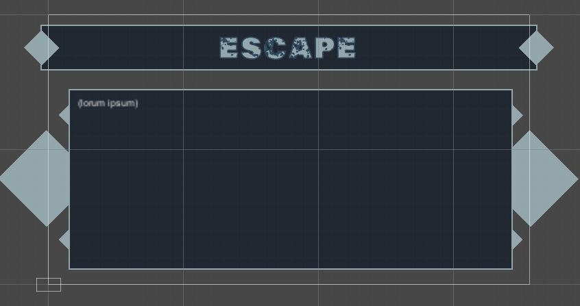
My title page with “escape” font. Not 100% satisfied with this font, but it does convey a sense of danger.

For colors I used colorhunt.co to find some starting blue colors, and then imported those in colormind.io to further tweak them. I did this even before the course showed the adobe colorwheel (which looks amazing) but I’m sticking with what I’ve got.

(Also thanks Miziziziz for telling me to only use a very limited set of colors)

4 Likes

It’s okay about the font! Just keep experimenting. Nice job with the colors! You did a great job!

Thanks! I did not expect the online course to have an actual active community with positive feedback included. That’s very nice, especially in these covid times, but it would always have surpassed my expectations.

Looks great, hats off! :slight_smile: 
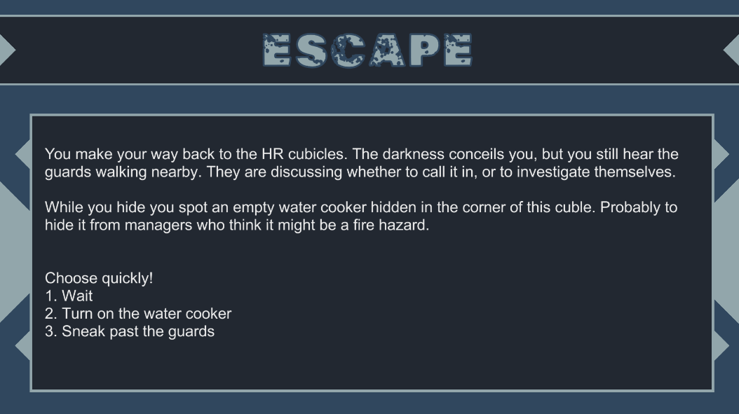
I was wondering how you managed to add the diamond like UI elements for the background? I tried creating common geometrical sprites in assets and then moving them to the Hierarchy, but it works only in the Scene view. In the Game view the elements seem to be overridden by the Canvas. Thanks!

I had the same problem:)

However, you can still rotate the image squares, and hide them partially behind other squares. That’s how I got my diamonds and other shapes. This is whay my scene editor looks like:

1 Like

Image squares, right! This totally makes sense now, thank you! :slight_smile:

1 Like

This looks awesome! I agree with @Aeon7 in that I like the diamond UI elements!
Was curious as to why you went with blue? (no issues, I just wanted to know the thought process!)

Thanks for asking. My game is about a thief trying to escape from an office building at night. Darkness and night plays an important role in the setting. Dark blue seemed like the best color to represent night.

Now that I look back at it afte a while, I might even make some of the lighter blue tones darker next time.

Does this make sense to you? I’m thinkig about if I could have gone for another base color as well, mayne all dark greys with one standout color could work? Not sure.

1 Like

Appreciate the explanation! The colour choice definitely makes sense to me =] I think the blue tones gives me a bit of a cold/icy feeling (what with the shapes), but I think that places into the theme of your game as well! Cold, need to get outta here kind of thing

I love such fonts and I use them very often because you always get something special if you know how to combine these fonts. Lately, I have discovered overwatch logo font and I use it most often. Does anyone here know about him? After seeing it on a forum and noticing that it looks so good, I said it was perfect and started using it in university projects so that something special always comes out and I can be proud of it.

1 Like

Nice use of colours. I’m interested to see how this story evolves :slight_smile:

Privacy & Terms