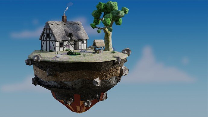
Final Low poly Course Renders

I adapted the design from Grant’s to be more realistic in design.
It still only used the same methods as in the course all apart from the well that made use of array modifiers.
Then the final addition of materials instead of plain colours.

(The full beginner course would cover those items.)

Day

Night

Not keen on bloom/glow effect so not used.
All Cycles.

19 Likes

Excellent work!
Glad you’ve taken a new route as an artist. It looks realistic in a professional cartoon-like style.
The diamond shape (below) is too much I think, It has no relation to the other objects (materials).
:+1: :+1: :+1:

1 Like

What bit do you mean by the diamond? The red faces at the very bottom.
I may fiddle with that more. It is outside the course adding materials, it sticks to very cartoon plain colours. My aim was to suggest a bit of the molten core of a planet the island was ripped from sometime. So it has rock materials and a fraction of emission. It does not work. Yet!

As the course launched I thought to get a sample up for others to see if they come through onto here. That had varied from the course design but not used much else in way of methods. I may add my nephew’s version that is more, as done in the course.

1 Like

Amazing work.

1 Like

Can’t wait to get to that point. Looks great!

1 Like

I love it, looks really good and a nice twist on the course content.

2 Likes

Tried a circling animated view.

5 Likes

To make it more lively, animate (swinging) lantern, tree, grass … ?

1 Like

Yes, it might well add something. I was only aiming for a turntable though. It was enough to find out how to make a start and end pause. :grinning_face_with_smiling_eyes:

1 Like

Compelling house and well! I like the starry night:)
Well done, sir!

1 Like

Privacy & Terms